VirtuArch
Architecture and project management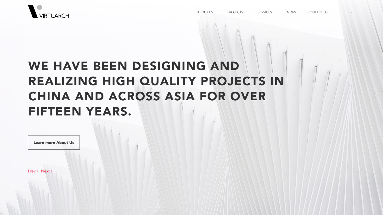
Overview
Website, design and build
VirtuArch designs and manages architecture and interior projects across China and Asia, from offices in Shanghai, Zurich and Bangkok. In 2019 the studio got a new identity, with brand guidelines and a presentation template. I planned the new site structure and designed and built the bilingual WordPress website on that identity.
for the website
English, Chinese
the new menu
Zurich, Bangkok
My Responsibilities
Web design and build
The website, from the structure to the WordPress build, on the studio’s new identity.
The old and the new site structure, with projects and services split into design and project management.
One overview of every page before a single screen was styled.
Nine page designs in Adobe XD, from the home page to a news article.
Navigation, cards, tiles, steps and the contact form, built from the brand’s black, white and red.
The site built on WordPress with Astra, so the studio adds news and projects itself.
English and Simplified Chinese on every page, switched from the header.
Brand identity
Logo, color and type
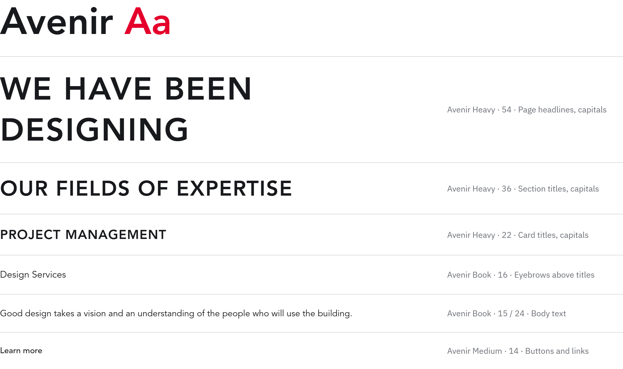
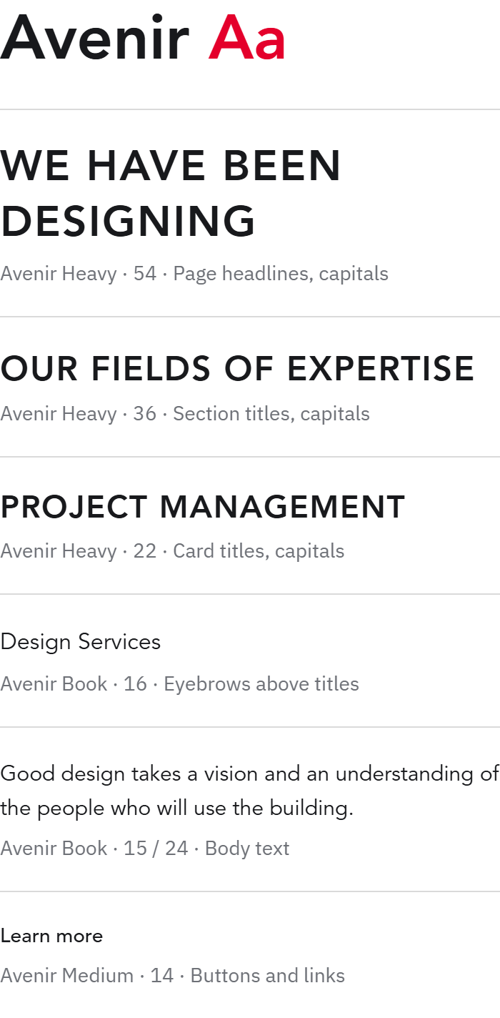
Black and white with one red accent, used sparingly. The mark is a V built from a slanted bar and a gray circle, the logotype is set in thin capitals, and Avenir carries every word: heavy capitals for titles, book for the text.
Logo
Logotype on white
Logotype on black
Brand mark on charcoal
Color
Logo, type and headlines
Pages and backgrounds
Accent, used sparingly
The circle in the mark, lines
Special print, Pantone 8001
Typography
Avenir is the primary typeface, from book for the text to heavy capitals for titles, with Source Han Sans CN for Chinese. A short red line marks every section title on the website.
UI components

Navigation, with English and Chinese
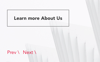
Hero button and slider
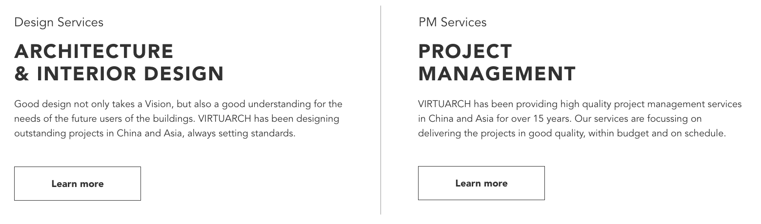
Service columns
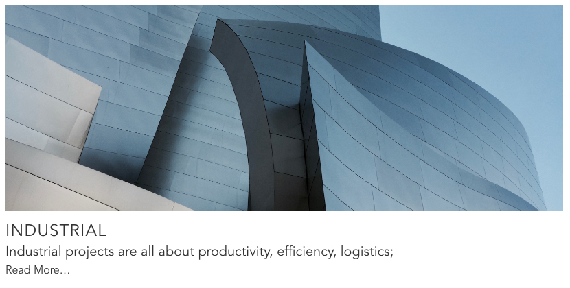
Project card
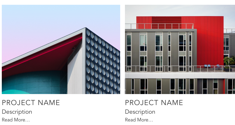
Related projects
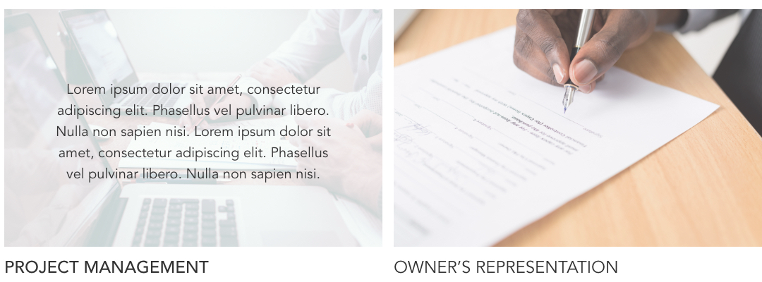
Service tiles, hover and rest
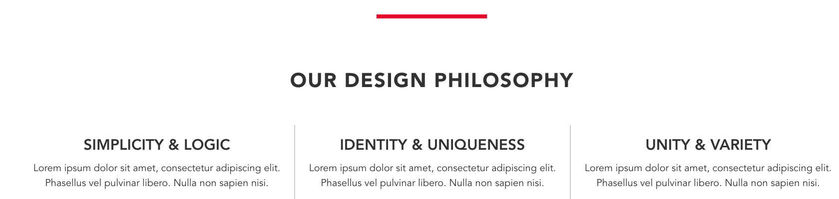
Values row with the red section line
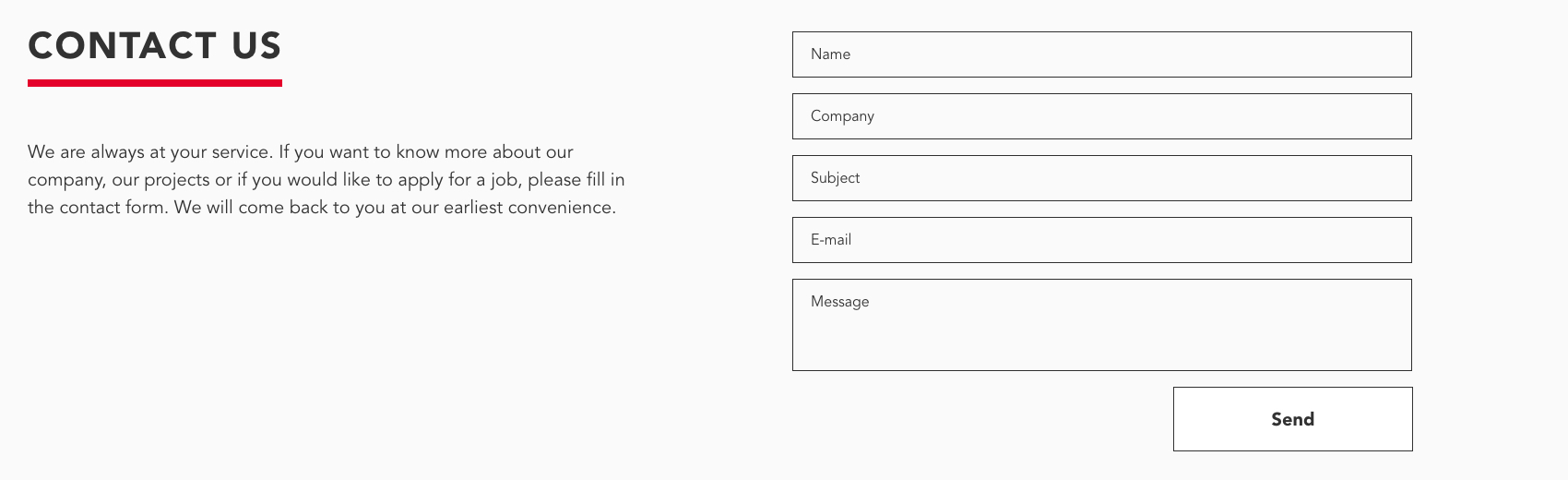
Contact form

Footer
Brand guidelines
A book of 59 pages
The book covers the logo, its clearance and color variants, the brand colors with their print values and Avenir in English and Chinese. Then it shows every application: business cards, letterhead, envelope, pencils, mugs, a brochure, WeChat, digital banners, a billboard, a construction site wrap and the photography style.
Cover
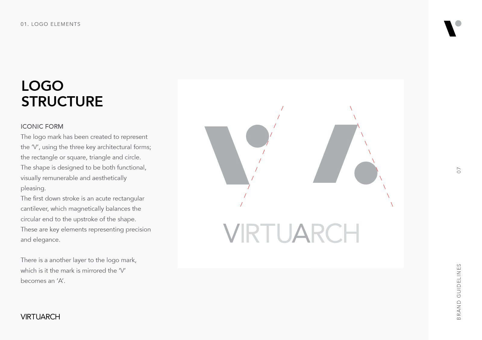
Logo structure
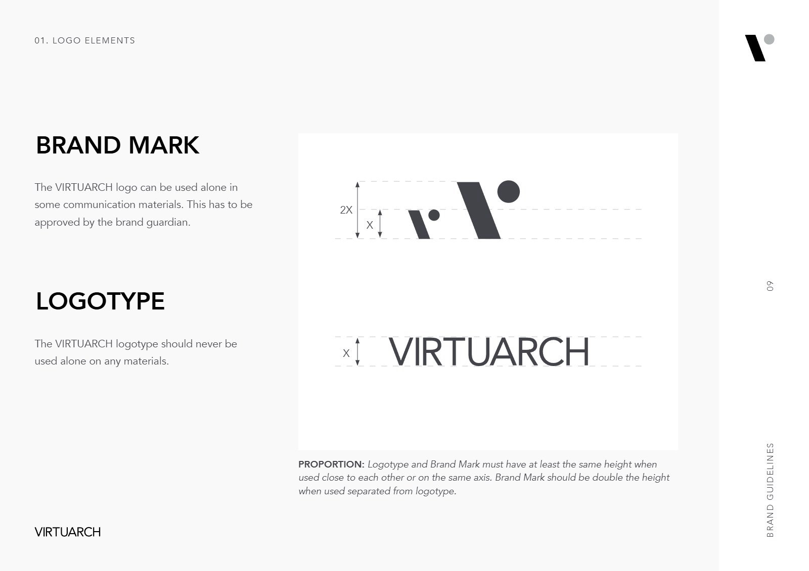
Brand mark and logotype
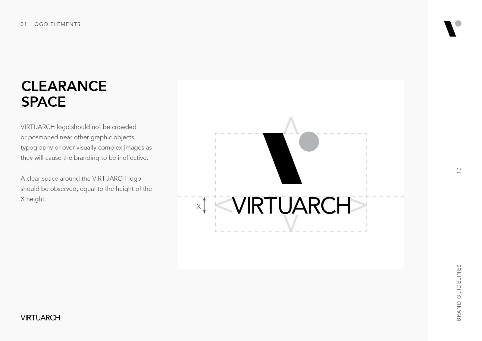
Clearance space
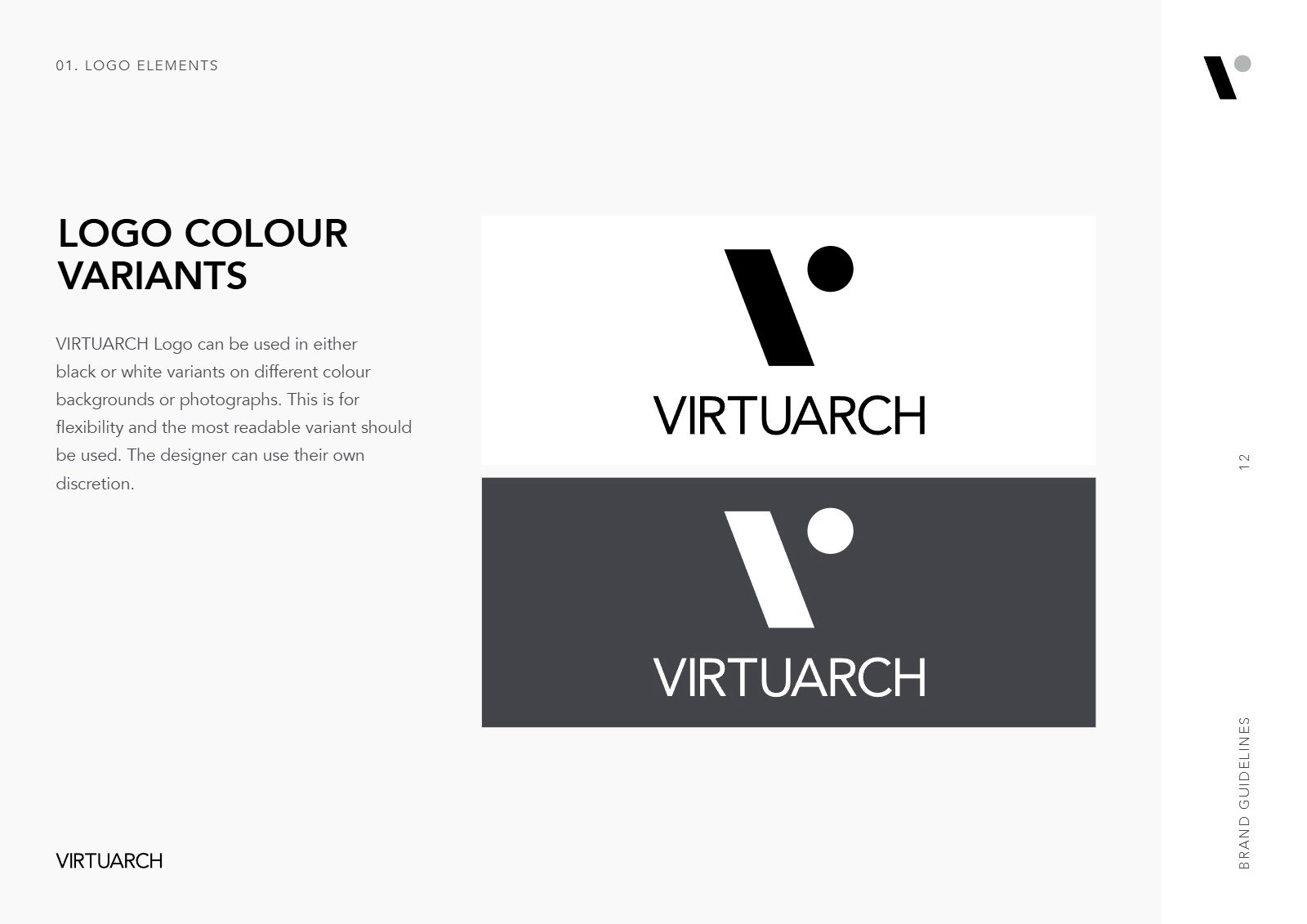
Logo color variants
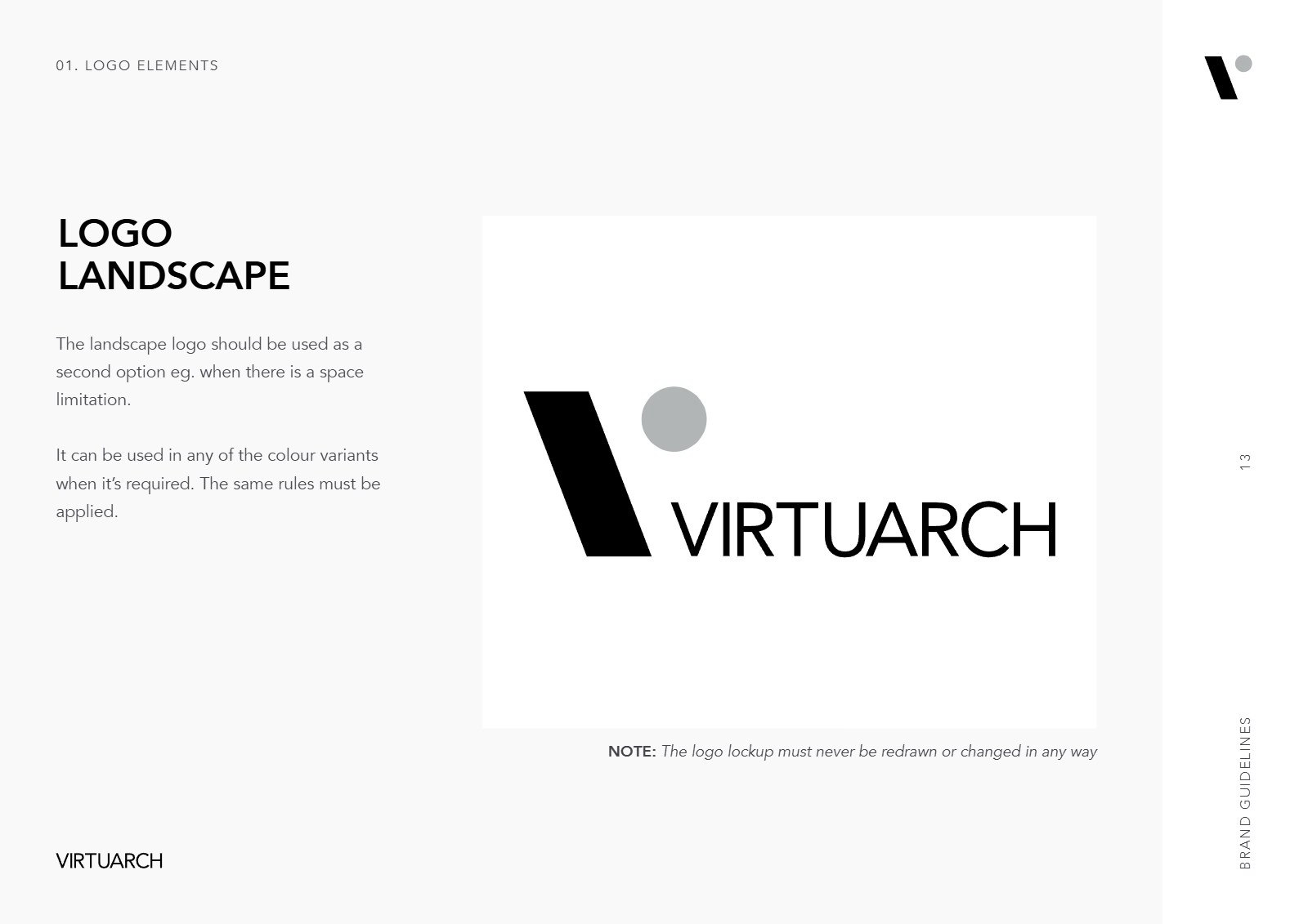
Logo landscape
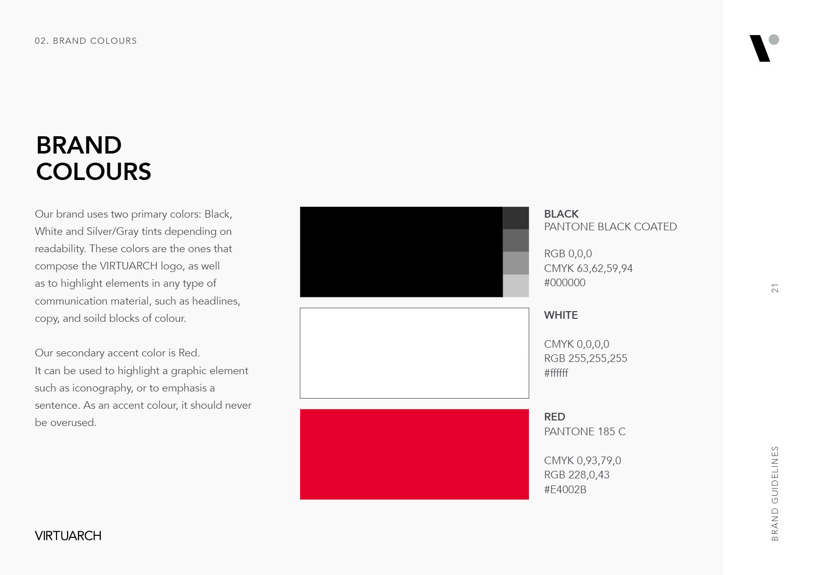
Brand colors
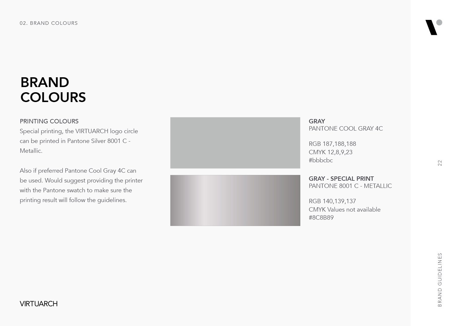
Print colors
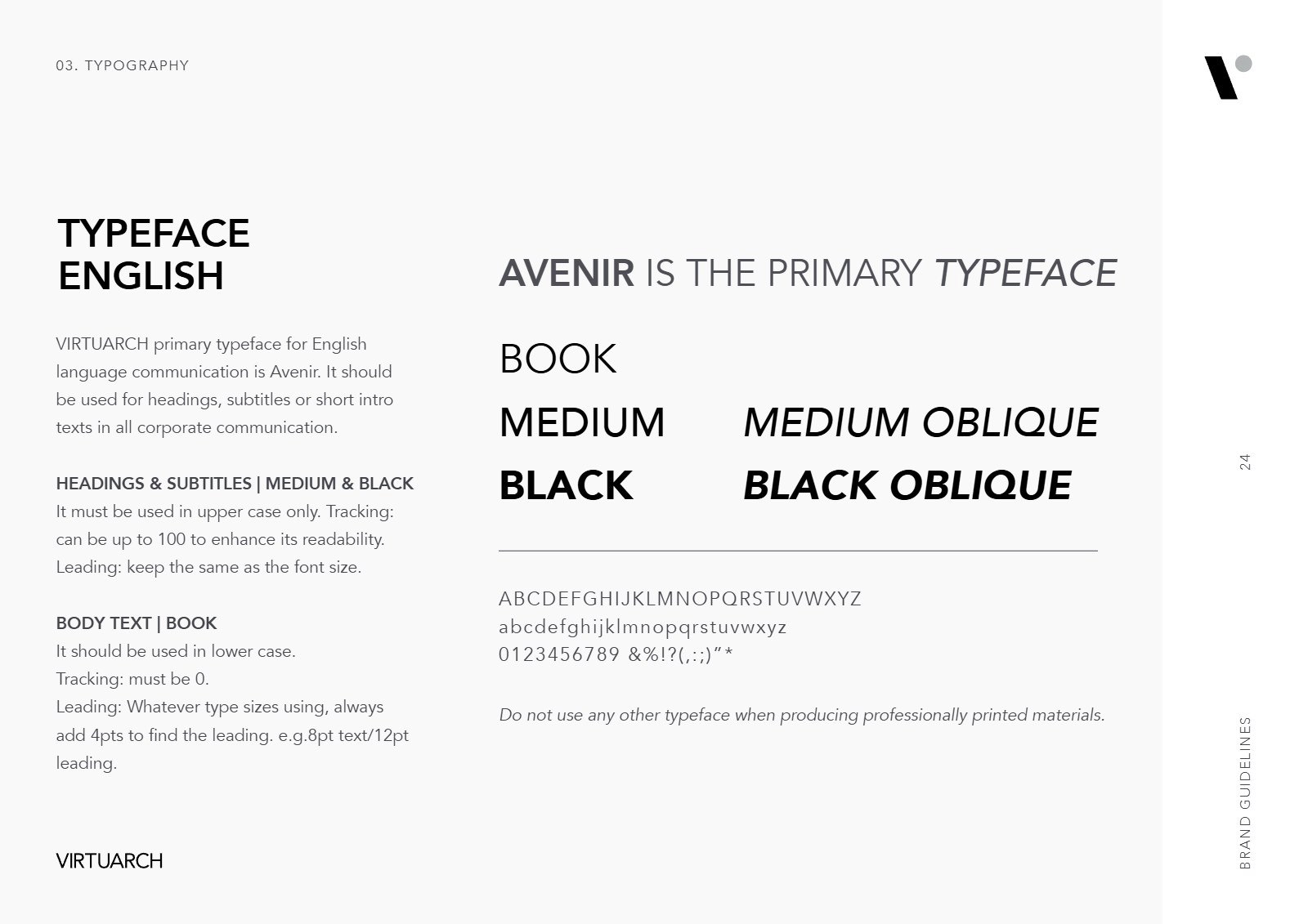
Typeface
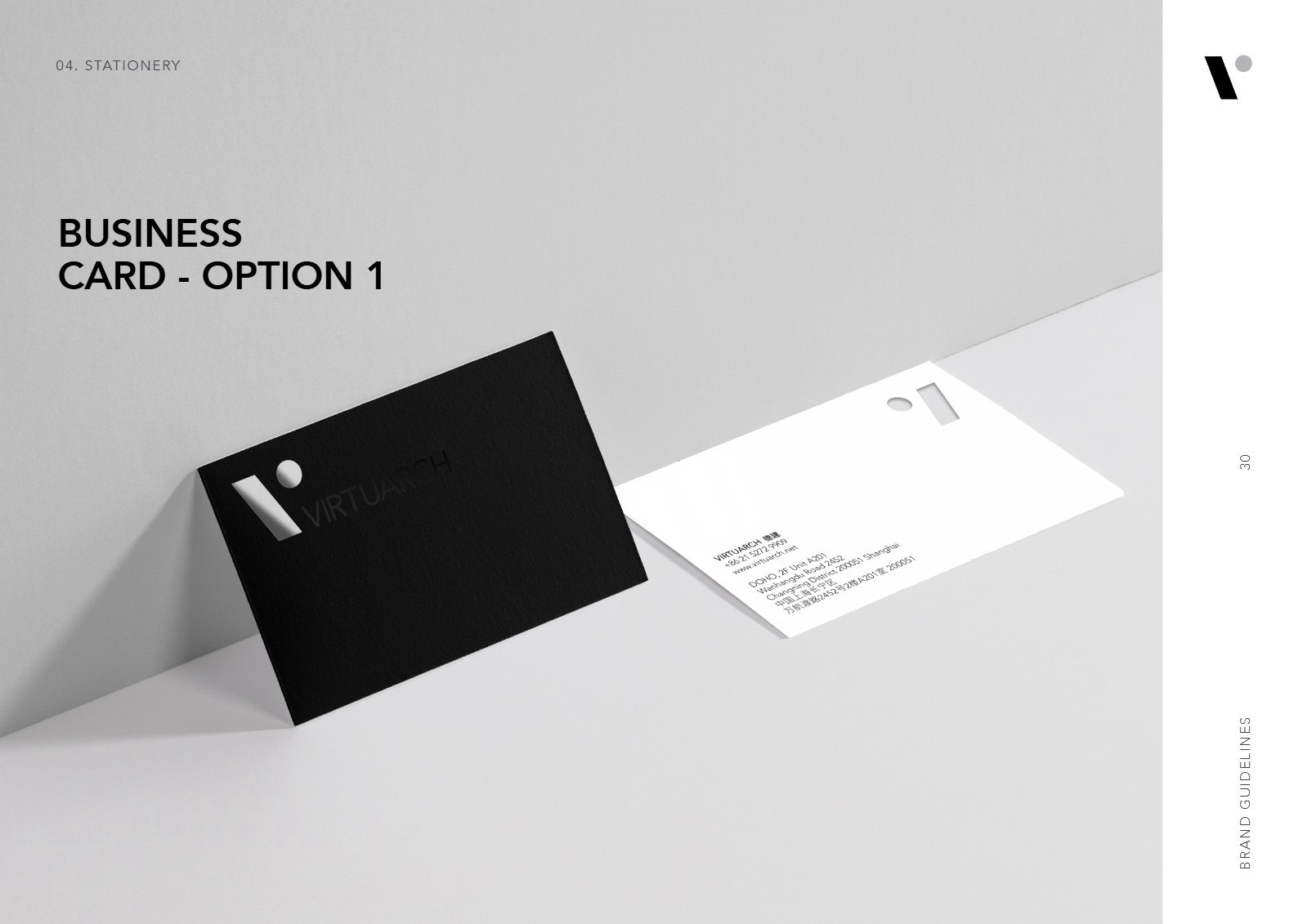
Business card
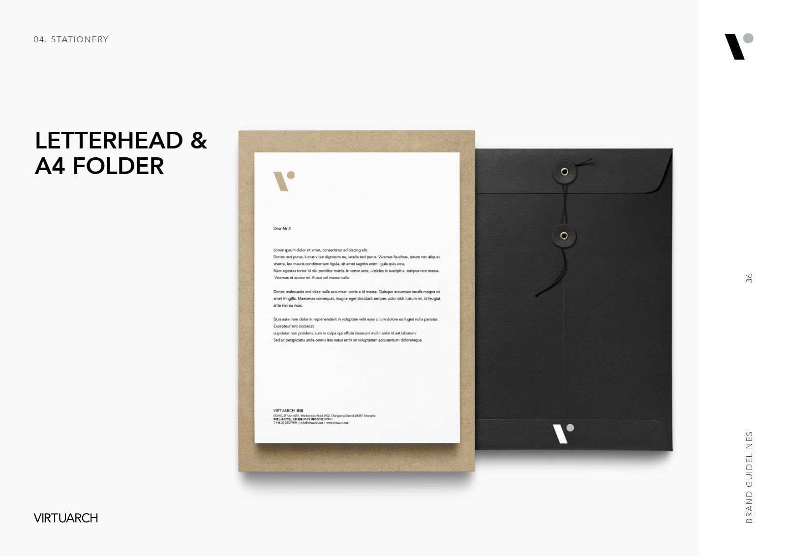
Letterhead and A4 folder
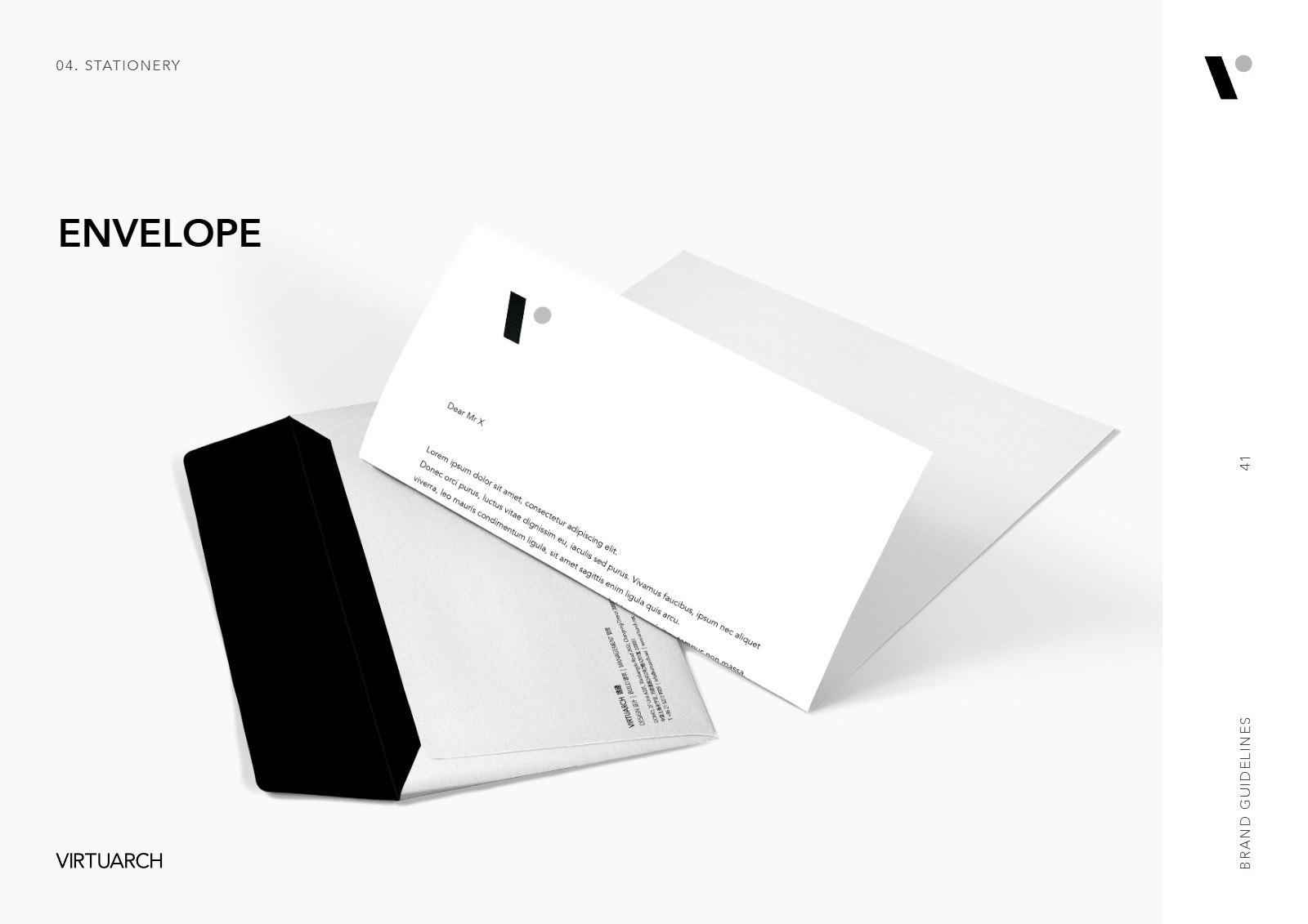
Envelope
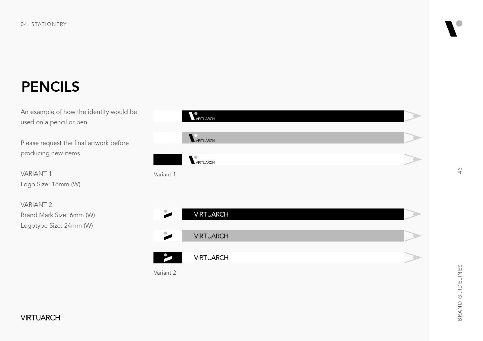
Pencils
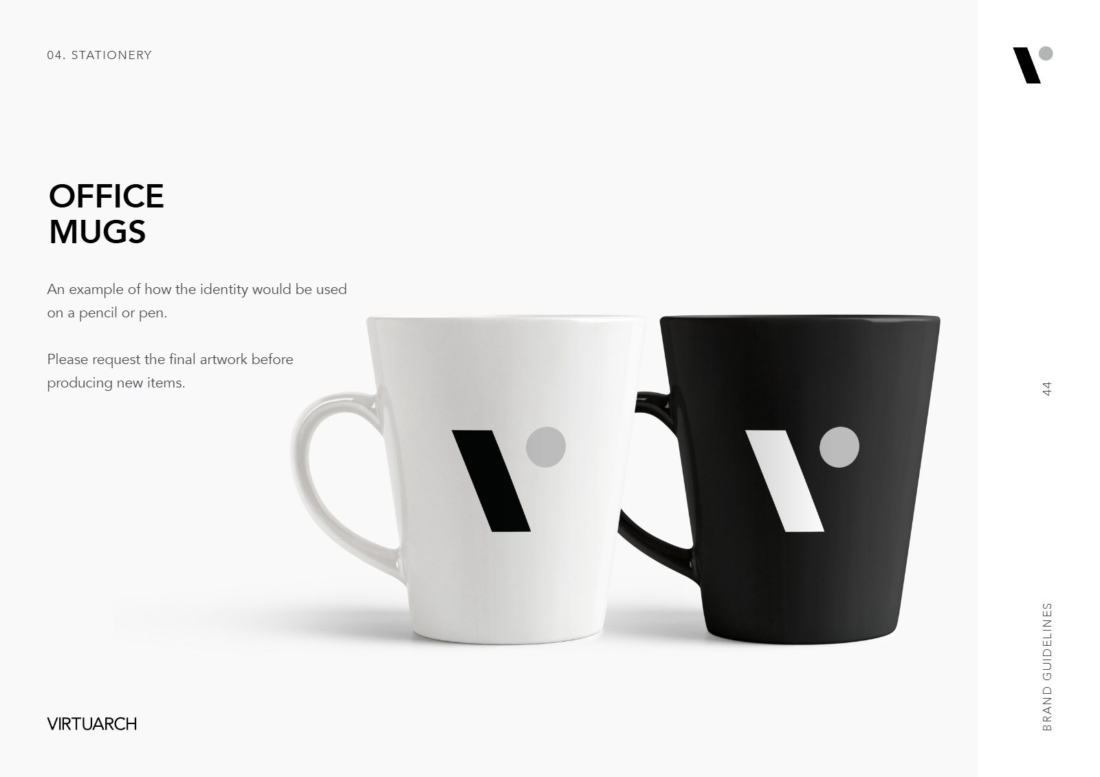
Office mugs
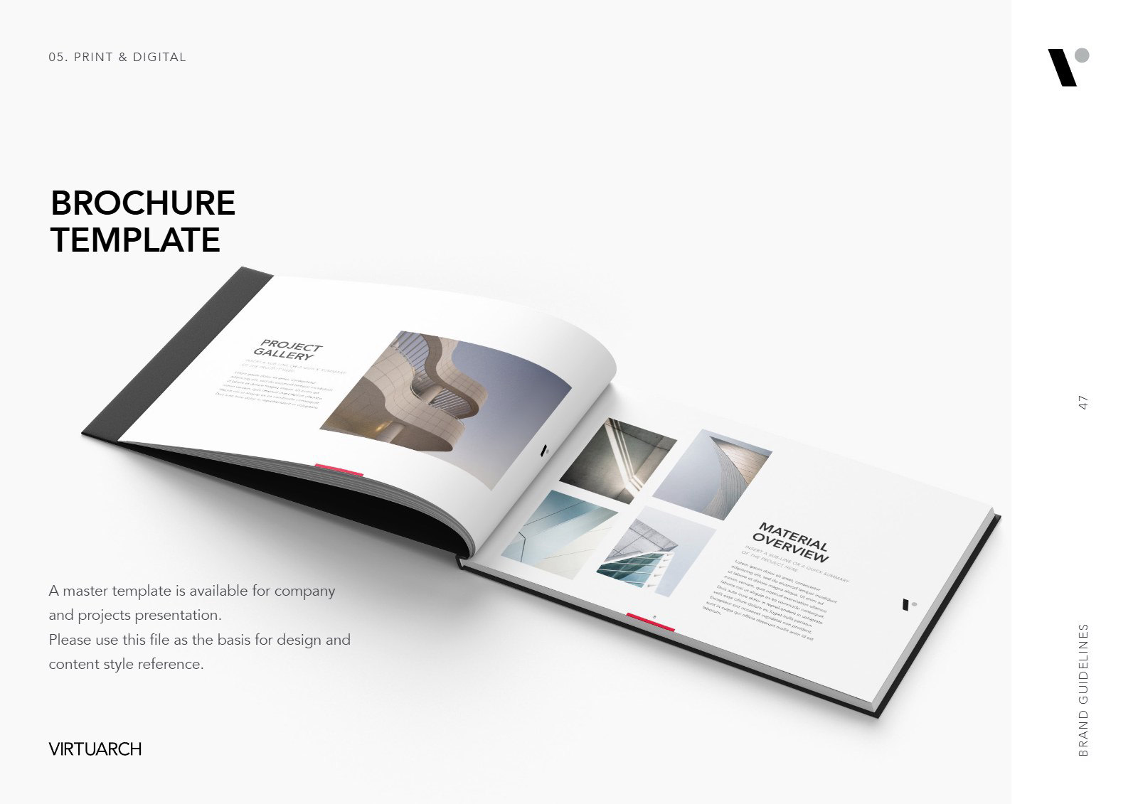
Brochure template
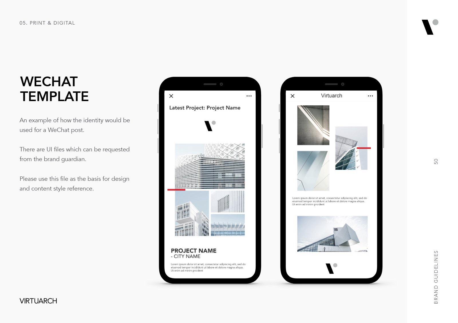
WeChat template
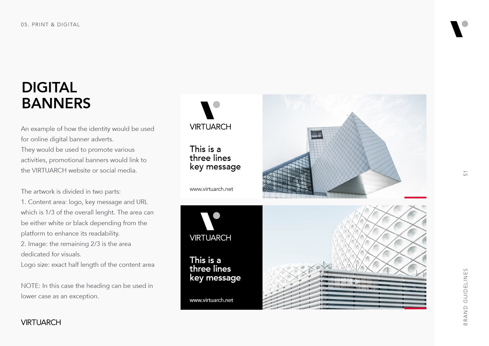
Digital banners
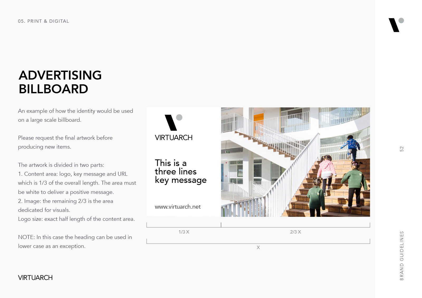
Advertising billboard
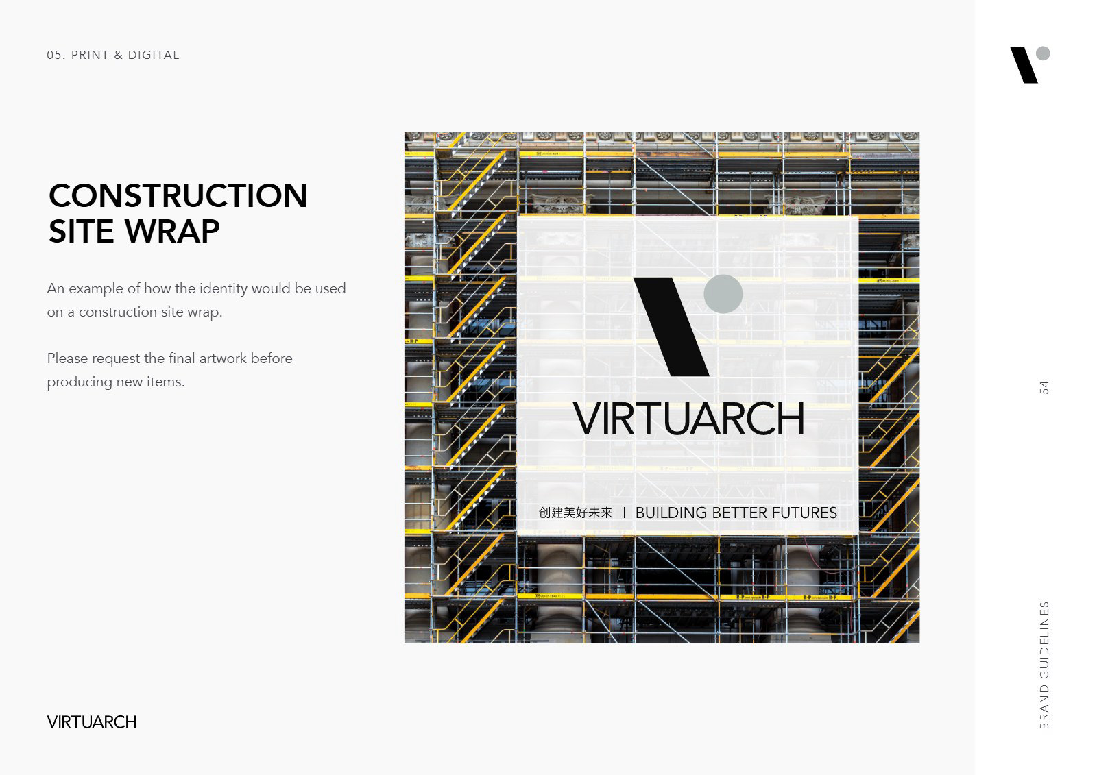
Construction site wrap
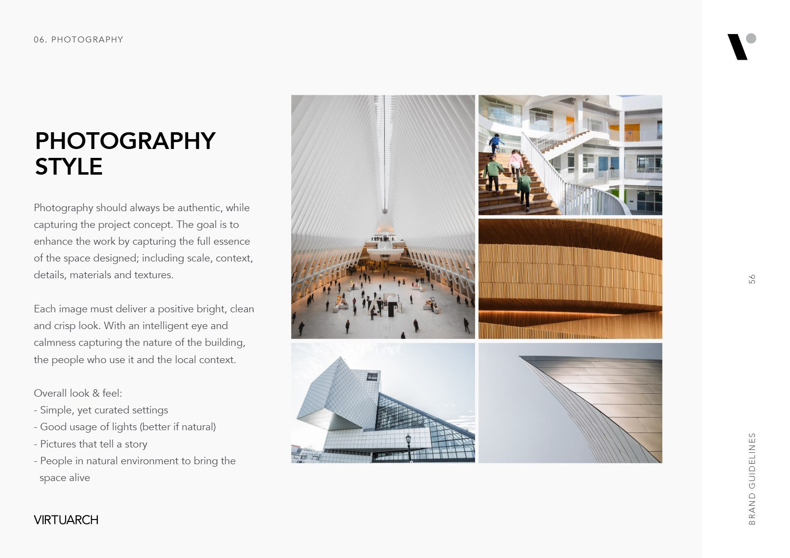
Photography style
Presentation template
Keynote and PowerPoint
A master deck of layouts in Avenir with the red accent, from the cover and the mission to awards, clients, the scope of services and the closing, so every proposal looks like it comes from the same studio.
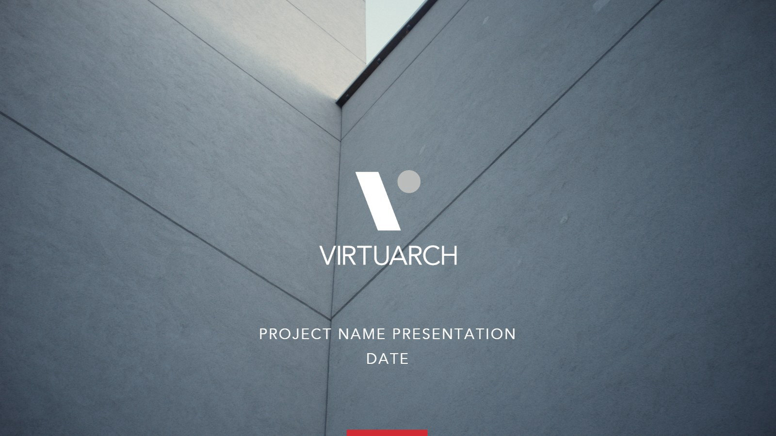
Cover
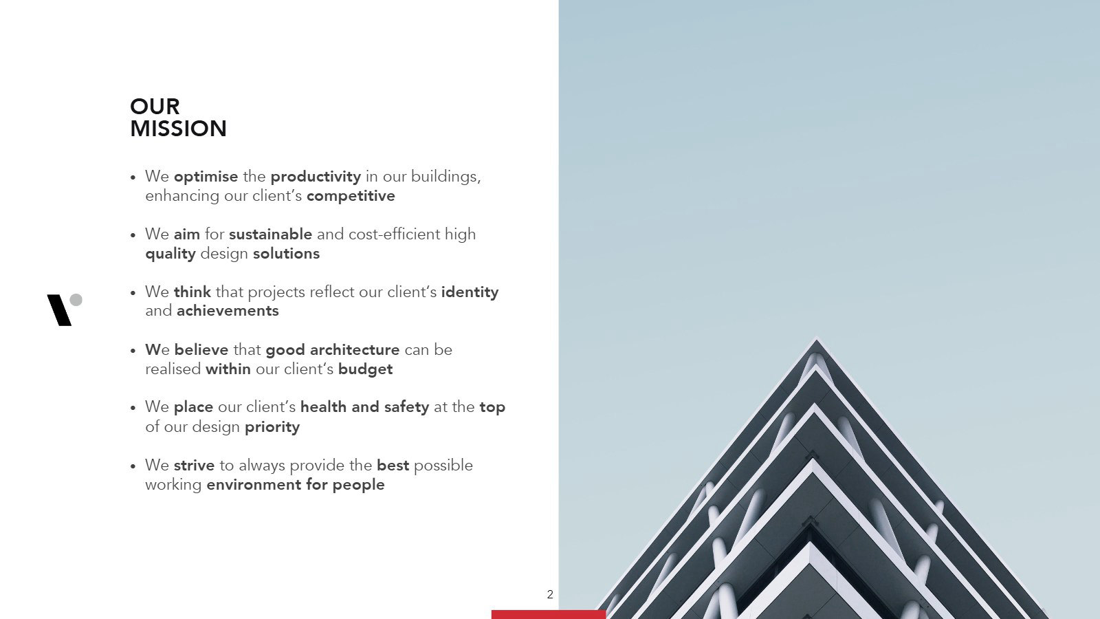
Our mission
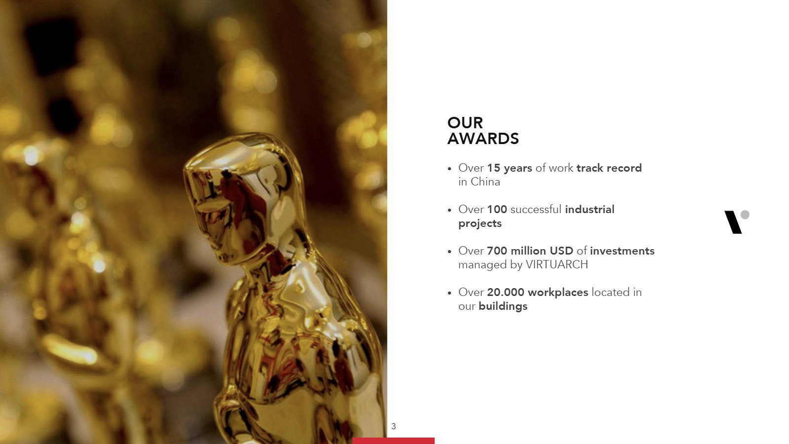
Our awards
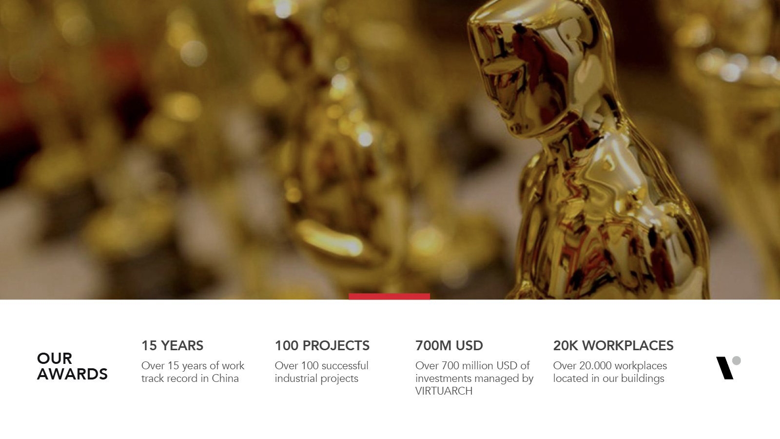
Awards in numbers
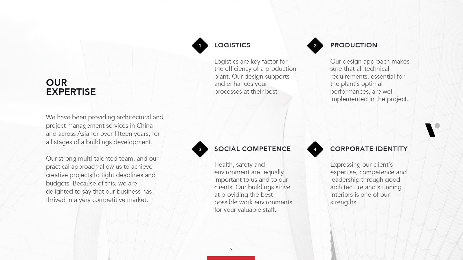
Our expertise
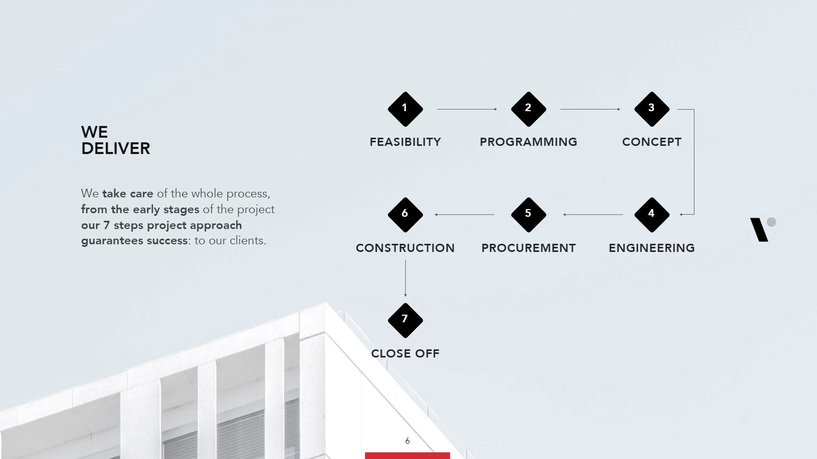
We deliver, in seven steps
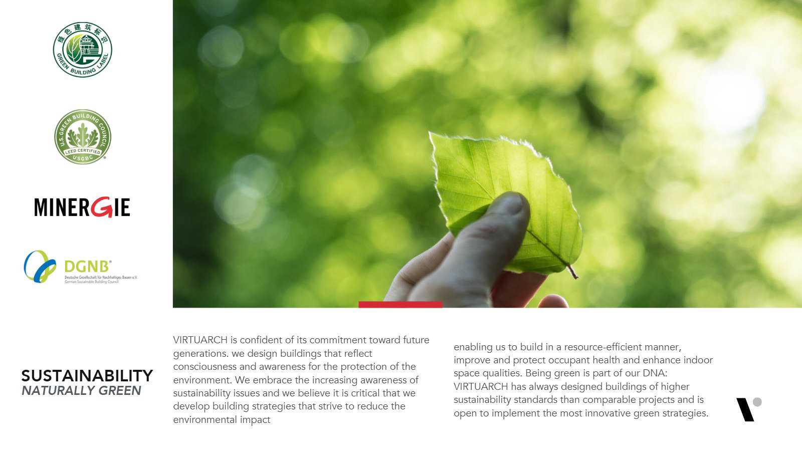
Sustainability
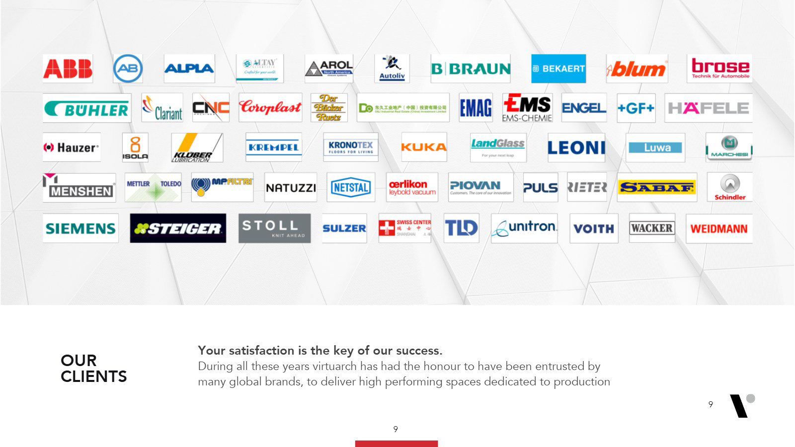
Our clients
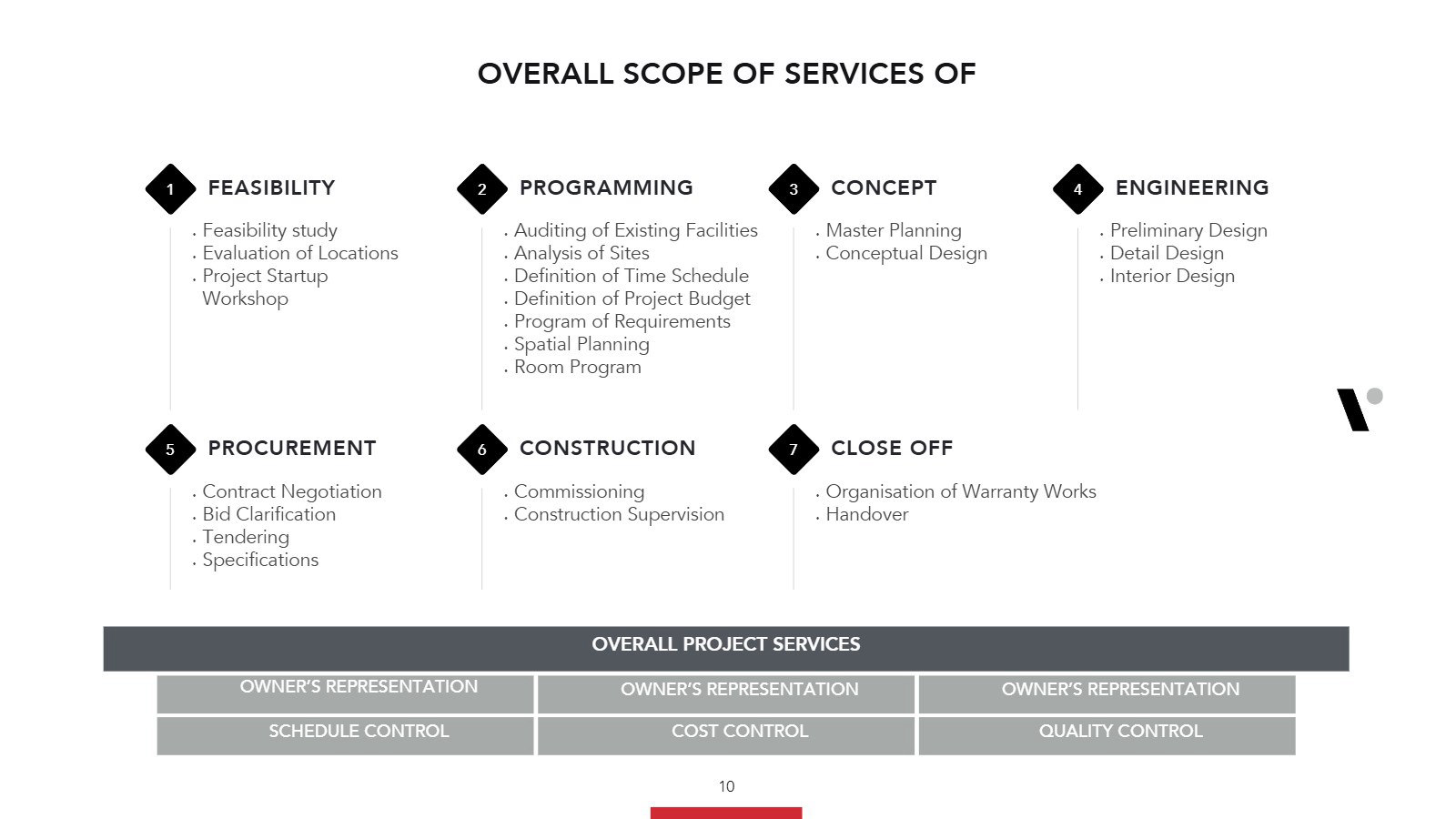
Overall scope of services
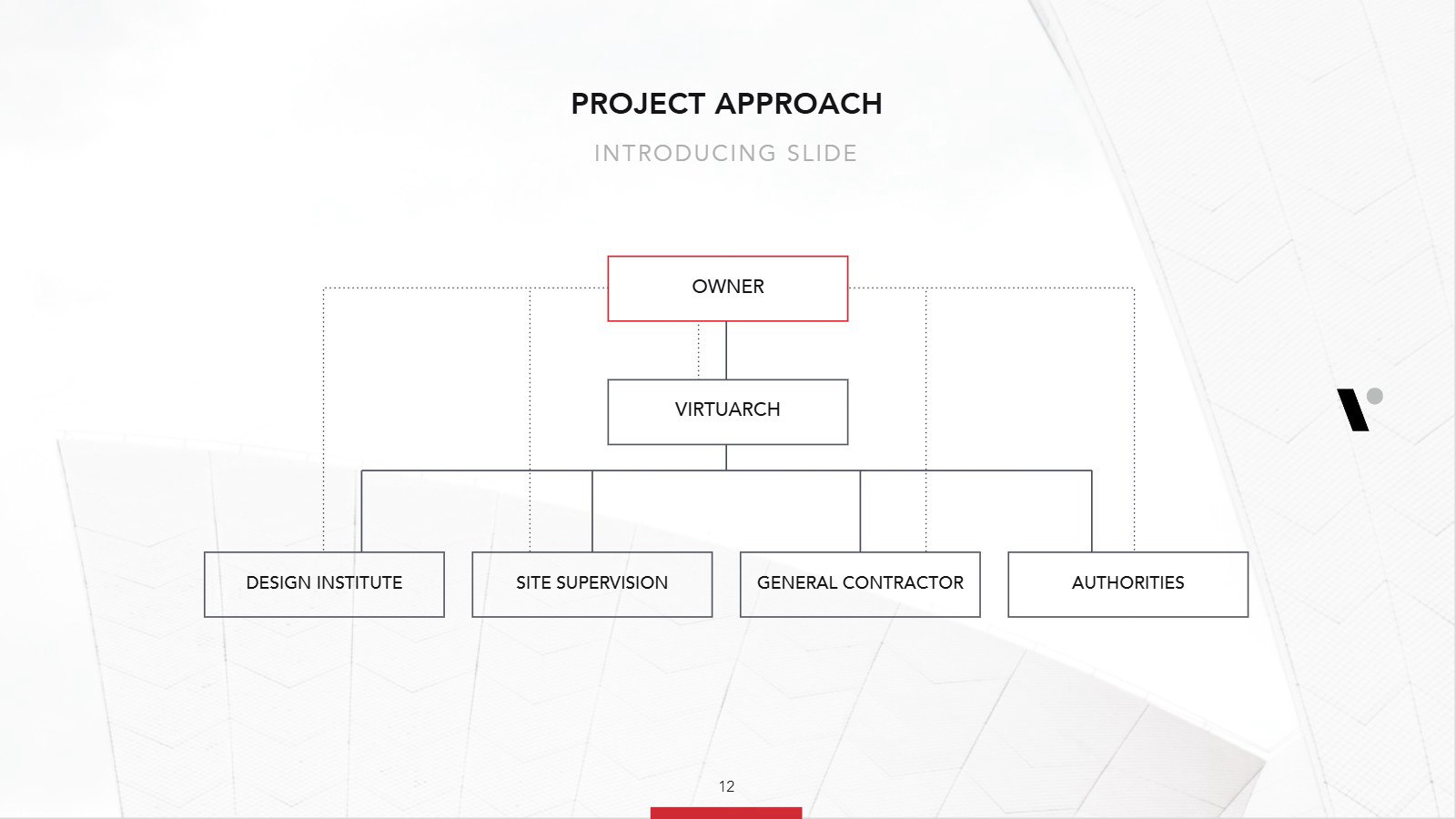
Project approach
Closing
Site structure
From the old site to the new one
The old site spread the studio over eight menus. The new structure groups everything under five: About Us, Projects, Services, Team and Contacts, with projects searchable by category and every service on its own page, in English, Chinese and later Thai.
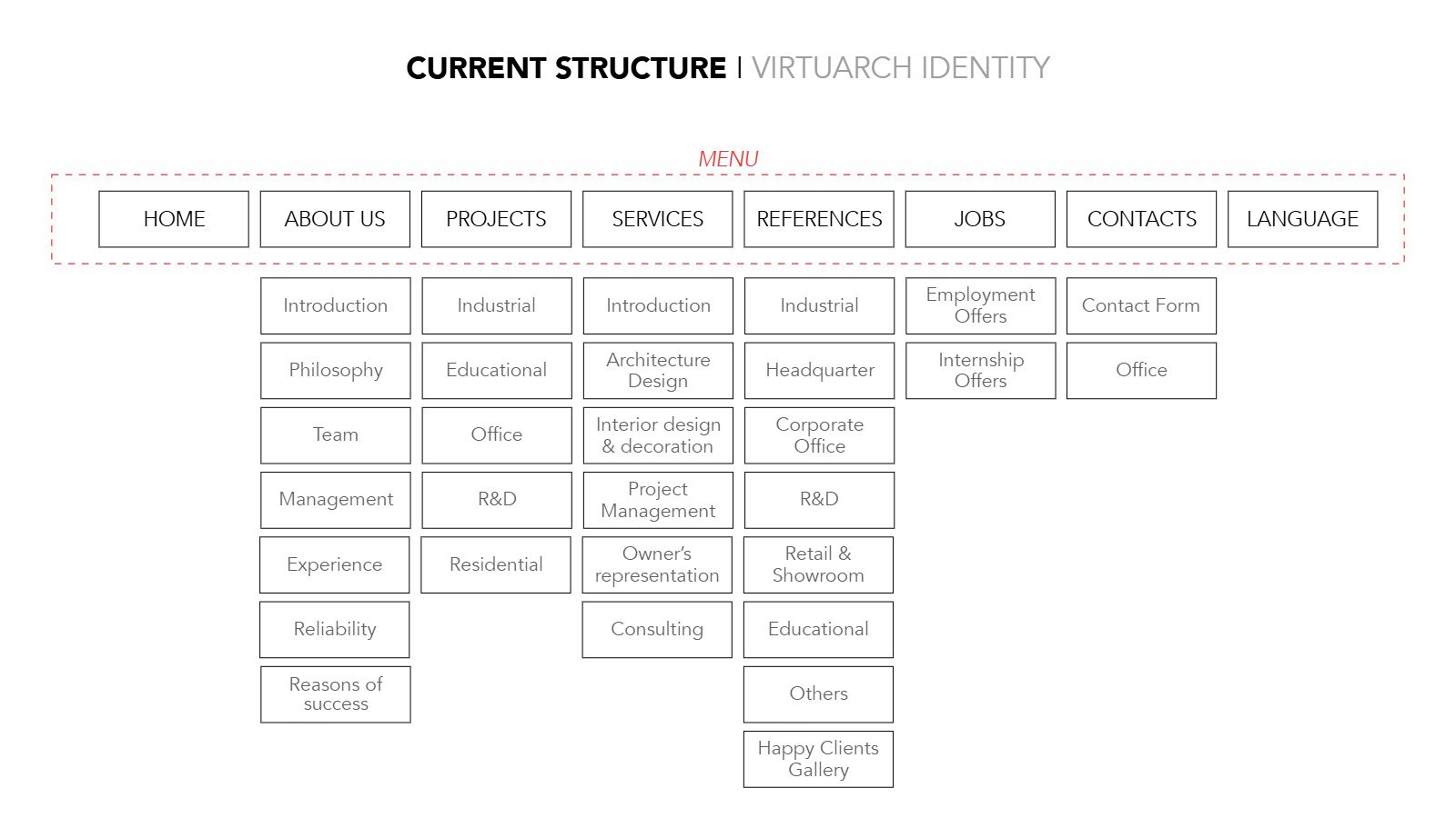
Current structure
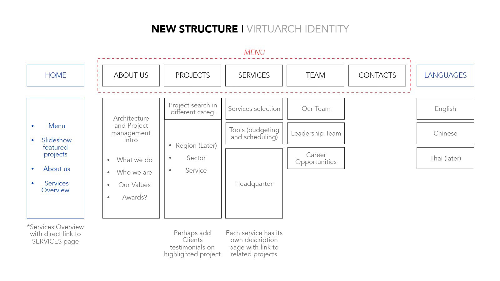
New structure
Wireframes
Every page before the design
Before any page was styled, one overview laid out the home page, About Us, Projects, Services, Team and Contacts, so the client approved the content and the order first.
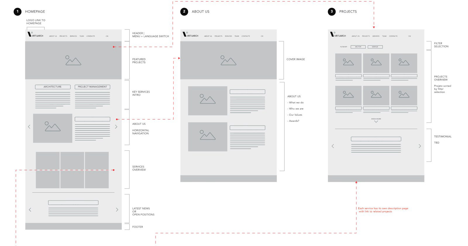
Home page, About Us and Projects
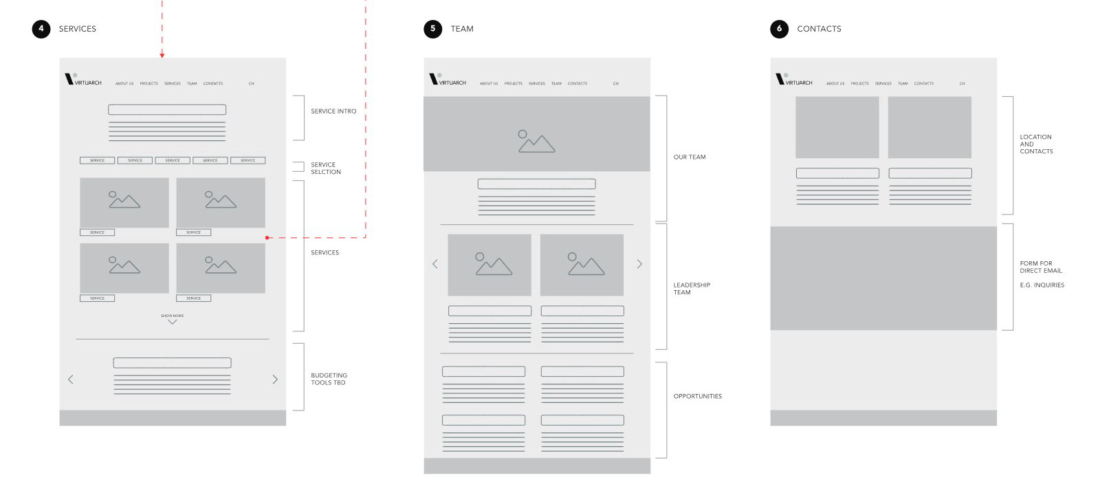
Services, Team and Contacts
The website
Nine page designs
White pages, black Avenir capitals and large architecture photography, with the red line marking every section title. Each page scrolls inside its window, from the home page to a news article.
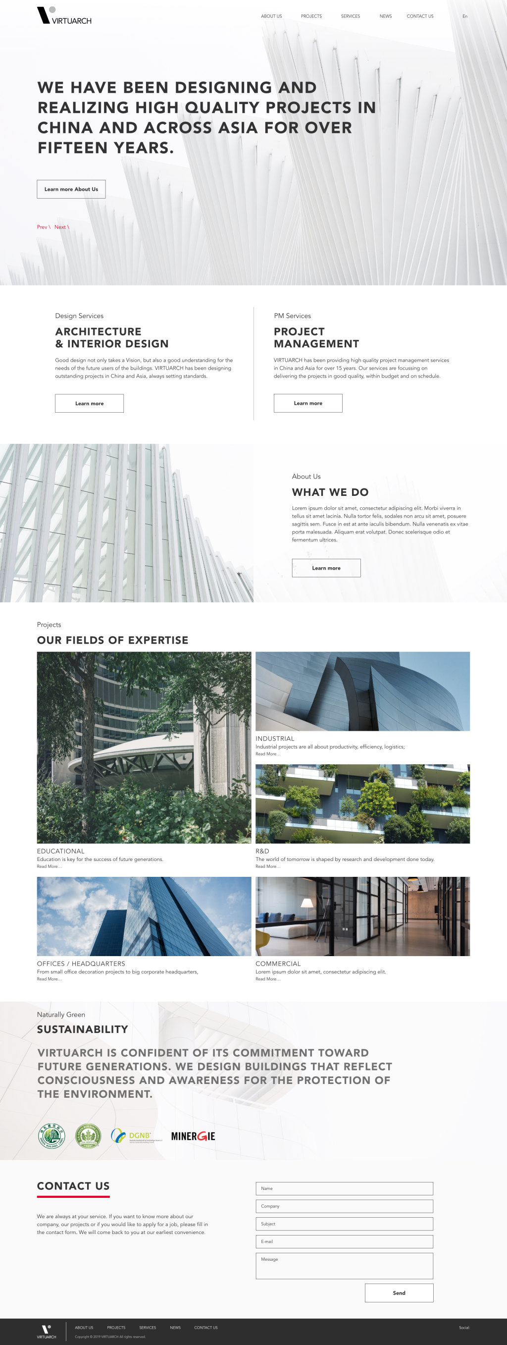
Home
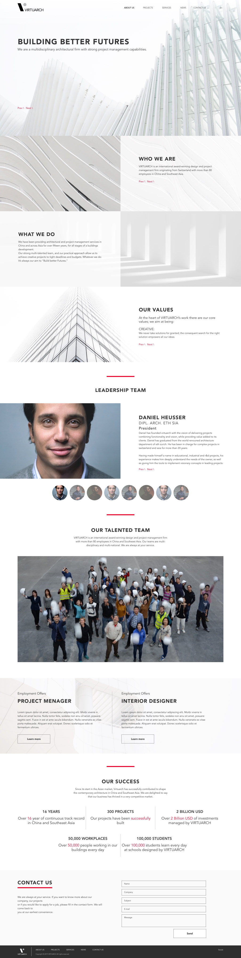
About Us
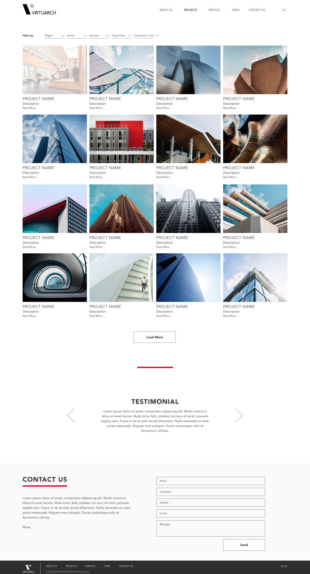
Projects
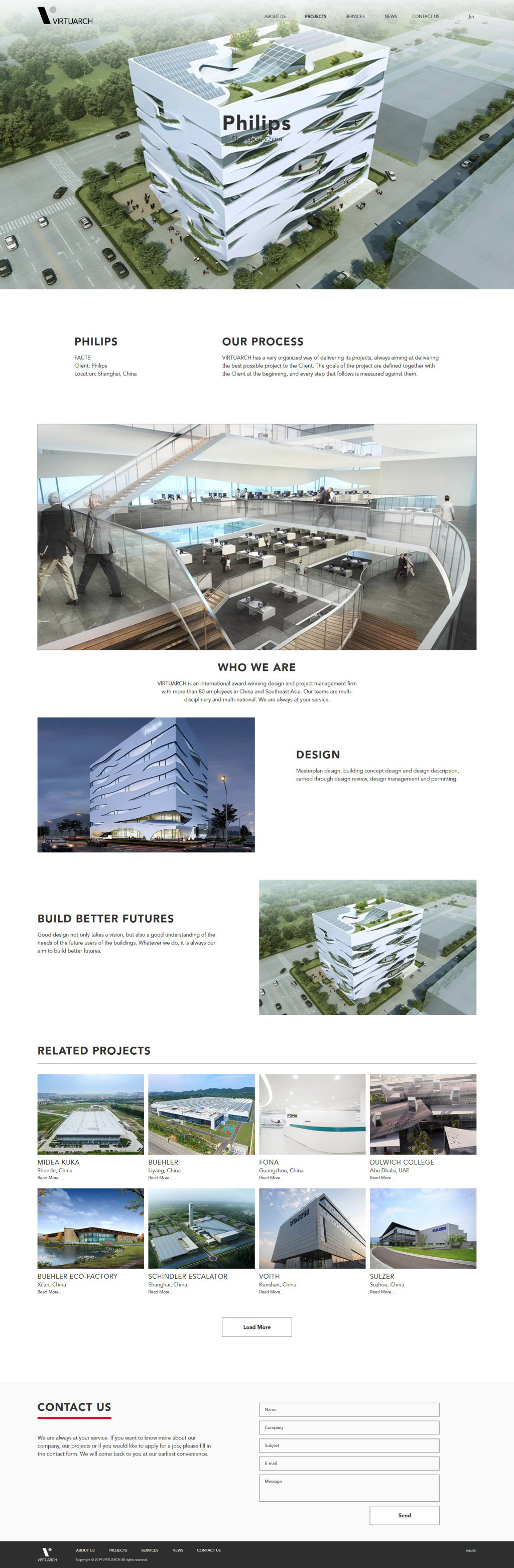
Project page
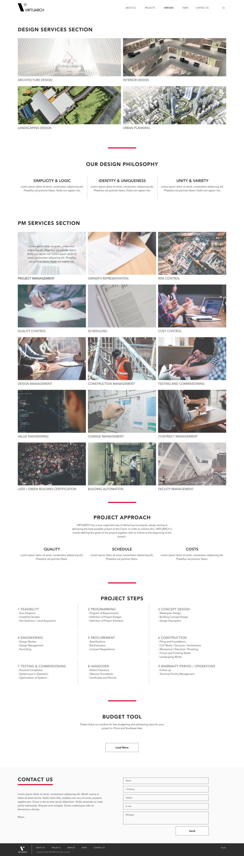
Services
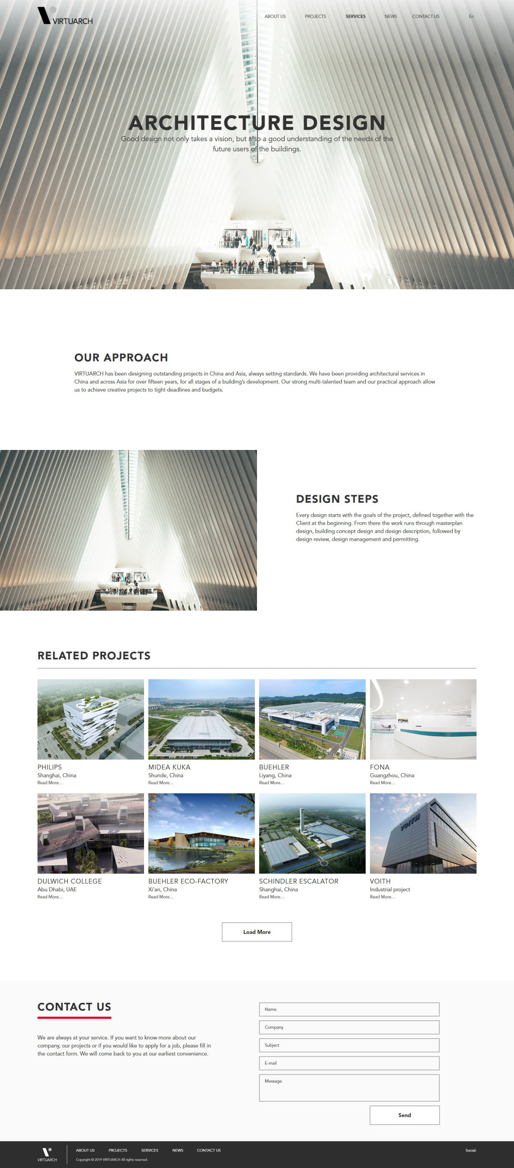
Service page, Architecture design
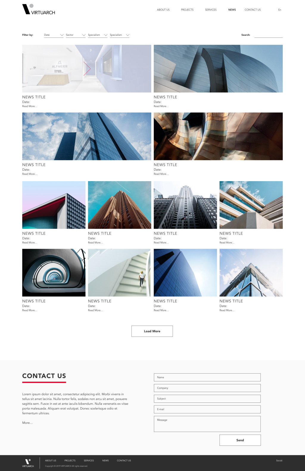
News
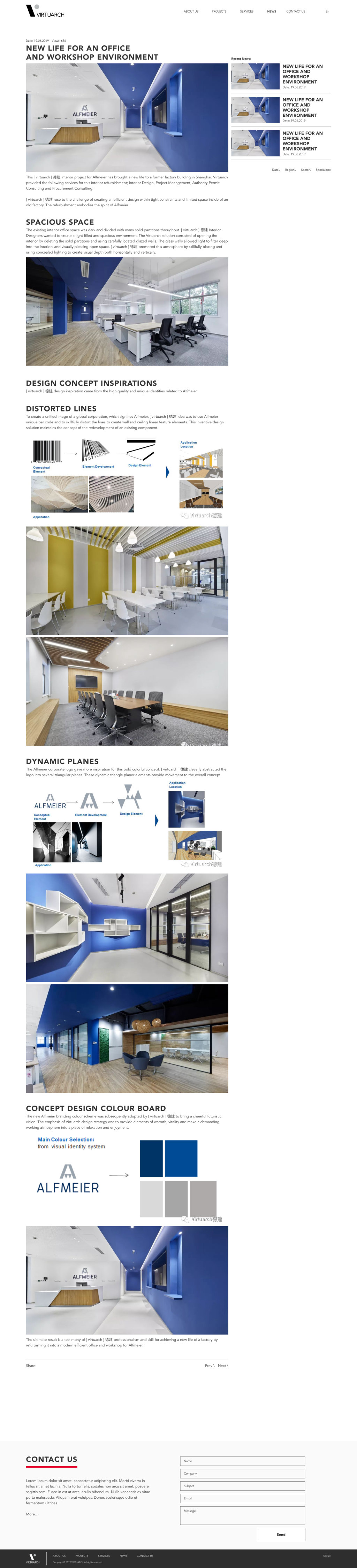
News article
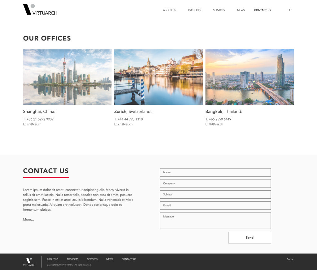
Contact