
Bikeep Media Network
Branding and Website Design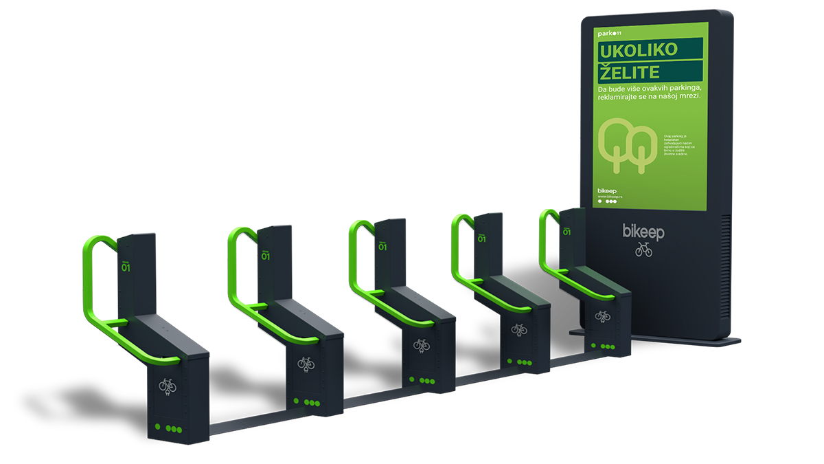
Key Features
Home, Locations, Contact
Built for media buyers, on desktop and phone
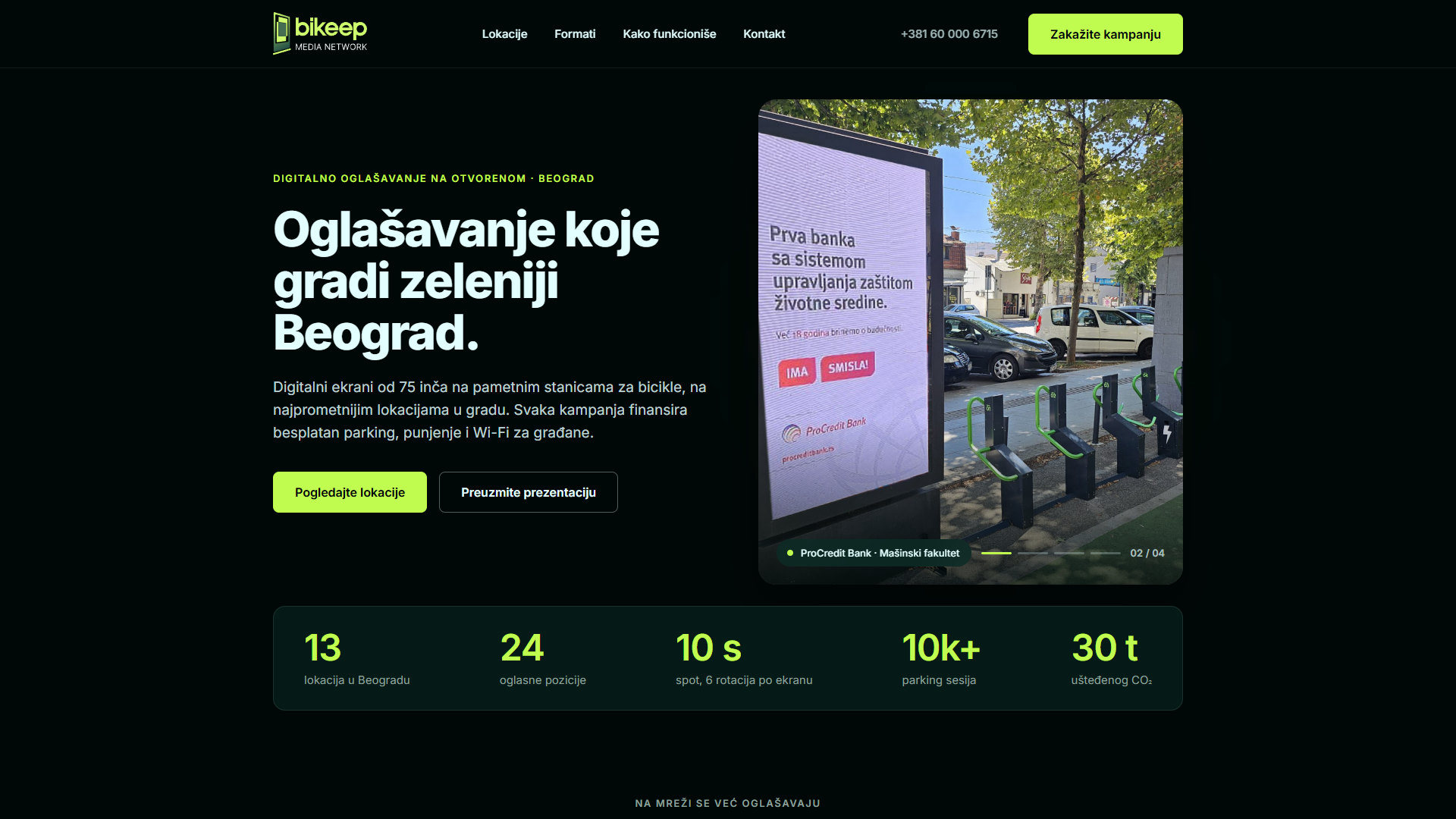
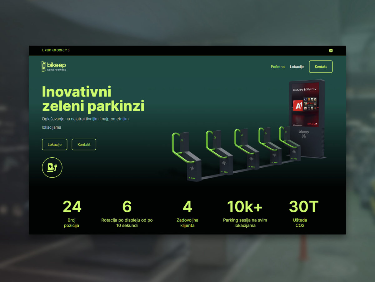
- Hero Slider: Real campaigns on real stations, changing every 5 seconds.
- Network Stats: Counters for locations, positions, spot length, sessions and CO2.
- Client Wall: 13 brands, set in one color.
- Location Map: All 13 stations at their street addresses, and hovering a location shows it on the map.
- Creative Formats: Five formats, each with an animated illustration.
- For the City: Free parking, charging, Wi-Fi and air sensors.
- AI Measurement: A campaign report with reach, gender and age.
- Enquiry Form: Name, email and message, with a confirmation state.
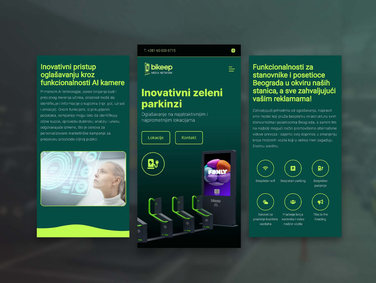
- Responsive Design: Dedicated mobile layouts and a full screen menu.
Introduction
Client and Project
About Bikeep Media Network
Bikeep Media Network is a digital out-of-home advertising network in Belgrade, run by Park011, the Serbian partner of Bikeep, the global maker of smart bike parking stations.
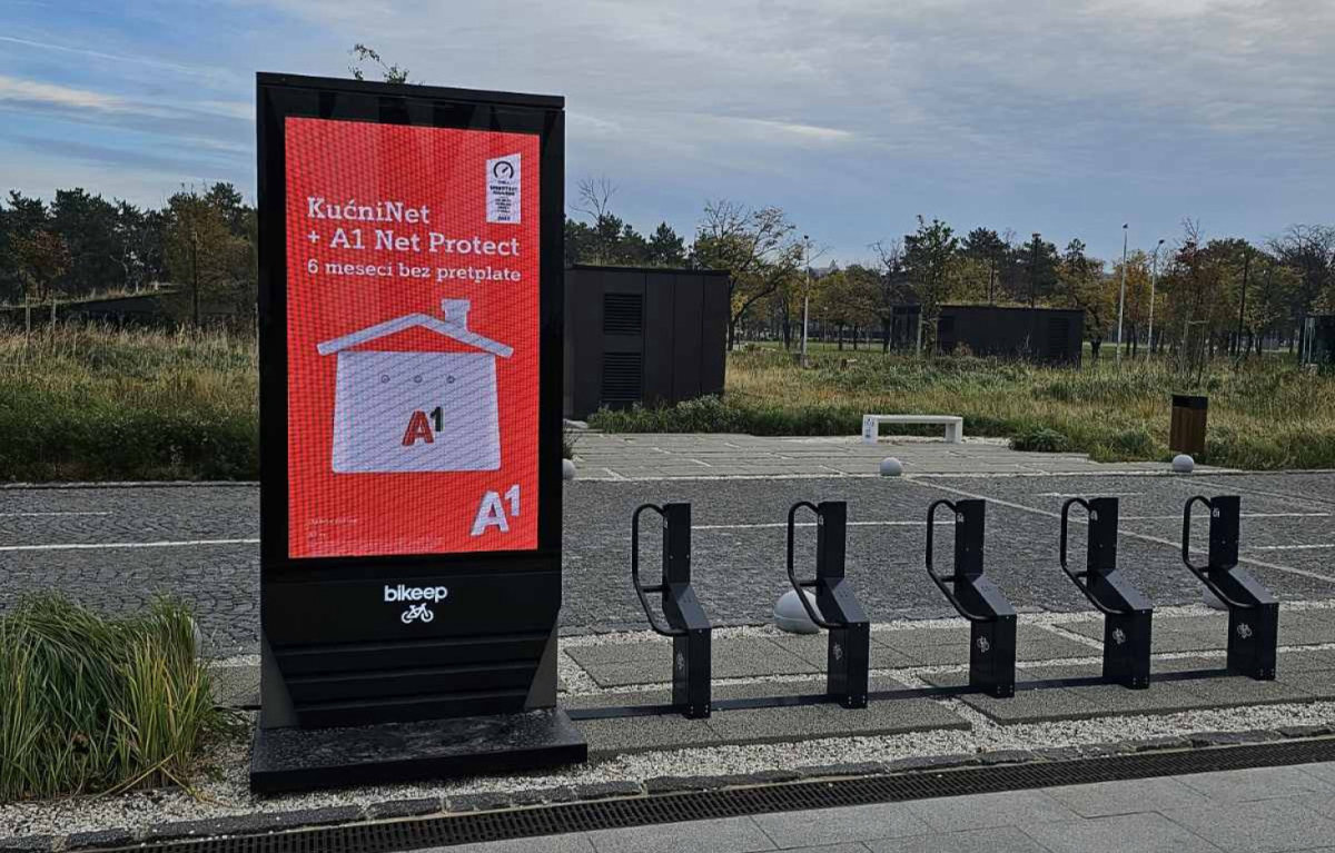
Every station pairs free, secure parking for bikes and scooters with a 75 inch LCD display. Advertising revenue pays for building and running the stations, so residents park, charge and connect for free, and brands reach them at the busiest addresses in Belgrade.
The network needed a brand of its own, and a website that sells its screens to advertisers.
My Responsibilities
- Brand identity: logo, color palette, typography.
- Brand applications: stationery, posters, billboard, wall posters.
- Sales presentation: an A4 deck for advertisers, redesigned to match the site.
- Website: UI/UX design and the 2026 redesign, components, motion, WordPress development, SEO.
Logo design
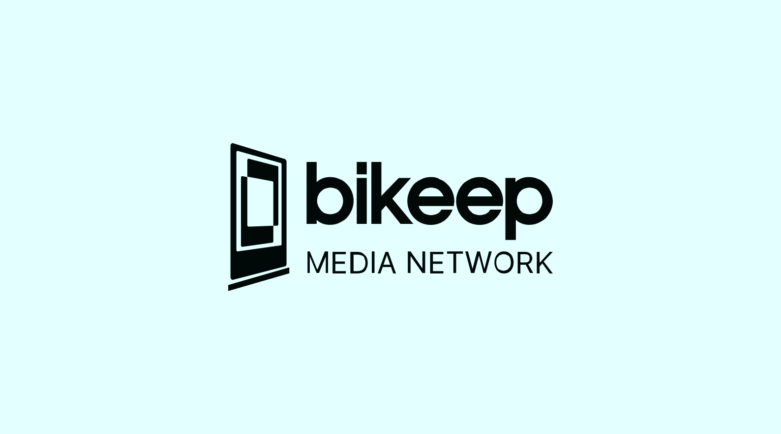
The mark is a portrait display seen in perspective, the same advertising screen that stands at every station, set on a base line like the station’s footing. The wordmark keeps the Bikeep name the stations already carry, with MEDIA NETWORK beneath it, so the network reads as part of the family while naming what it sells: screen time. It works in a single color on dark and light grounds, and in lime wherever the brand has color to spend.



Branding
Mood board
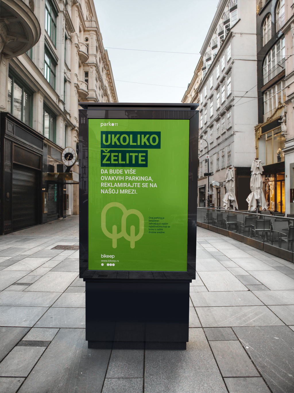
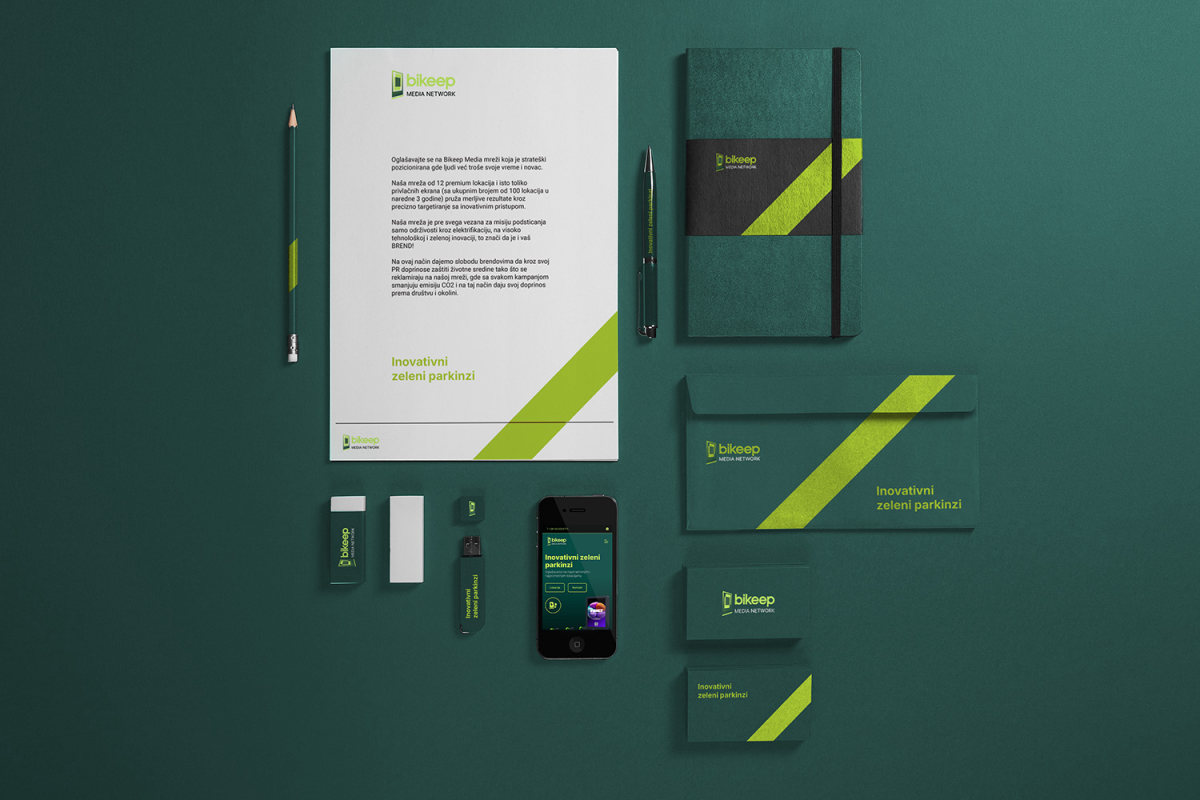
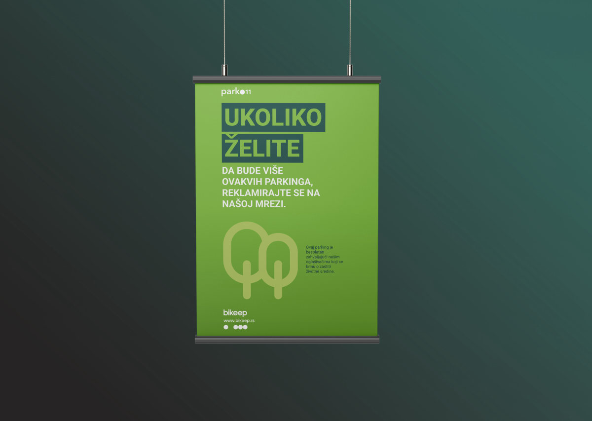
The identity was rolled out across the surfaces the network actually sells and works with: street billboards and the station screens themselves, posters and wall posters for campaigns, and stationery for the sales team. Every piece carries the same lime on teal, so the network reads the same on a 75 inch screen, on the street and on paper.
Advertising billboard
Stationery
Poster
Wall poster
Website
Sales presentation
A4 deck for advertisers
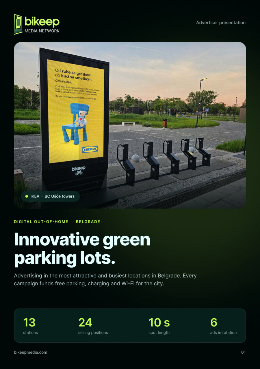
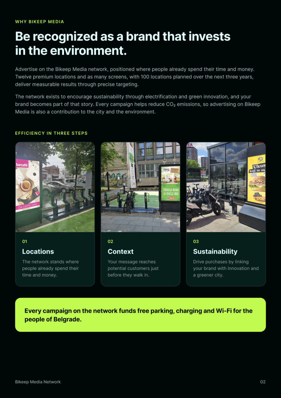
The website opens the conversation, and the deck closes it. The eleven page A4 presentation was redesigned in the same system as the new site: real campaigns on real stations, the network map, illustrated formats and a campaign report, ending on a single call to action.
Cover
Why advertise with us
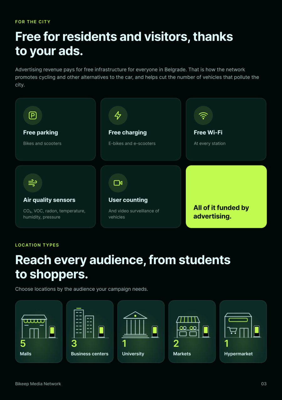
Features for residents
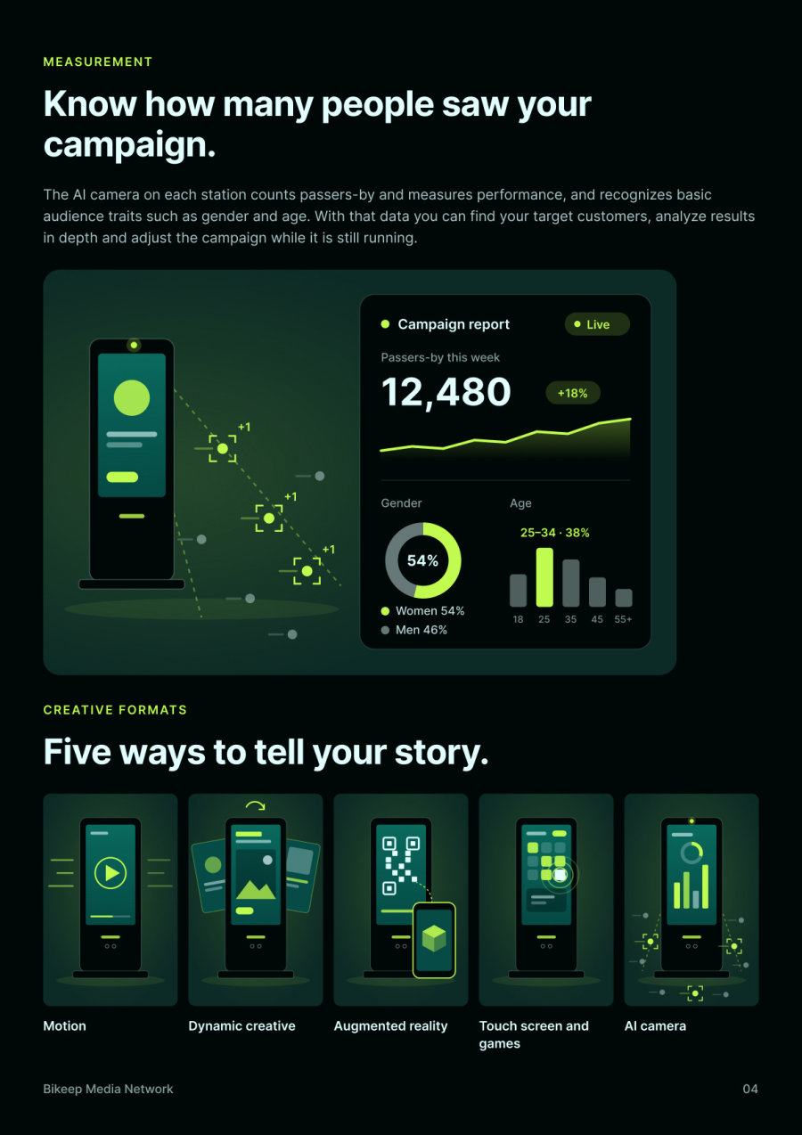
AI camera and creative formats
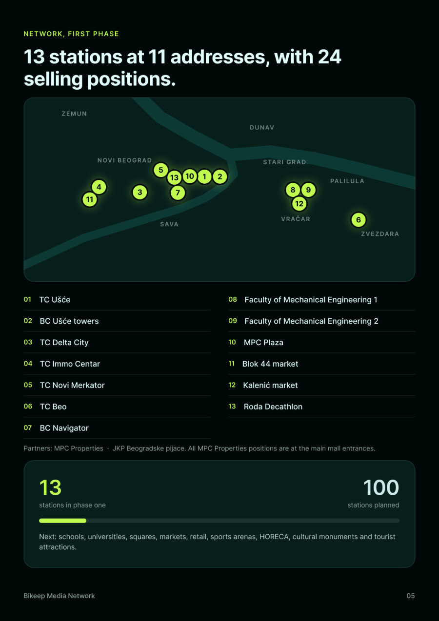
Network, first phase
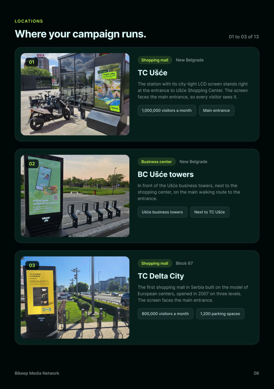
Locations
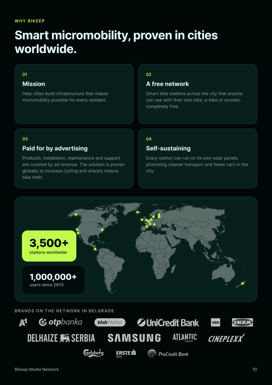
Why Bikeep
- Format
- A4 portrait
- Pages
- 11
- Language
- English
- Audience
- Advertisers and media buyers
- System
- Night and lime, Inter, real campaign photos and the site’s illustrations
Home Page
Desktop View
The redesign keeps the logo, the palette and Inter, and rebuilds the page around what a media buyer needs. One dark ground replaces seven alternating color bands, lime is kept for the accent and a single call to action, and the hero leads with real campaigns on real stations. Below it the network is shown on a map of Belgrade with every location listed, and hovering a location brings up its station and photo, followed by the formats, the case for the city, AI measurement and a short enquiry form.
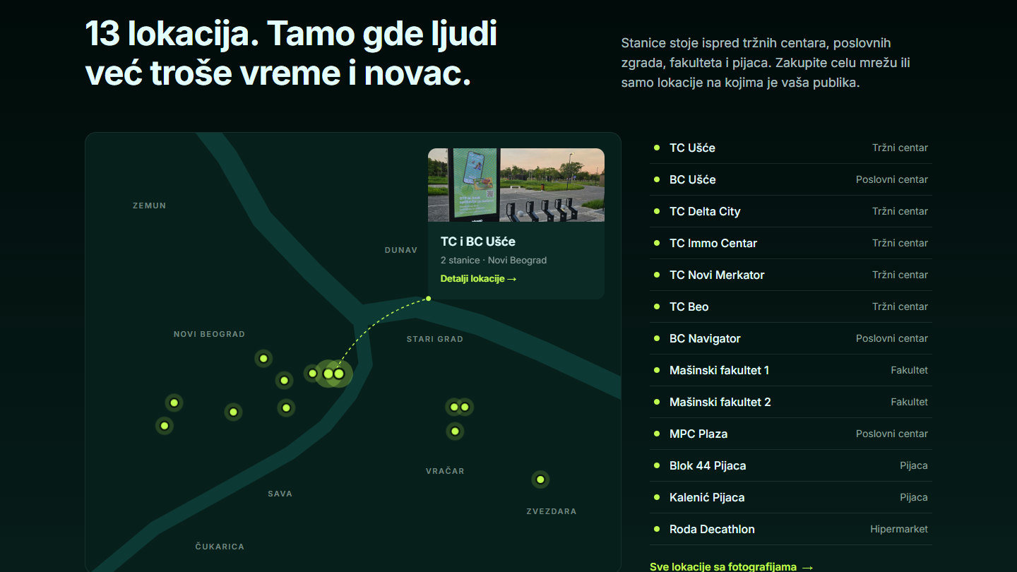
Page Previews
Početna, Lokacije, Kontakt
Every page shares one sticky navigation and the same close: a lime block with the phone number and a three field enquiry form. Locations adds filters, the network map and a card for each of the thirteen stations, each with a photo of a real campaign in place and its street address. Contact keeps the form simple, then explains what happens next and offers the presentation.
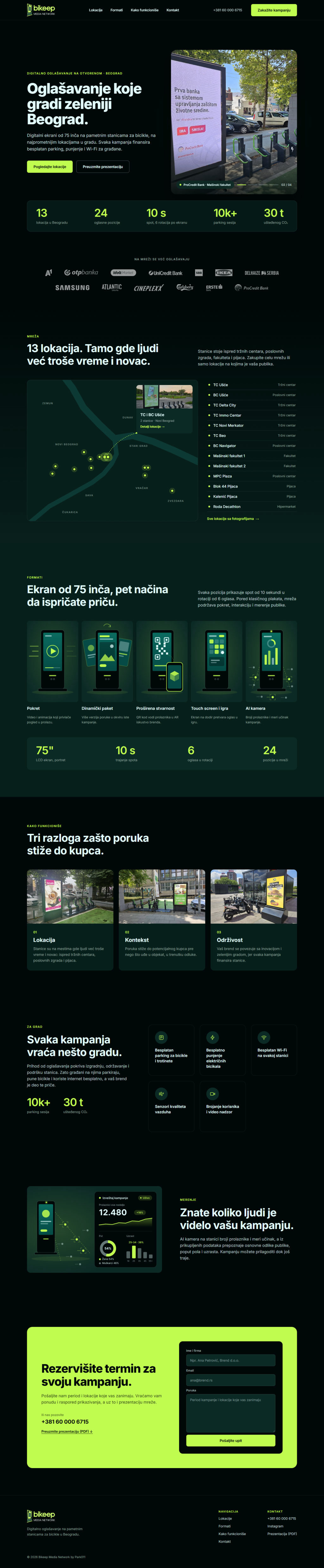
Početna
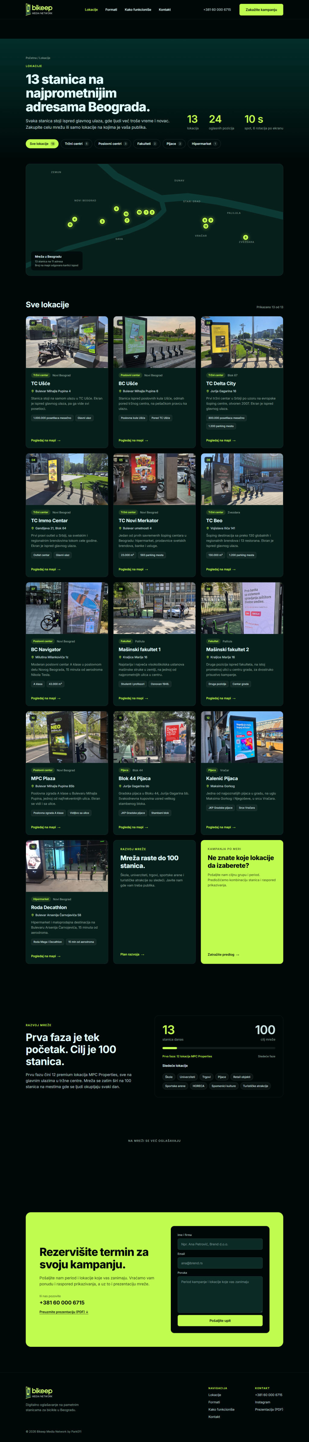
Lokacije
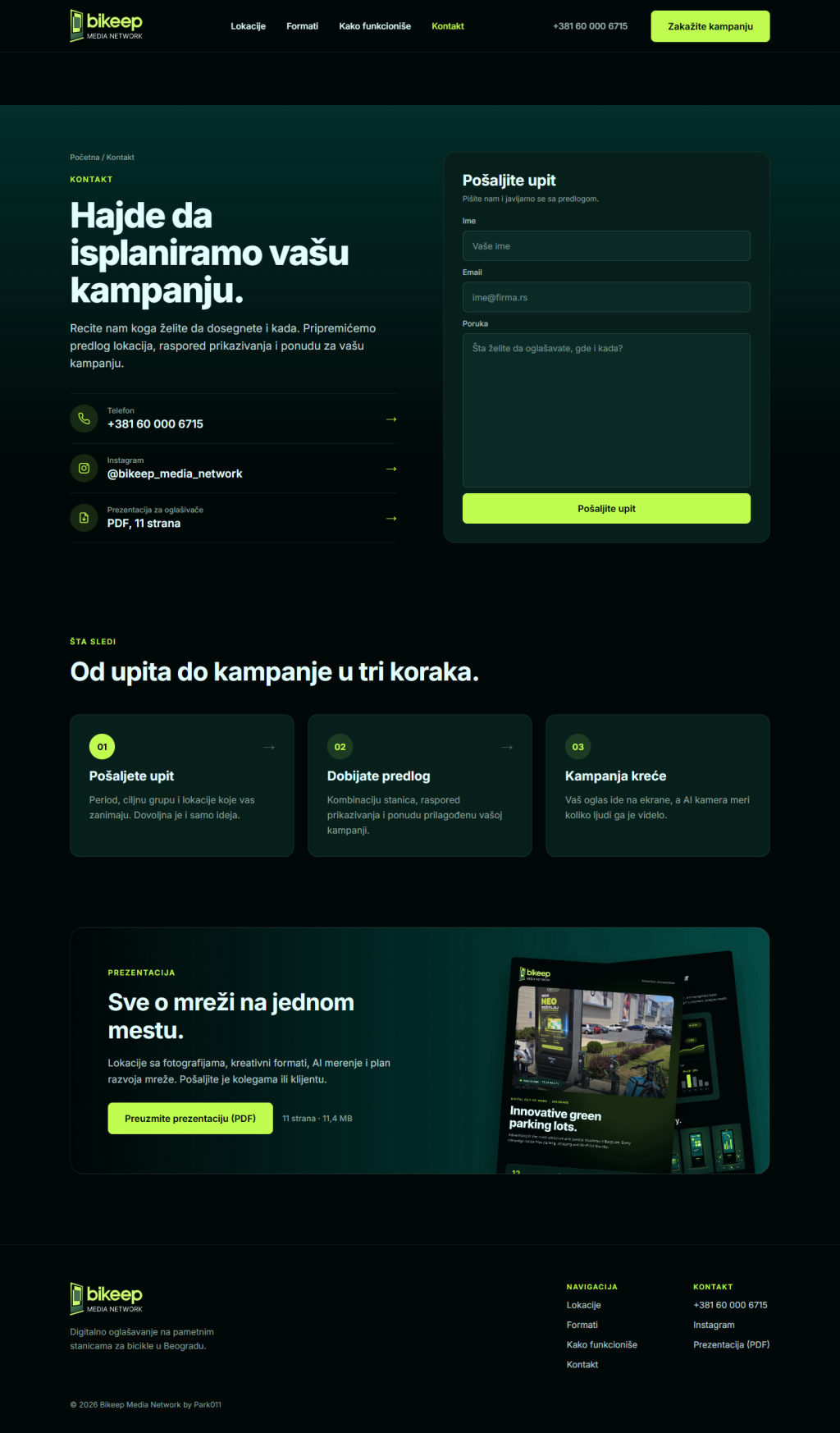
Kontakt
Responsive Design
Mobile Version
On a phone every section becomes a single column. Cards stack one below another instead of scrolling sideways, the map grows and lists all thirteen locations, and the locations page switches to compact cards. A full screen menu keeps the call button and the presentation one tap away.
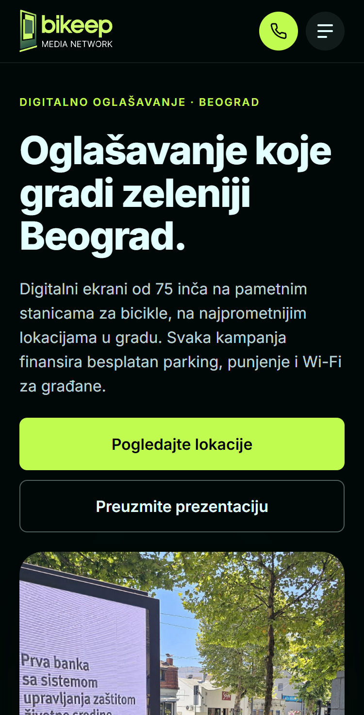
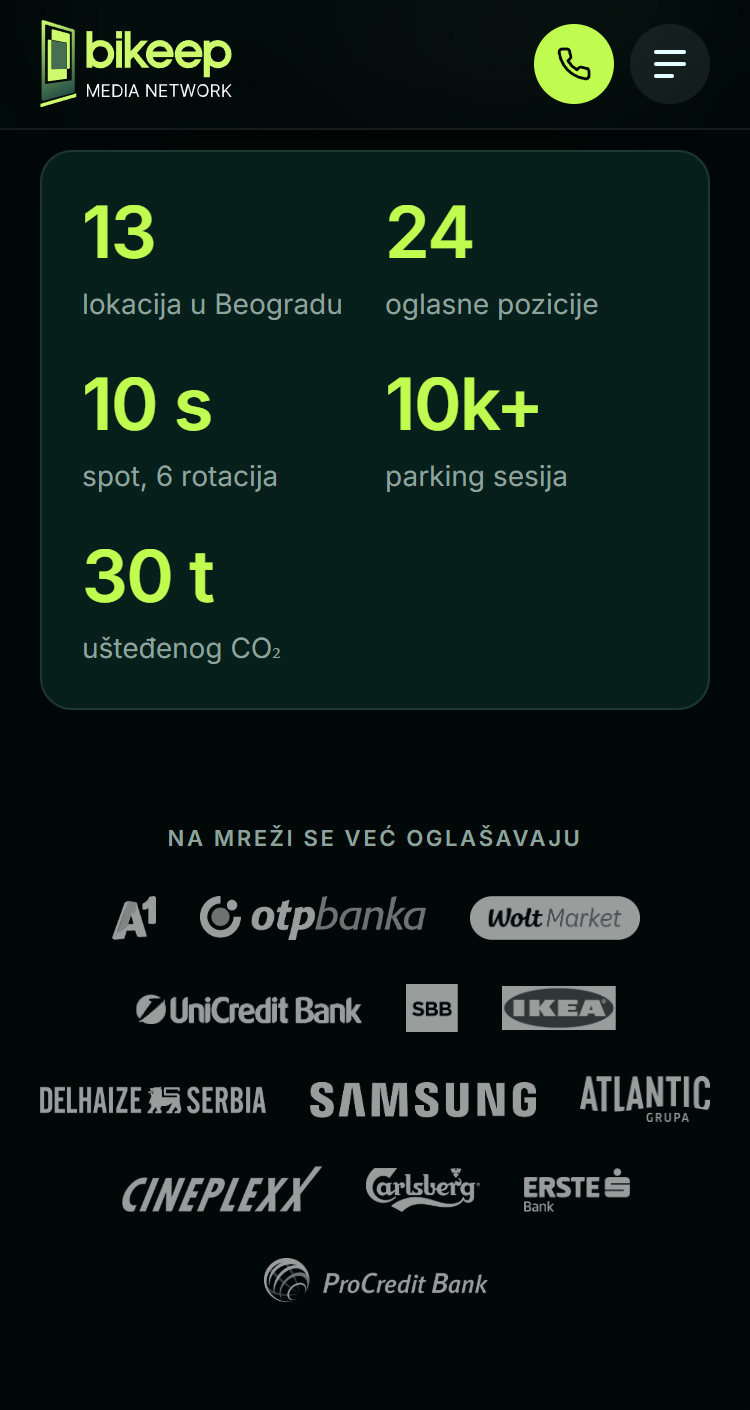
Network stats
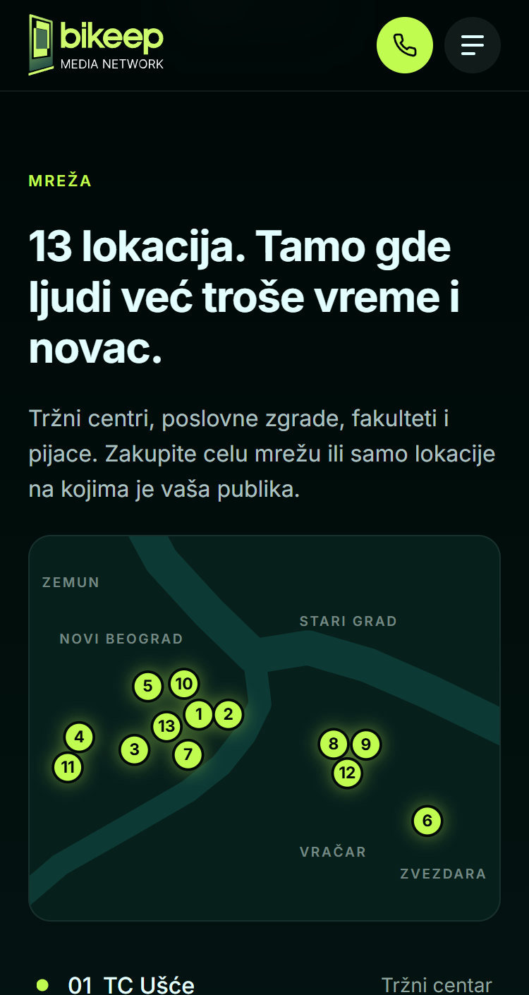
Map and all locations
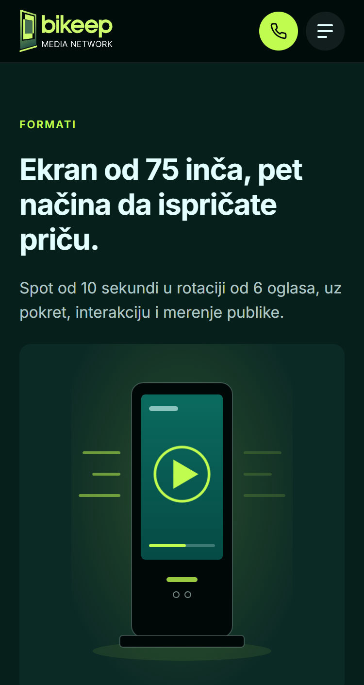
Creative formats
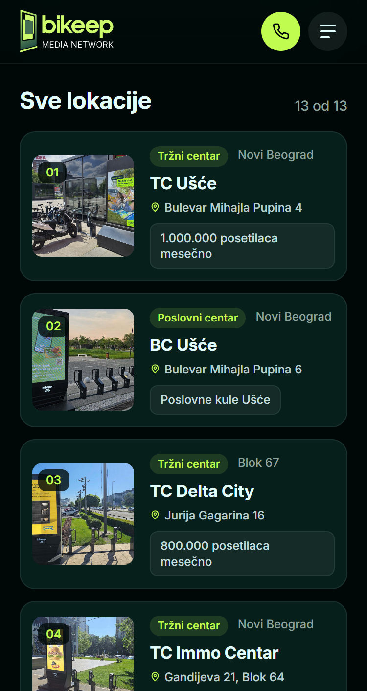
Location cards
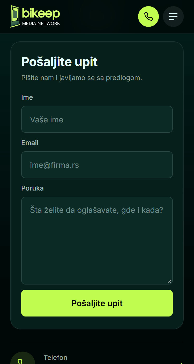
Enquiry form
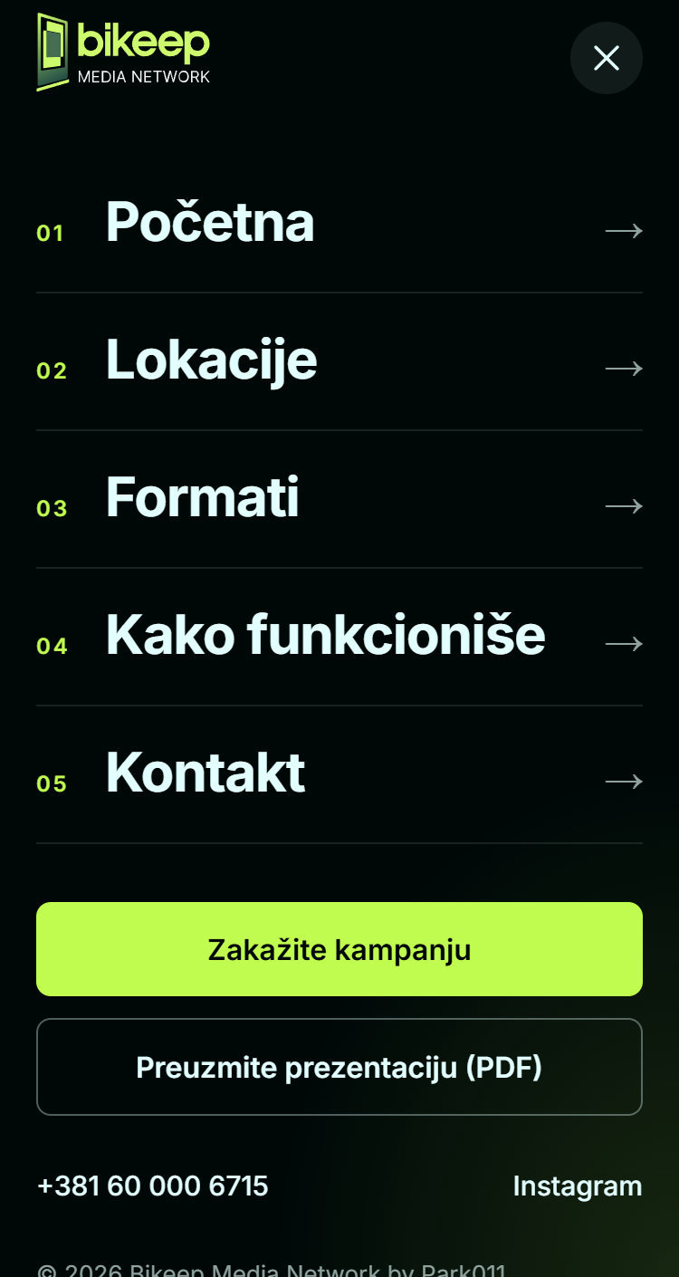
Menu