Key Features
Built for architects, designers and homeowners
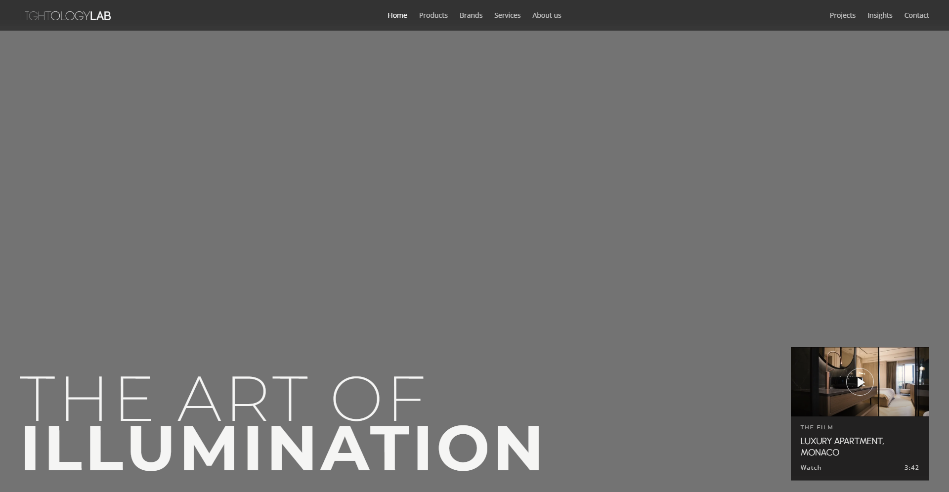
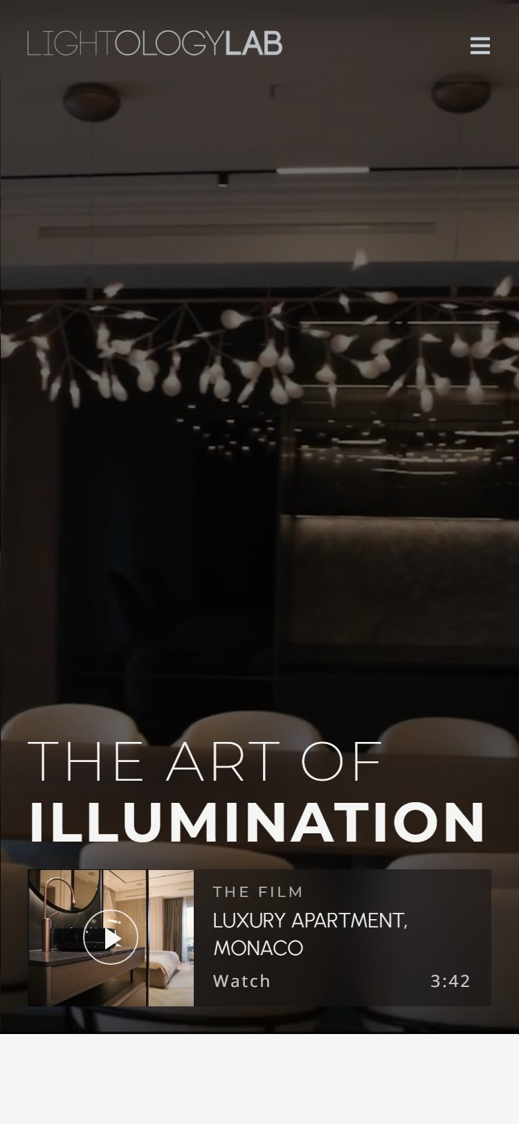
"The Art of Illumination" over a slow film of a finished interior.
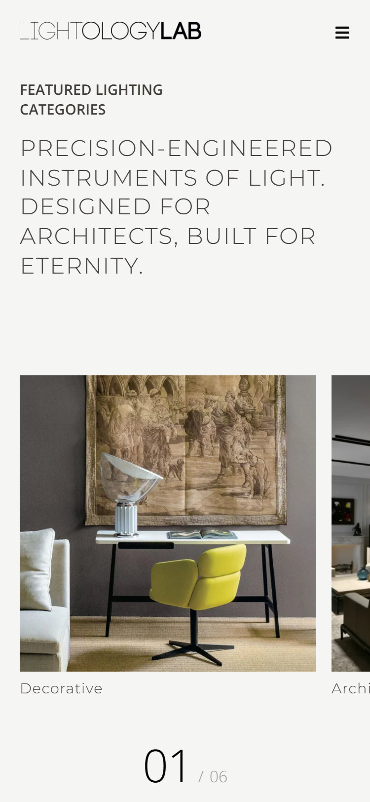
Six categories, from Decorative to Carpets, one click from the home page.
46 products, filtered by category, each on its own page.
Gallery, designer, specifications and related products.
97 manufacturers, indexed by letter and by category.
A reference list by sector, and case pages with full galleries.
Seven services, from lighting design to bespoke solutions.
Stories on light, new products and the designers behind them.
An inquiry form that asks who you are and what you are building.
The whole catalogue works on a phone.
Introduction
Client and Project
About Lightology Lab
Lightology Lab is a lighting studio and showroom at Misarska 8 in Belgrade. For more than 27 years it has worked where lighting, architecture and interior design meet: it develops the concept, writes the specification, sources the fittings from the European brands it represents, among them Flos, Kreon, Moooi, Marset and Nemo, and sees the installation through.
Its website had not changed since 2018. It listed the brands, but the studio's own projects sat in galleries that no longer loaded, and nothing could be browsed the way an architect chooses a fitting: by category, by brand or by project.
The brief was a new site that sells the studio as much as the products, a brand system to carry it, and a plan to keep it alive on social media.
My Responsibilities
Design, build and brand
Website, content and brand for one studio, from the sitemap to the first month of posts.
Sitemap, wireframes, desktop and mobile layouts, product and project templates.
The Elementor build, filterable product and project catalogues, the brand index and the inquiry form.
Copy for every page, one clear heading per page, and titles and descriptions that pair English copy with Serbian search terms.
The stacked logo, colors and type, the company profile, Instagram templates and the first month of posts.
Company Profile
Presentation for Architects and Clients
The website starts the conversation, and the company profile is what the studio sends after it. Fifteen landscape pages carry the same system as the site: the stacked logo, Stone pages, light Montserrat capitals and full-bleed project photography. It moves from who Lightology is and how it works, through the brands it represents, to its reference projects grouped by sector, and closes on the showroom at Misarska 8.
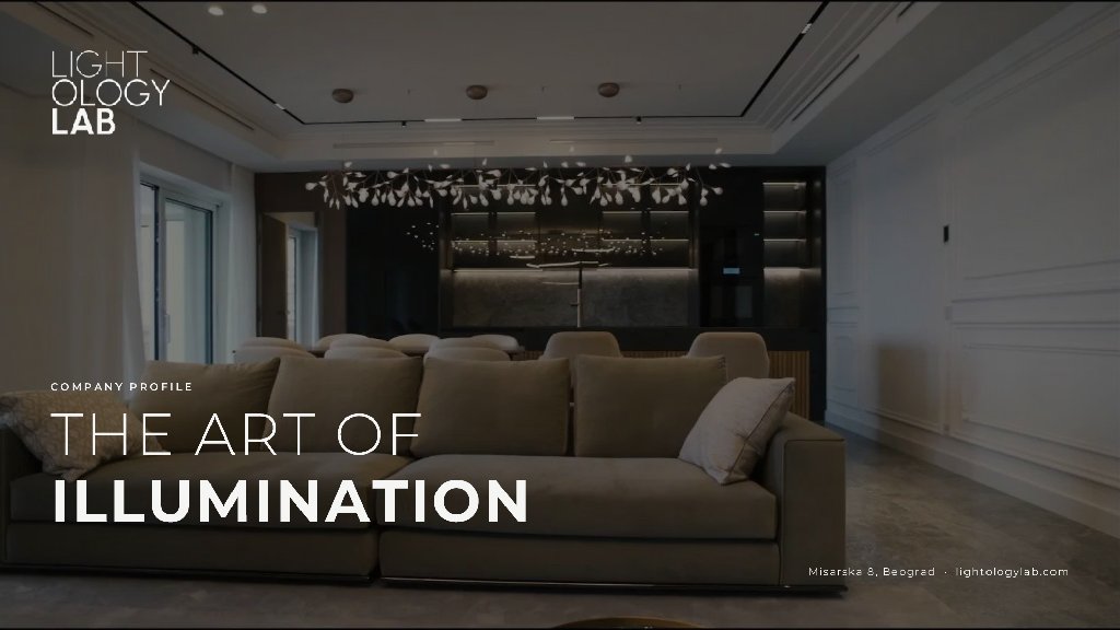
01Cover
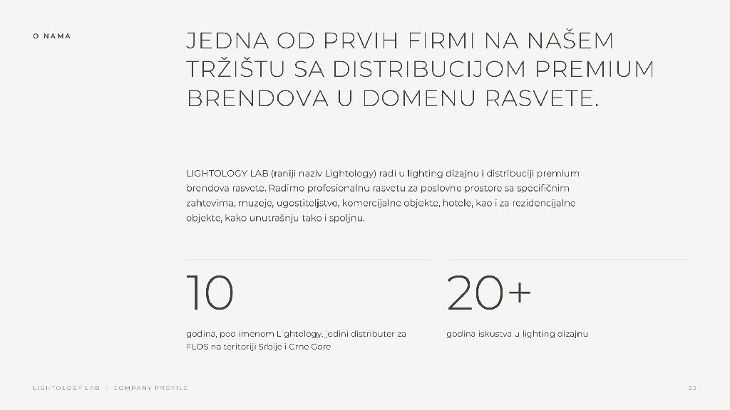
02About us
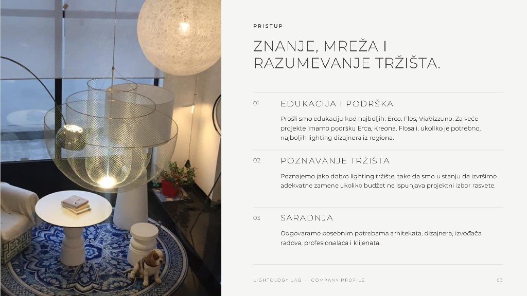
03Approach
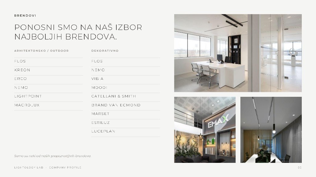
05Brands
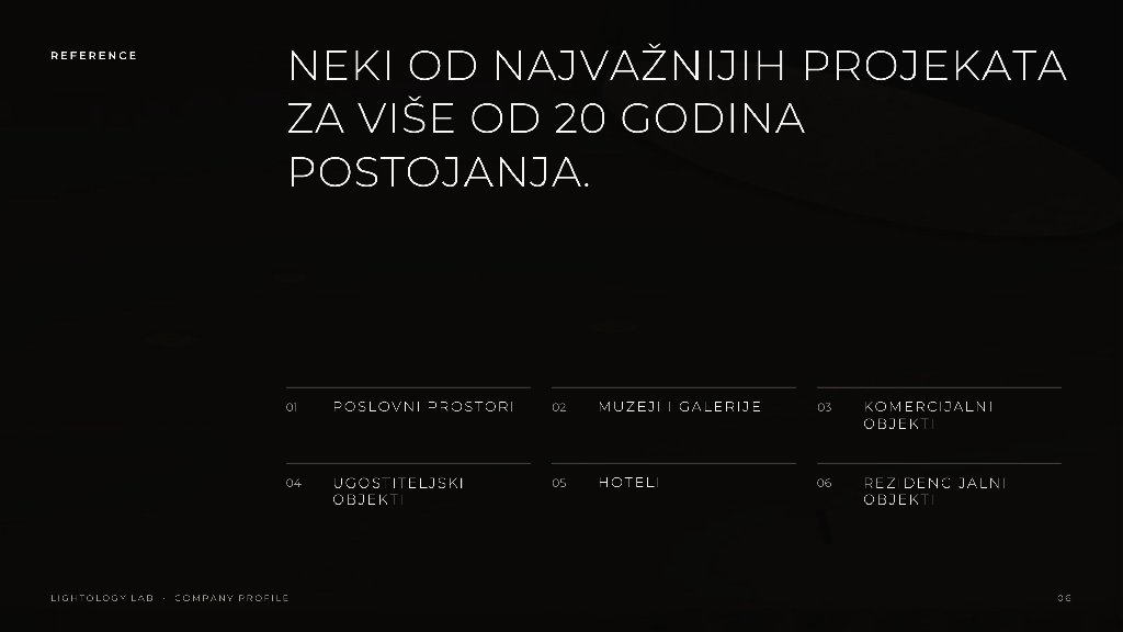
06References
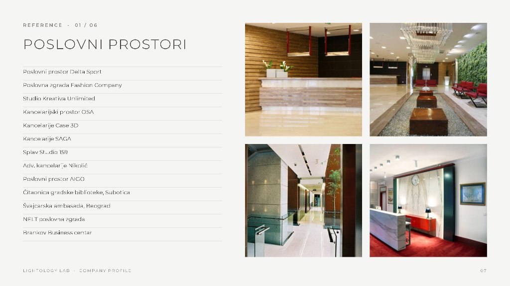
07Offices
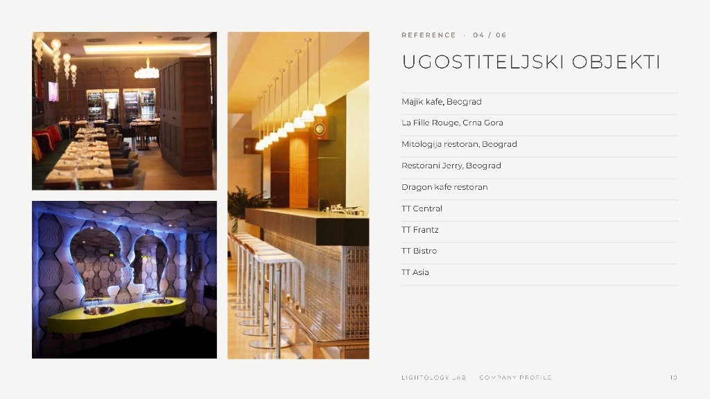
10Hospitality
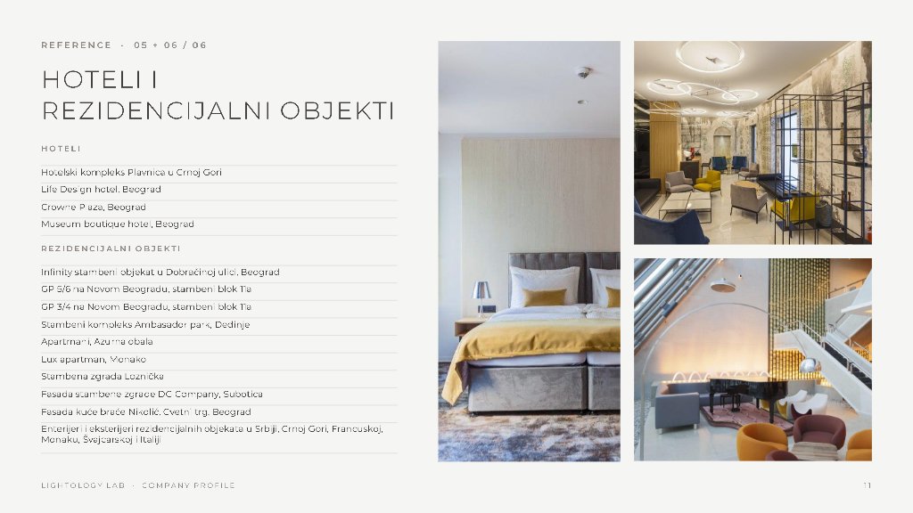
11Hotels and residential
The profile at a glance
Home Page
Desktop View
The home page reads like a walk through the showroom. It opens on a film of a finished interior under one line, The Art of Illumination, then moves through the six product categories, a short statement of who the studio is, the newest products and the latest project, and closes on the invitation to visit. Shown here at full length, top to bottom and left to right.The window below scrolls through the full page.

Inside Pages
Products, Projects, Brands and More
Every listing works the same way: a short introduction, a row of filters with a count beside each, and a grid of photographs with a name and a maker beneath. Products and Projects each end in a detail page with a gallery and the facts a specifier needs. Brands are indexed from A to Z, so a client who knows only the maker can still find the piece. Each preview scrolls through the whole page.
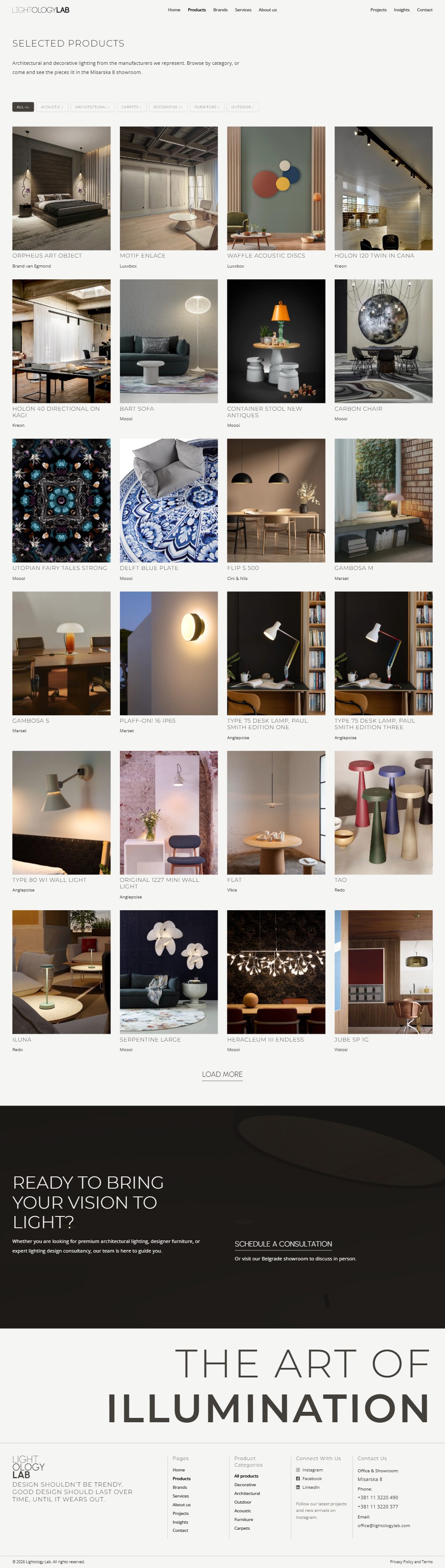
Products
46 products, six categories
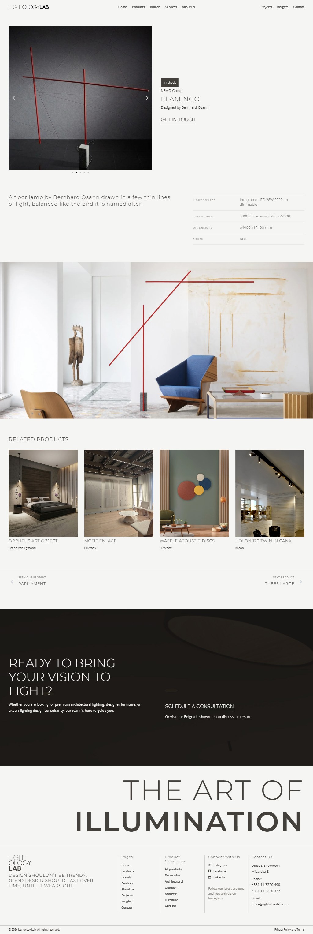
Product page
Flamingo by Bernhard Osann
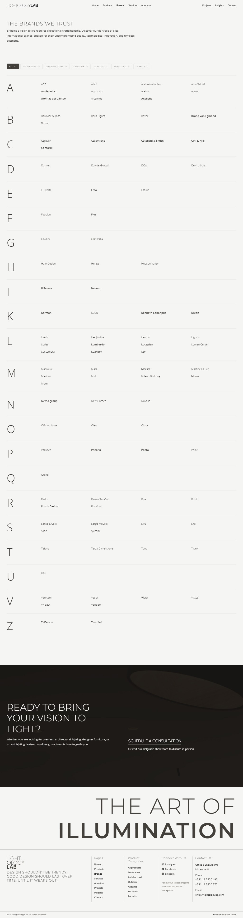
Brands
97 makers from A to Z
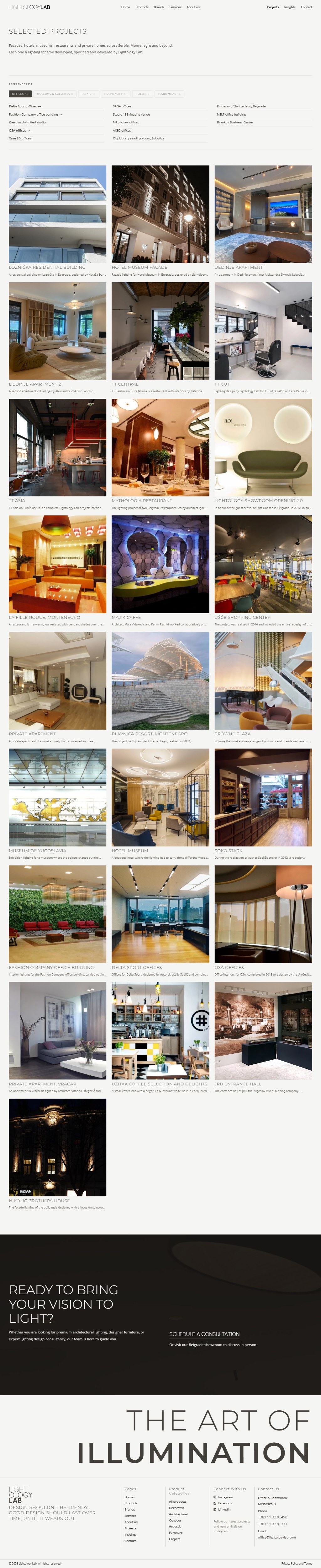
Projects
Reference list by sector
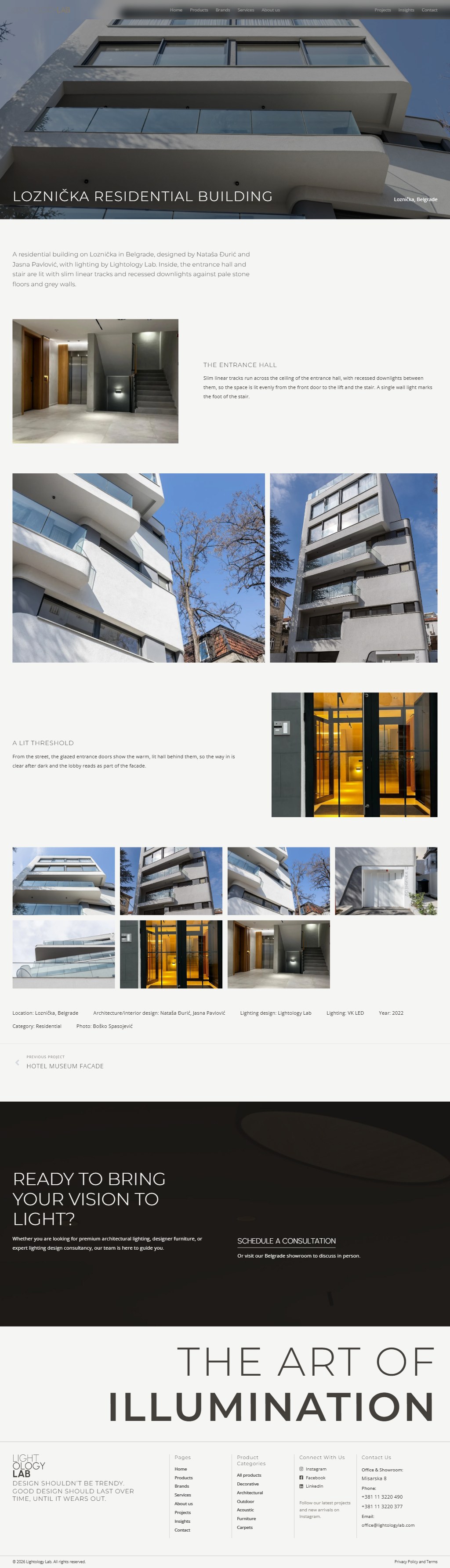
Project page
Ložnička residential building
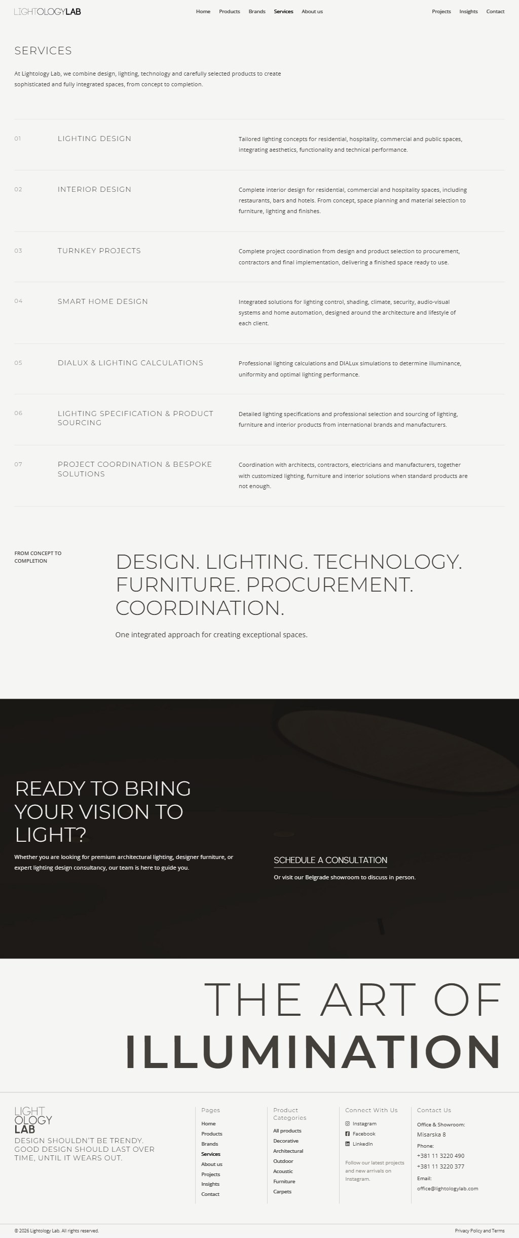
Services
Seven services
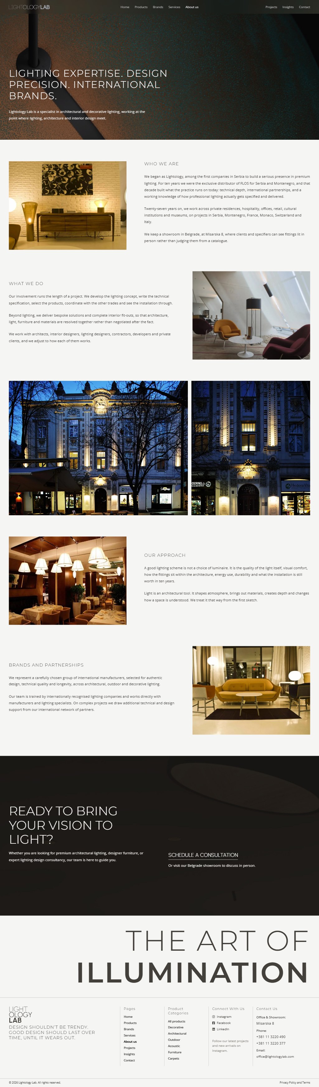
About us
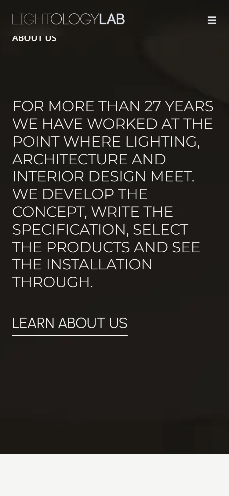
27 years of the studio
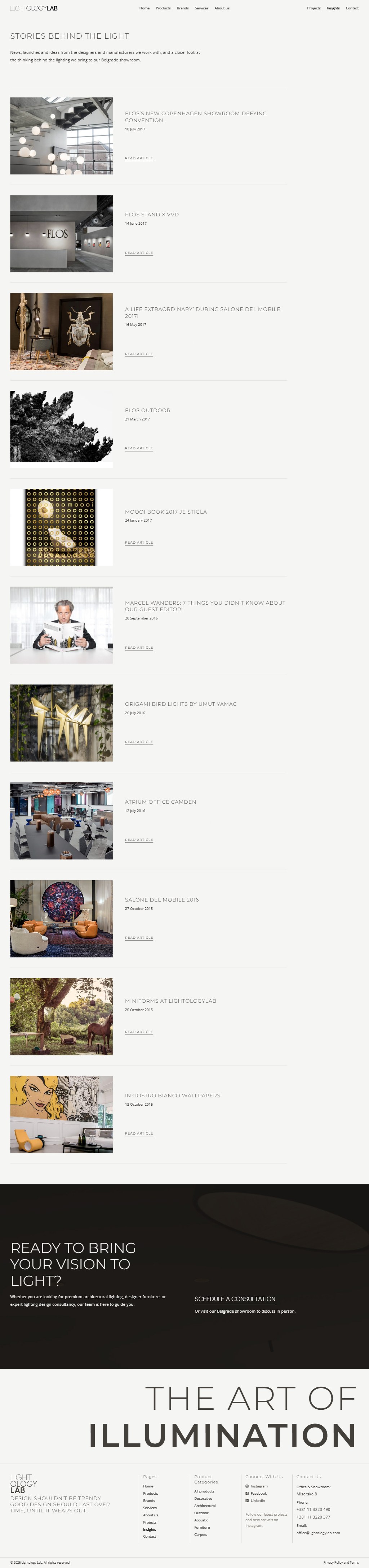
Insights
Stories behind the light
Contact
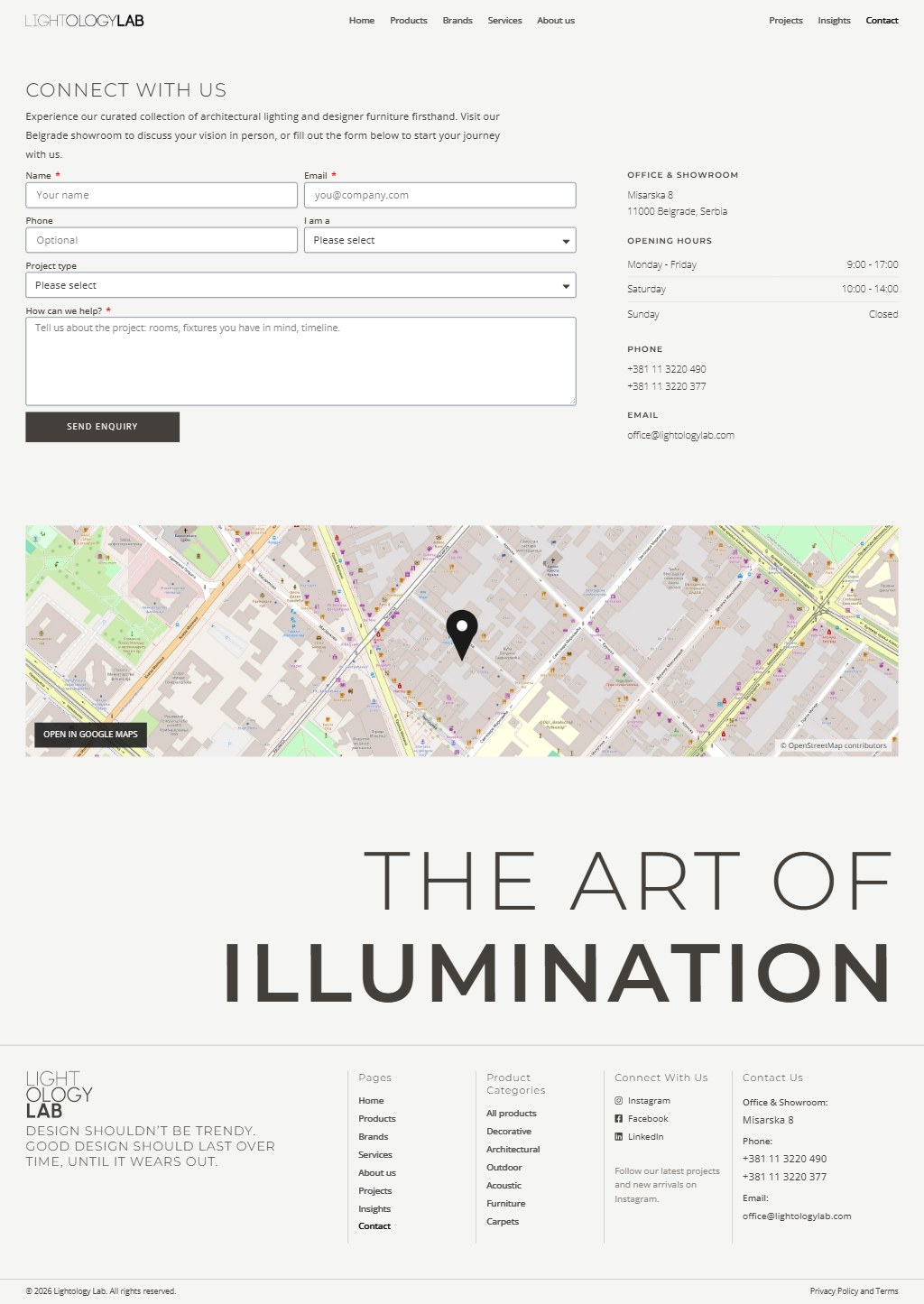
Inquiry form and showroom
Responsive Design
Mobile Version
On a phone the film and the headline still open the page. The category cards become a row to swipe, product grids drop to one or two columns so every name stays readable, and the filters wrap into rows of chips that keep their counts. The inquiry form stacks to a single column, and the menu opens as a full-screen list of all eight pages.
Featured categories
About us
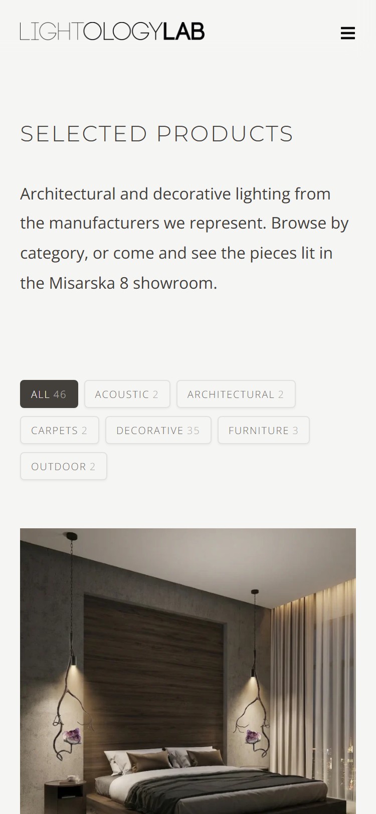
Product catalogue
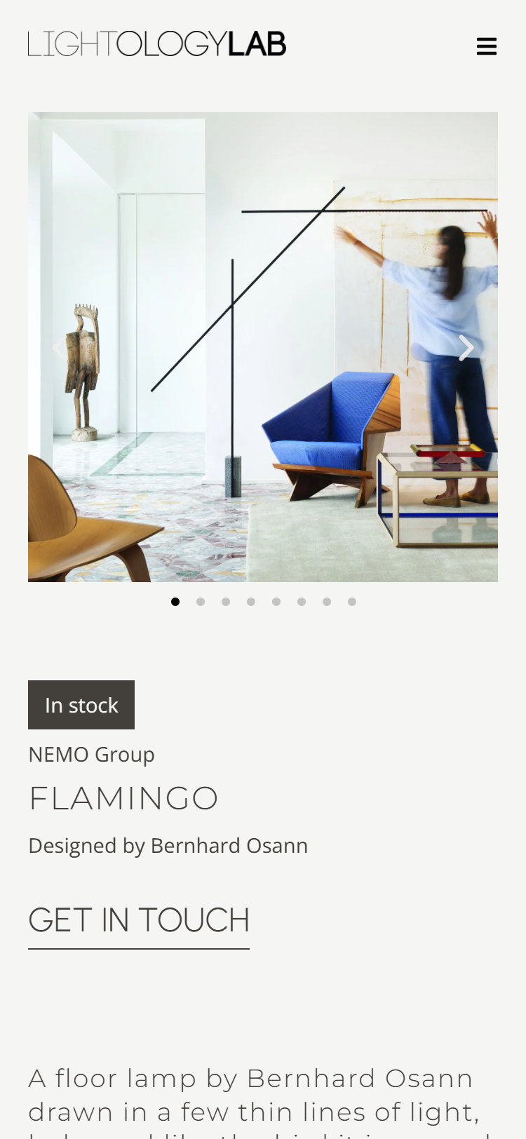
Product page
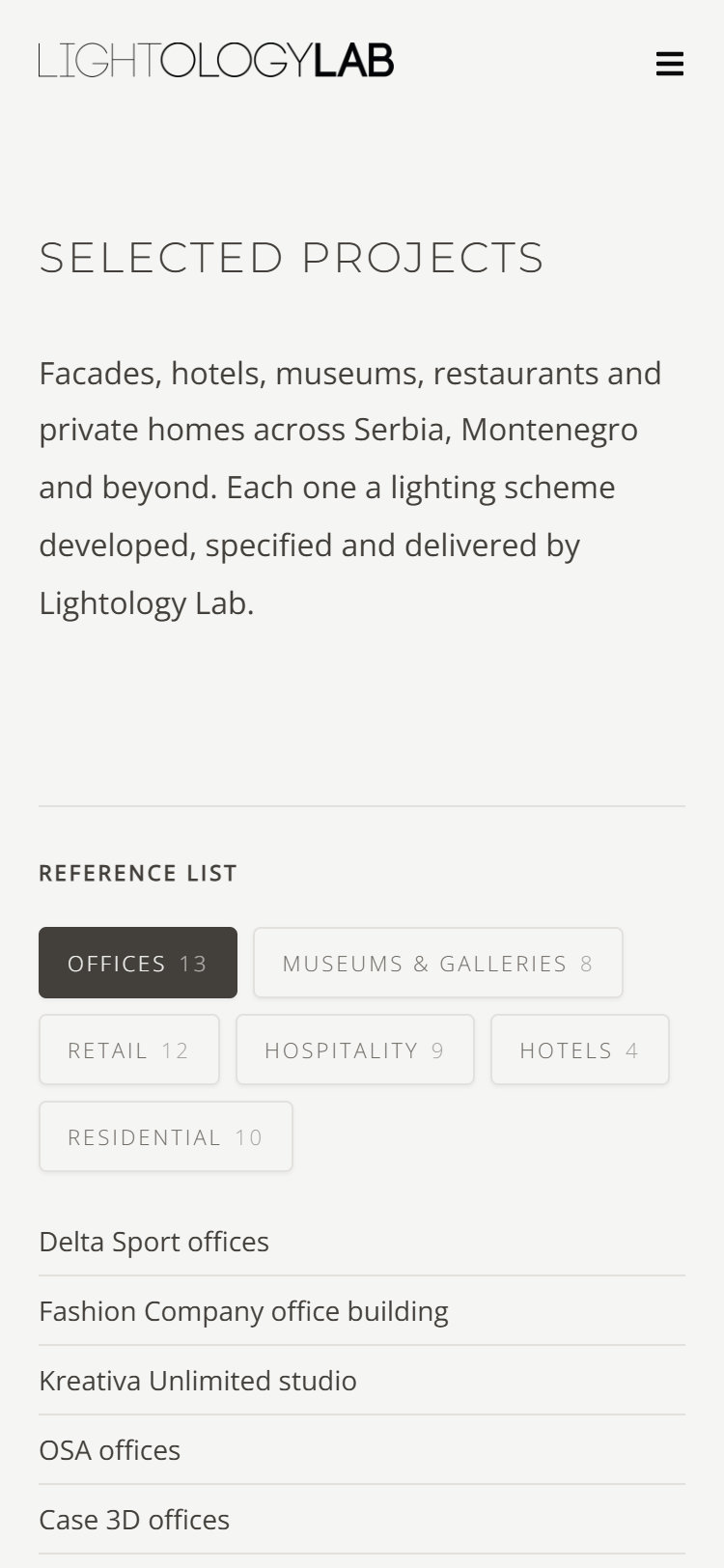
Projects
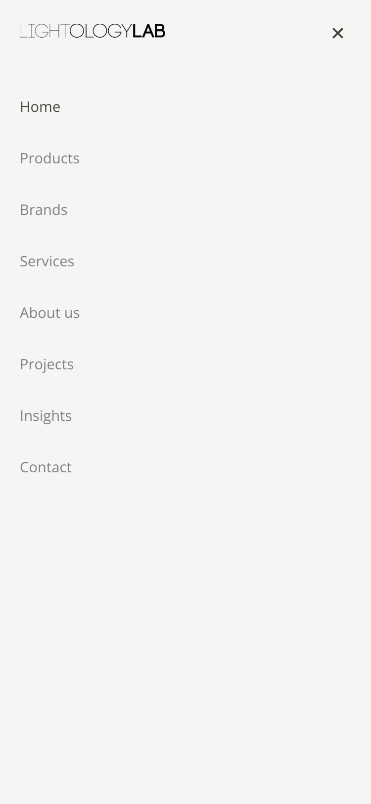
Navigation menu
Online Marketing
Plan, Templates and the First Month
A new site only works if people are sent to it. Lightology had 2,440 followers on Instagram, about 2,600 on Facebook, a LinkedIn page with no posts and a Google listing nobody had claimed. The plan gives each channel one job: Instagram shows the work, LinkedIn speaks to architects and developers, Google brings people to Misarska 8, and every post points back to the site. Six templates in the brand's own type and palette, and a first month of posts already written and laid out, let the studio start on day one.
The Plan
Instagram leads. LinkedIn for architects and developers. Google Business Profile for the showroom. The website is where every post points.
Three Instagram posts a week: a reel on Monday, a carousel on Wednesday, a single post on Friday. One LinkedIn post a week.
The studio, its projects, the brands and products it carries, and practical knowledge about light, one theme for each week of the first month.
Reels
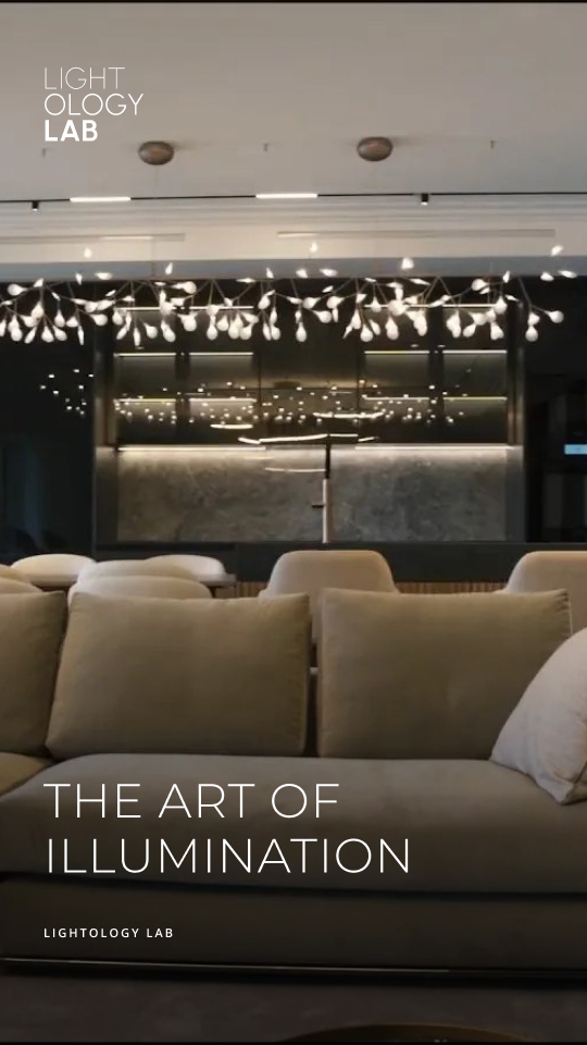
Meet Lightology Lab
Week 1, Monday
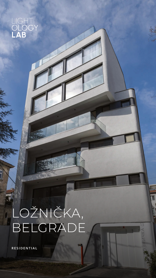
Ložnička, Belgrade
Week 2, Monday
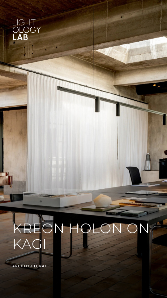
Kreon Holon on Kagi
Week 3, Monday
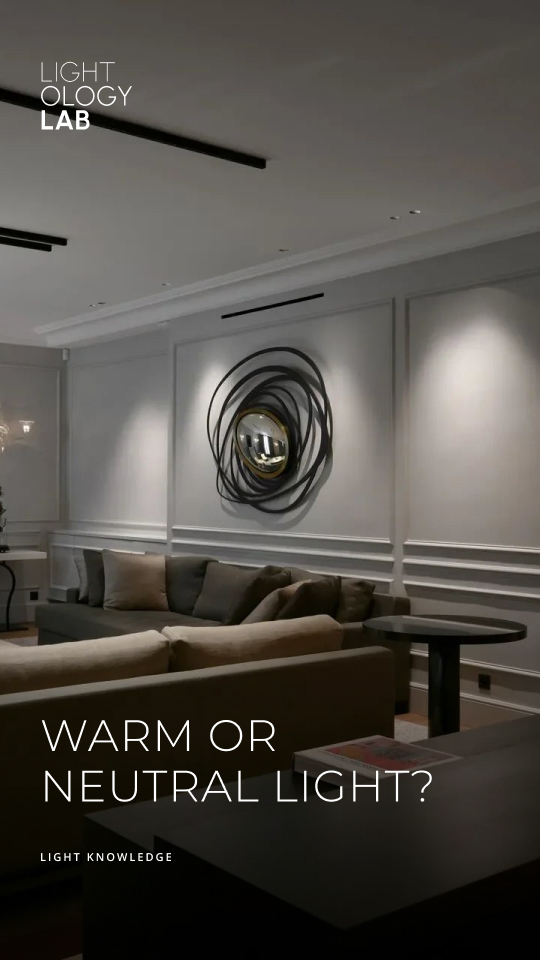
Warm or neutral light?
Week 4, Monday
Carousels and posts
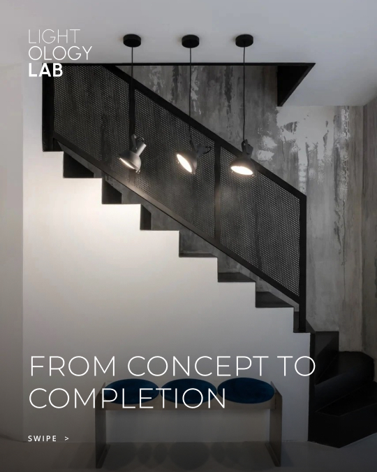
What we do
Carousel cover
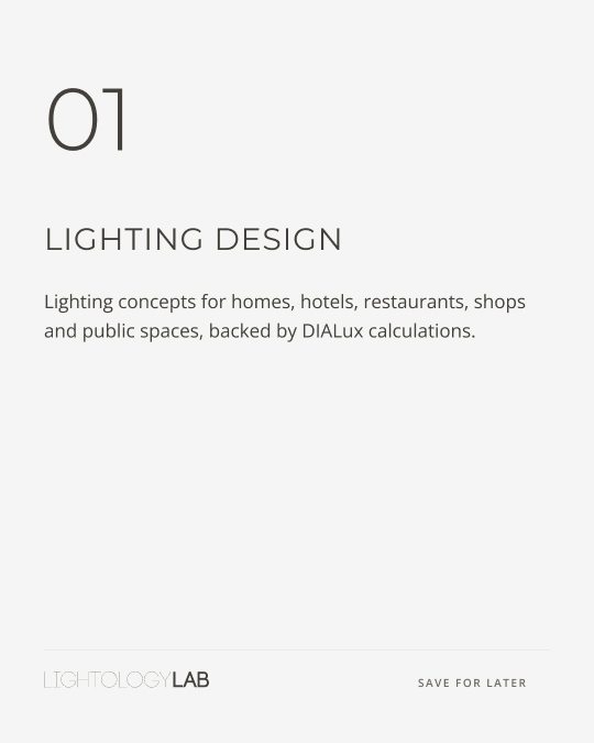
Lighting design
Carousel slide
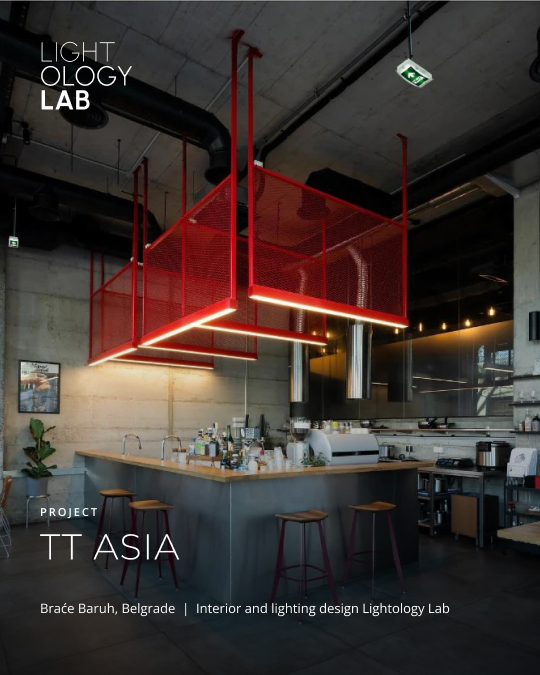
TT Asia
Project post
Visit the showroom
Closing slide
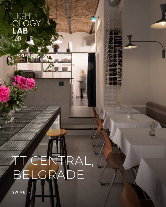
TT Central, Belgrade
Carousel cover
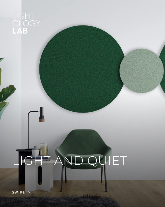
Light and quiet
Carousel cover
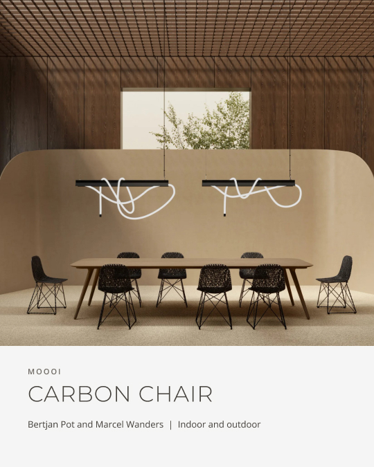
Carbon Chair
Product slide
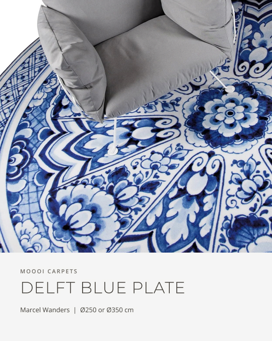
Delft Blue Plate
Product post
What Lightology gained
From the 2018 site to the new one
The previous site had been left as it was built in 2018. What follows is what the redesign gives the studio, and the evidence for each, measured on both sites.
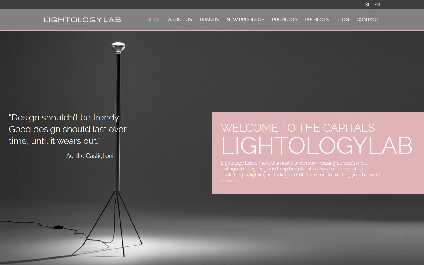
Before
lightologylab.com, 2018
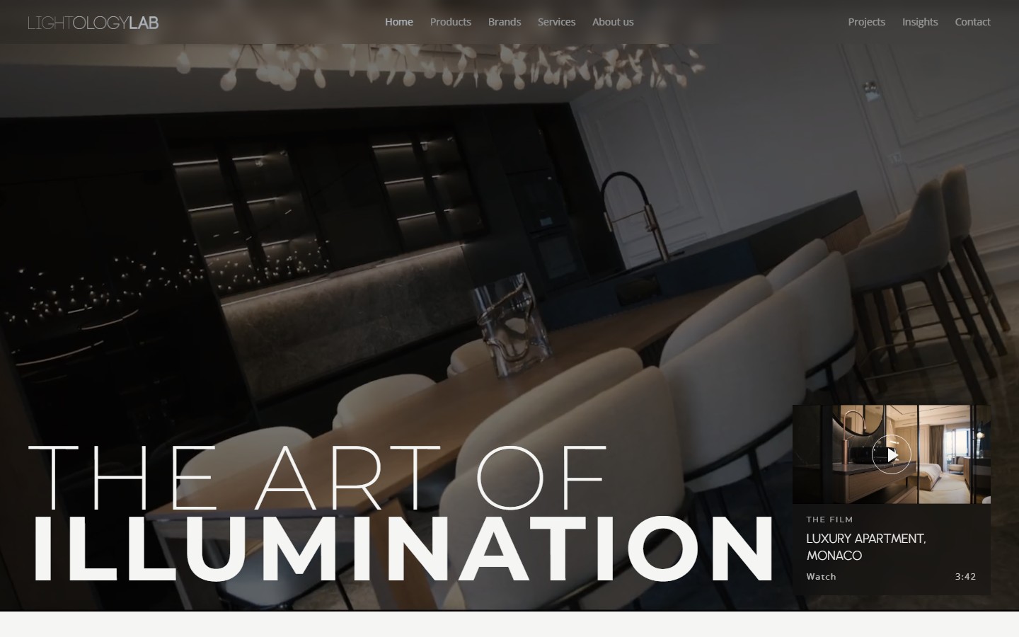
After
The new site, 2026
The old project galleries had stopped loading and showed empty tiles. The studio's projects now have their own photographed pages, a reference list filtered by six sectors, and case pages with full galleries, from Ložnička to Crowne Plaza.
46 products in six categories, each on its own page with the designer and specifications, and 97 brands indexed from A to Z. Every listing carries filters with a count beside each option.
The English home page had a Serbian title and description and five h1 headings. Every main page now has its own English title, a description that adds the Serbian search terms, and a single h1.
The old site disabled zoom on mobile with user-scalable=0. The new layouts are built for small screens, and visitors can zoom again.
A thin single-line wordmark became a stacked logo with a five-tone palette and three typefaces, carried into a fifteen-page company profile, six Instagram templates and a first month of posts.
WordPress 4.9 with WPBakery, left as it was in 2018, was replaced by WordPress 7 and Elementor, so the studio can edit every page itself.