


Tecon
Branding and Website Design
Branding & Ui/Ux Website Design
Key Features
Home, Divisions, About Us, News, Contact
Built for industrial buyers, on desktop and phone
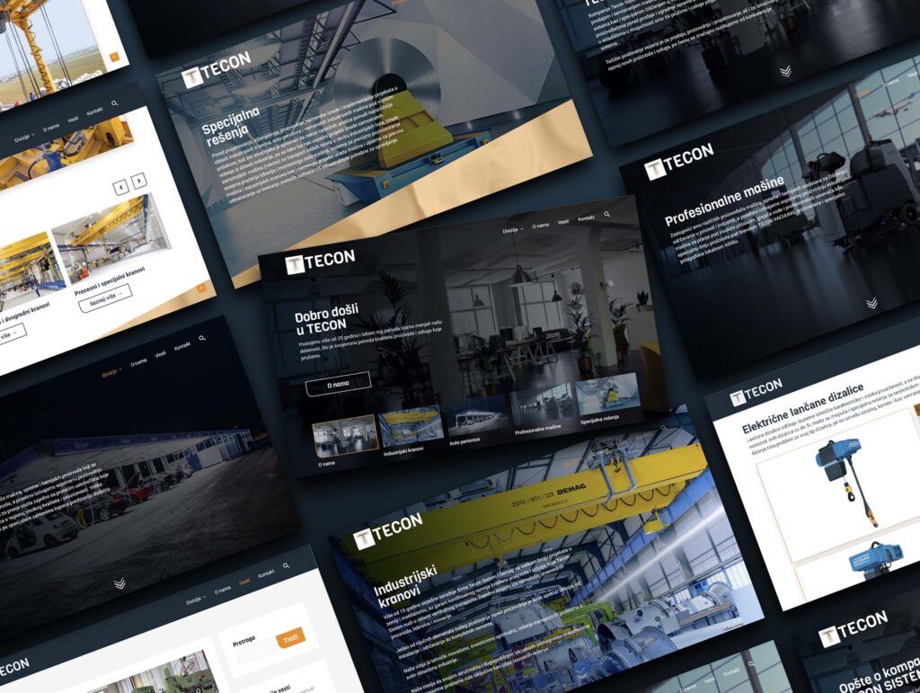
- Home Page: The four divisions up front, so a buyer reaches the right one in a click.
- Divisions: Industrial cranes, car washes, professional machines and special solutions.
- Product Pages: Product line, single product and related products, each with specifications.
- Gallery: Large photo sets of real installations that still load fast.
- About Us: Company story, certificates and partners.
- News: A blog for projects and company updates.
- Search: Site-wide search with its own results page.
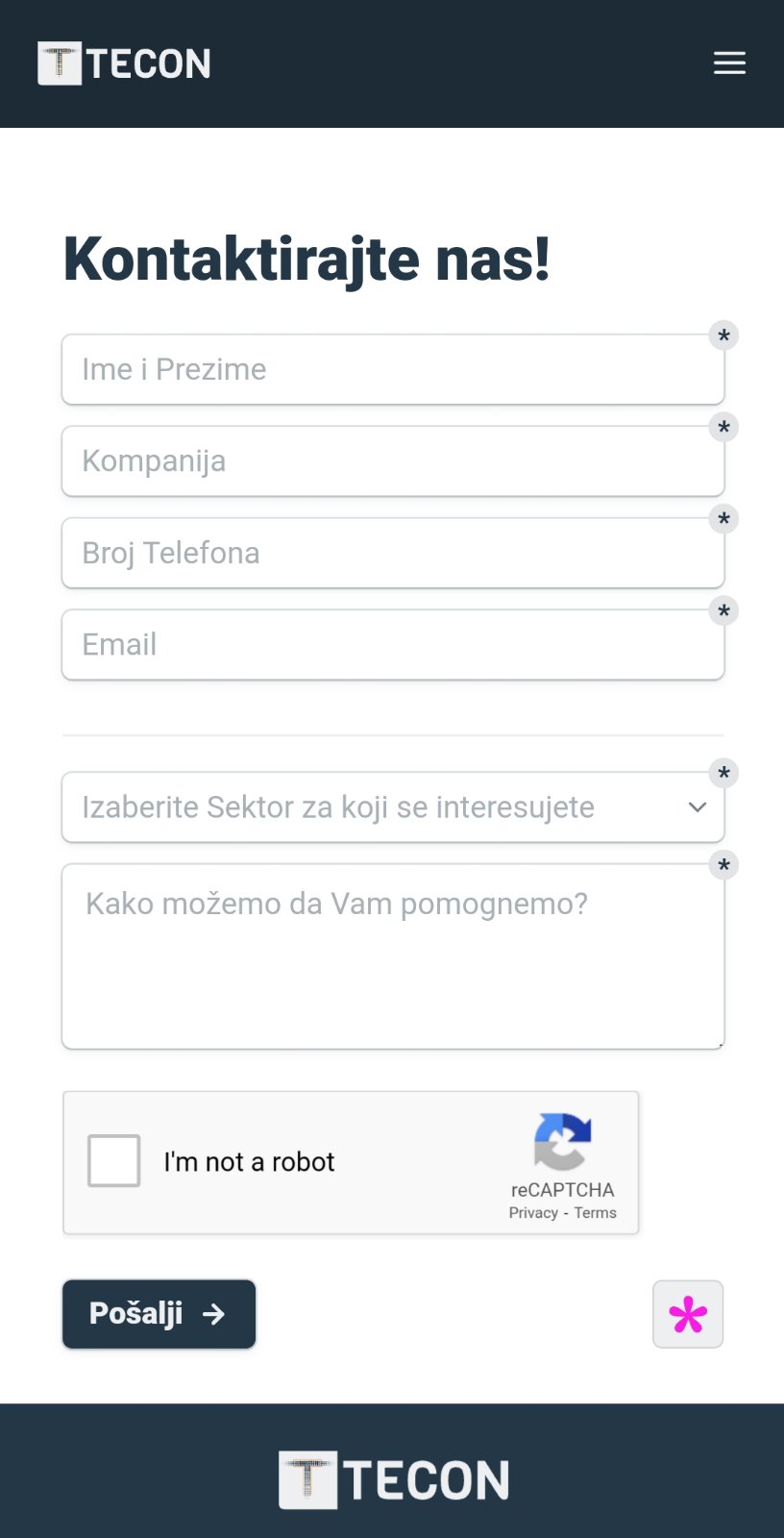
- Contact Page: Enquiry form and contact details.
- Responsive Design: Every page laid out for phones.
Introduction
Client and Project
Tecon Sistem has been engineering industrial crane systems for more than 25 years. Over that time the company grew into four distinct divisions: industrial cranes, professional machinery, automated car wash stations, and custom industrial solutions built to order.
The engineering was never the problem. The presentation was. Tecon had no consistent visual identity, and its divisions read as four unrelated businesses rather than one capable partner. For a company selling six figure equipment to industrial buyers, the gap between the quality of the work and the quality of its presentation was costing credibility before the first conversation.
The brief was to build one identity that could carry all four divisions, and a website that lets a procurement manager find the right product line, understand the specification, and get in touch without friction.
My Responsibilities
I led the project end to end, from the first identity sketches to the live site.
- Brand identity. Logo design, color system, typography, and the rules holding them together across four product divisions.
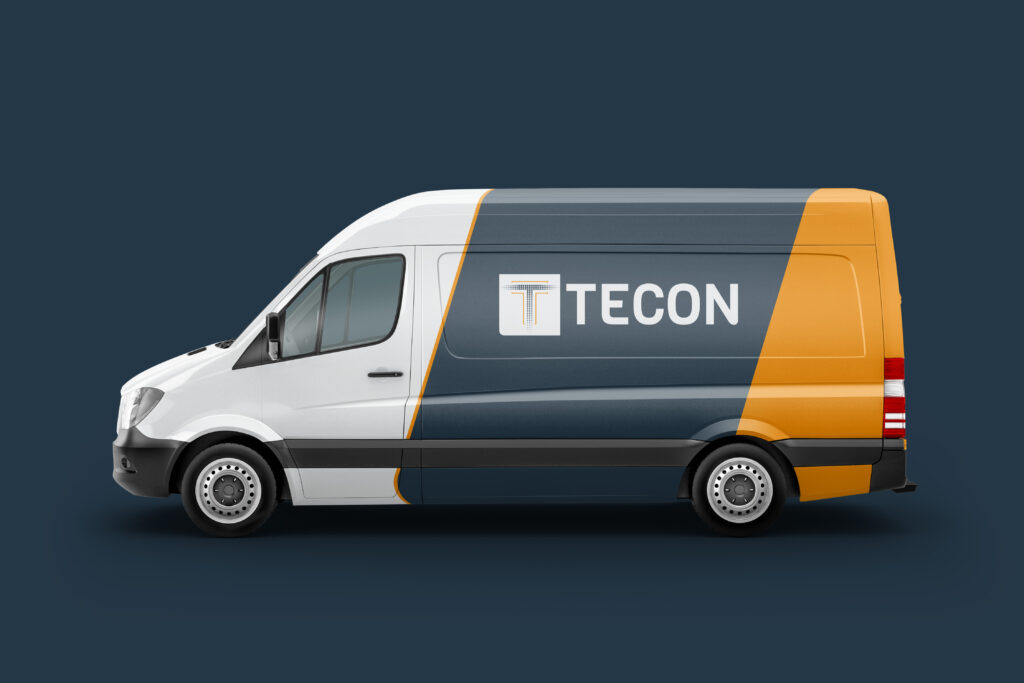
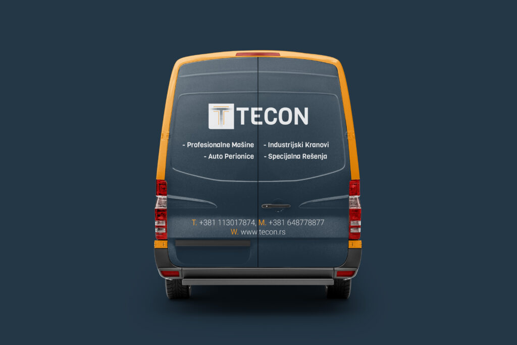
- Print and environmental. Stationery, posters, wall graphics, and vehicle livery, applying the identity at every scale from business card to the side of a van.
- UX and information architecture. A sitemap built around how industrial buyers actually search: by division first, then product line, then specification.
- UI design. Desktop and mobile layouts for every page type, in Serbian.
- WordPress development. The full build, including a fast gallery for the large product photography sets each division needed.
- SEO. On page structure and technical setup so the product lines rank for the terms buyers use.
Style Guide
Color and Font
The palette is built around the safety orange found on the crane equipment itself, grounded in a deep industrial navy. Viga sets the headings, its condensed squared letterforms echoing structural steel. Roboto carries body copy, chosen for legibility in dense specification tables and for full support of Serbian Latin characters.
COLOR PALETTE
Signal Orange
#E79046
Accent, calls to action and active states
Steel Navy
#0E2A3E
Primary surface, headers and footers
Concrete
#D3DBE6
Body text on dark, secondary surfaces
Mist
#899BB3
Dividers, disabled states, subtle fills
TYPOGRAPHY
Heading 1
Viga Regular 400 · 56 / 64 · Concrete #D3DBE6
Heading 2
Viga Regular 400 · 48 / 56 · Concrete #D3DBE6
Heading 3
Viga Regular 400 · 40 / 48 · Concrete #D3DBE6
Subheading
Roboto Medium 500 · 24 / 32 · Concrete #D3DBE6
Body copy
Roboto Light 300 · 16 / 24 · Concrete #D3DBE6
Caption
Roboto Regular 400 · 12 / 18 · Mist #899BB3
Tecon Sistem has been engineering industrial crane systems for more than 25 years, across four divisions: industrial cranes, professional machinery, automated car wash stations, and custom solutions built to order.
Paragraph, 640px measure
BUTTONS
Default
Hover, proposed
Logo design
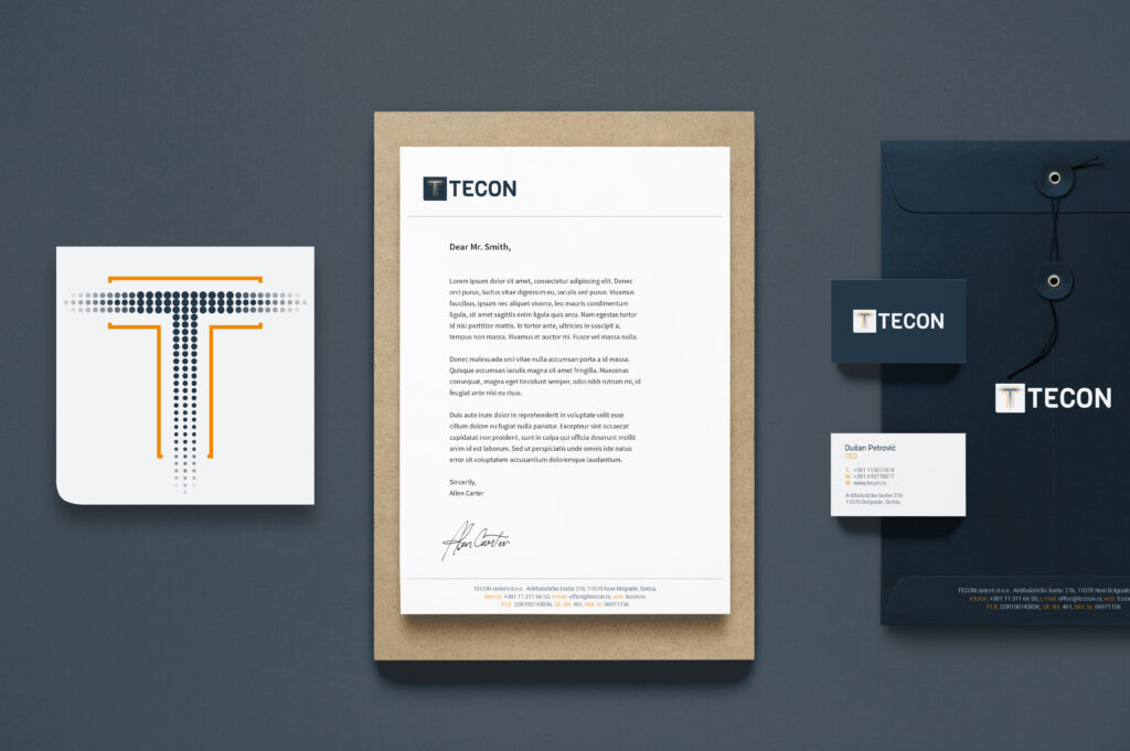
The mark is a T monogram built from a halftone dot field, set in a rounded navy square, with orange rules that read as the dimension lines on a technical drawing. It was drawn to survive the full range the company needed, from a favicon and an embroidered work shirt to the side of a van.
Branding
Mood board
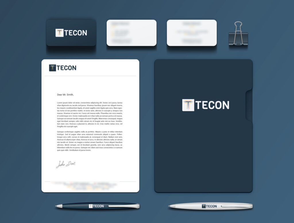
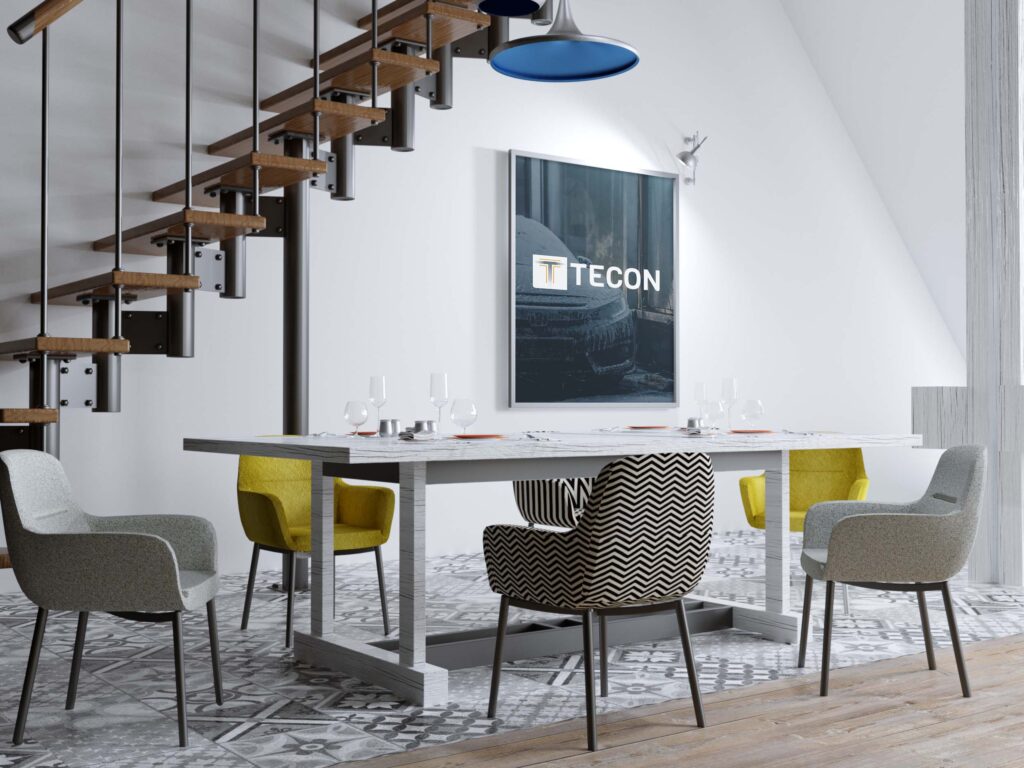
The identity was rolled out across the surfaces the company actually meets its customers on. Stationery carries the quotations and proposals. The vehicle livery puts the mark on the road between industrial sites, where it is seen far more often than any advertisement would be.
Stationery
Poster
Wall poster
Website
Vehicle livery
Vehicle livery
Sitemap
Flowcharts
The four divisions sit at the top level, because that is how buyers arrive. They know they need a crane, or a car wash system. They do not arrive knowing the brand. Search is given its own path, since returning buyers often arrive knowing a product code.
Home Page
Desktop View
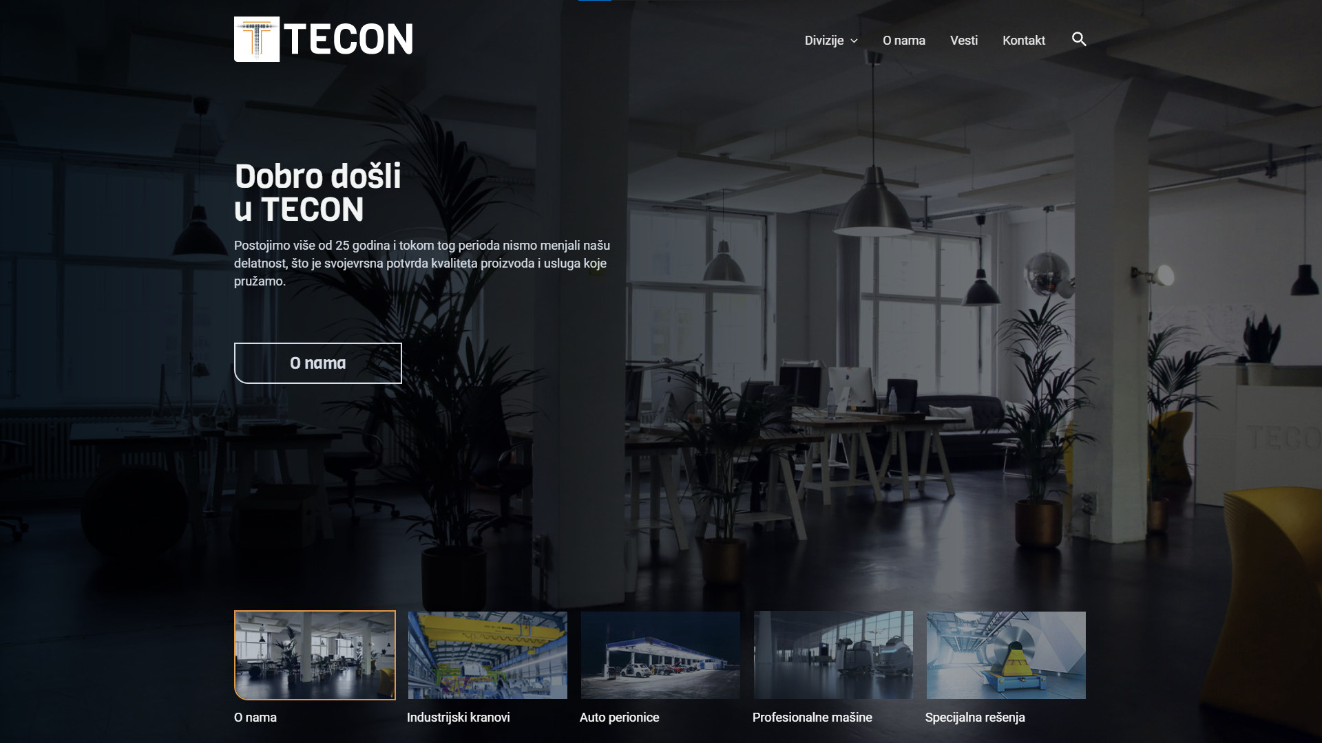
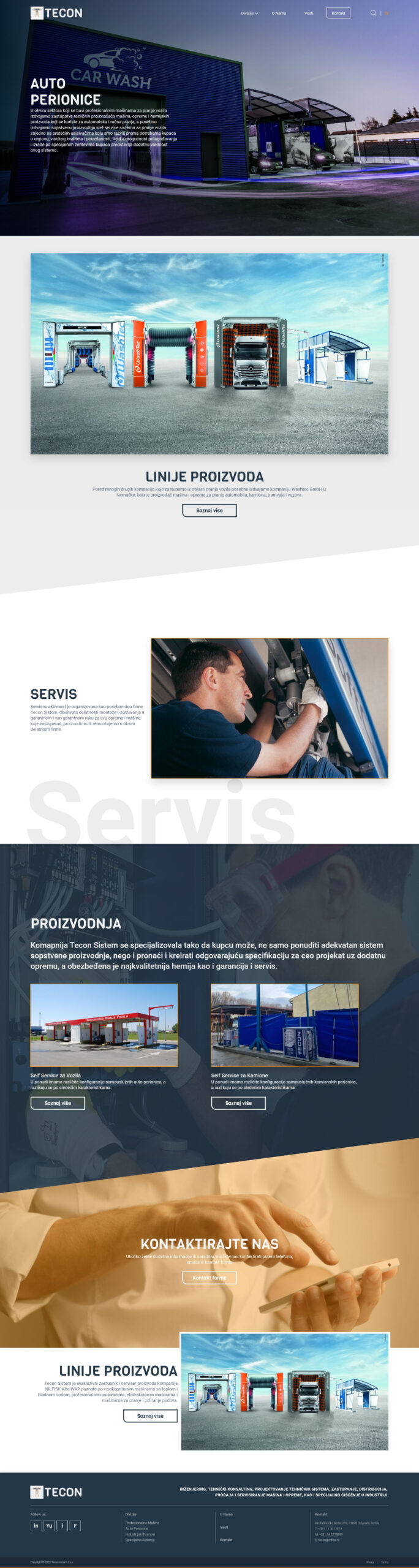
The home page opens on the equipment itself, at full width, then moves straight to the four divisions. Nobody has to scroll past a mission statement to find out what the company makes.
Interior Pages
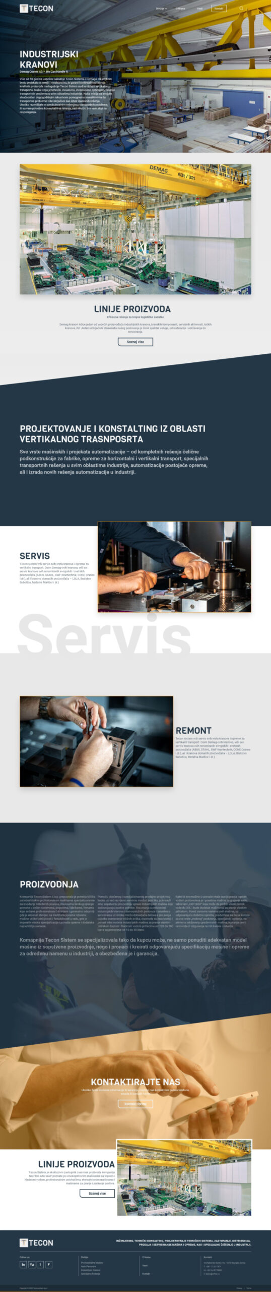
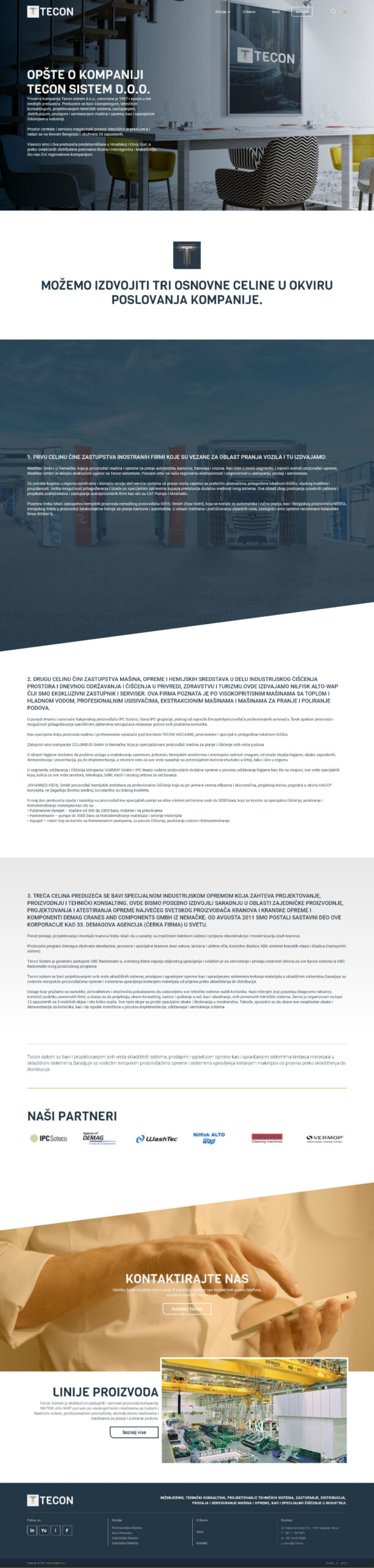
Industrial Cranes, Car Washes, About Company
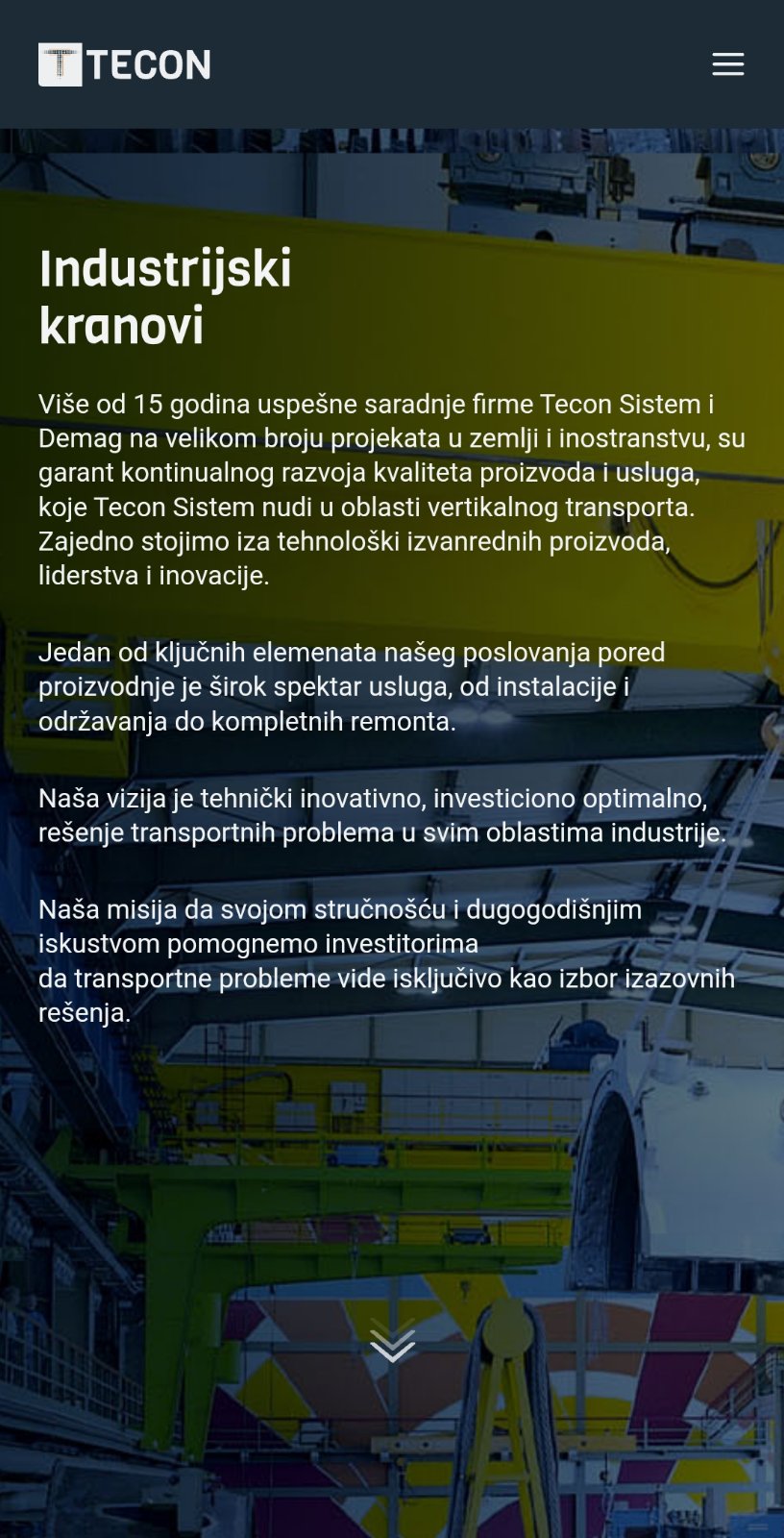
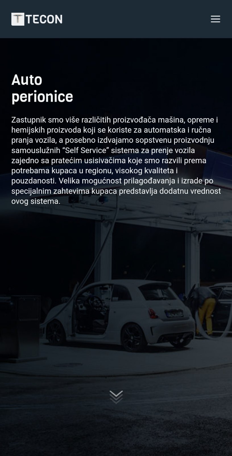
Each division page follows the same spine: hero, capability summary, product line grid, then specification. The gallery was the real technical constraint. Tecon photographs every installation, so the page had to carry large image sets without becoming slow.


Responsive Design
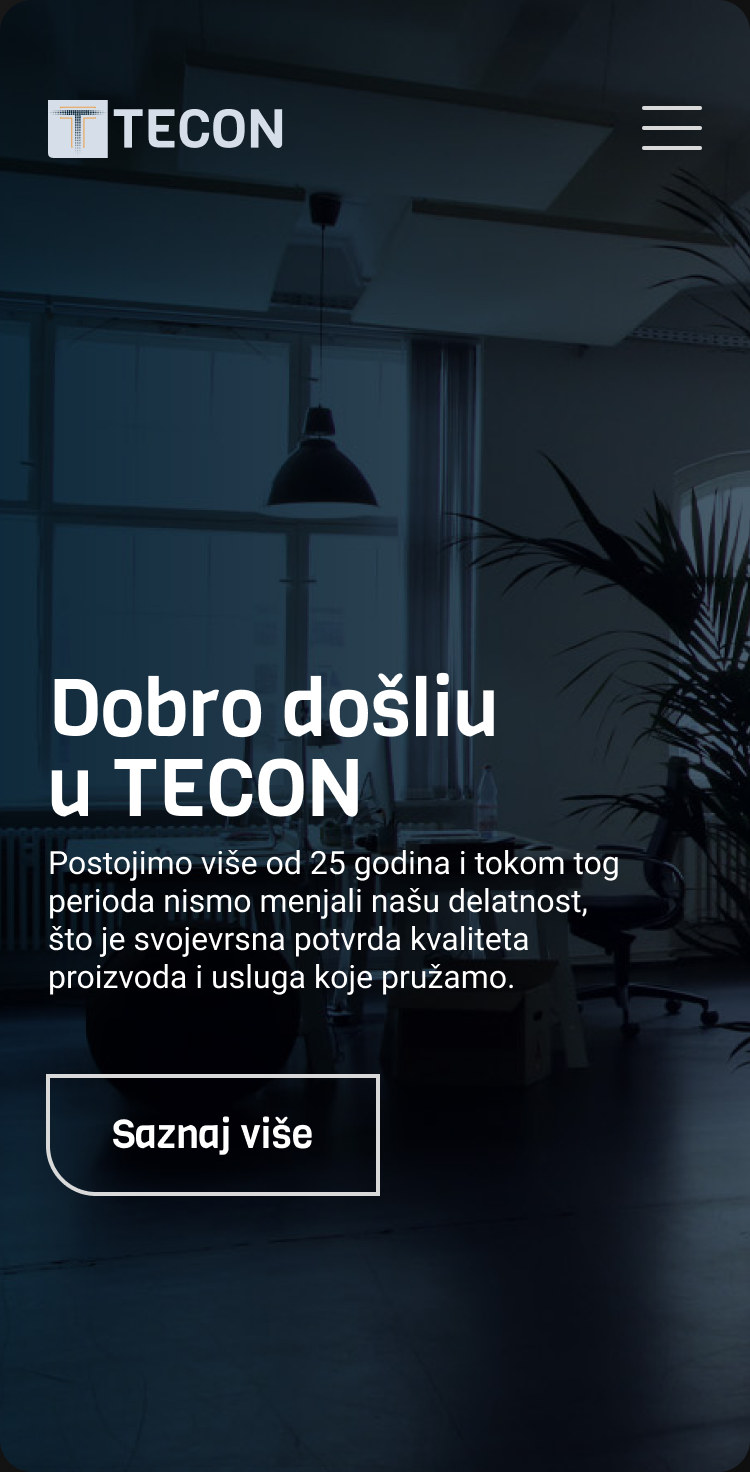
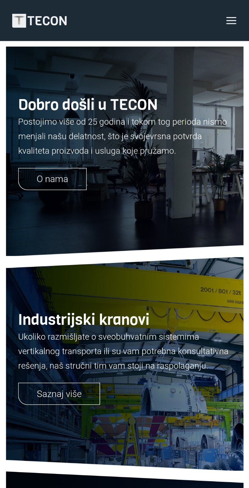
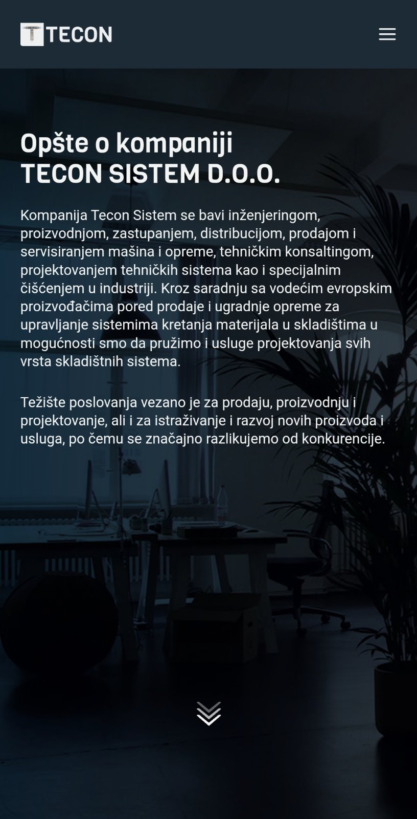
Much of the traffic arrives from the factory floor and from the road, on phones, often in gloves. Navigation collapses to a single reachable menu, specification tables scroll horizontally rather than shrinking below legibility, and the contact action stays fixed within thumb reach.
Announce section
About page
Industrial cranes
Car wash page
Contact page
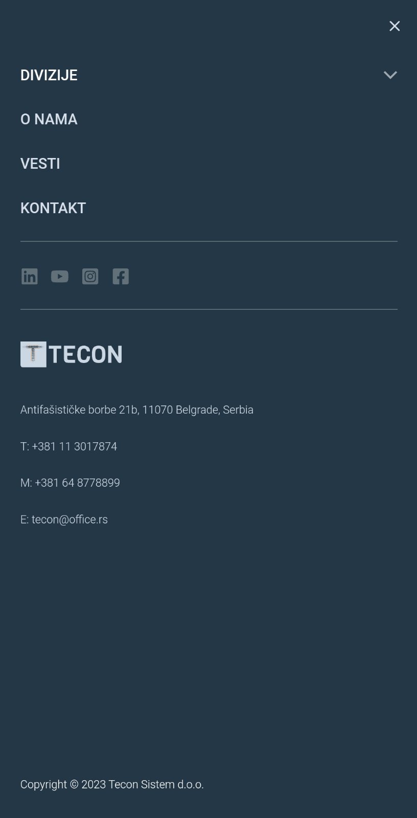
Navigation menu
What Tecon gained
Tecon came to the rebuild with 25 years of engineering behind it and a website that undersold every year of it. What follows is what the company got out of the work, and how each of those claims can be checked.

Before, the wordmark it replaced
After, the monogram that replaced it
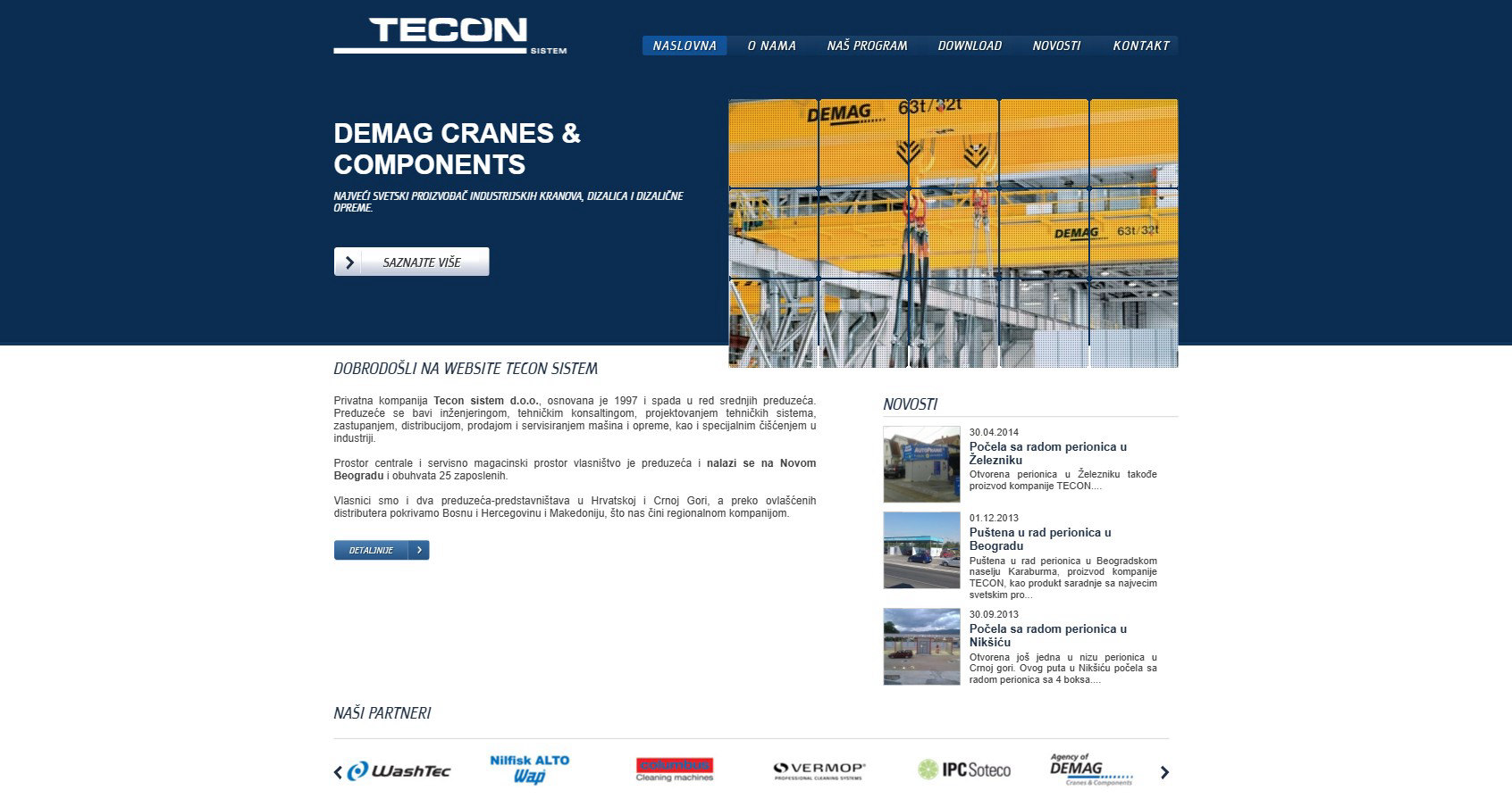
The site it replaced, archived May 2023

The site that replaced it, live since 2023
tecon.rs
