
P1 Concept Store
Website, Presentation and Instagram
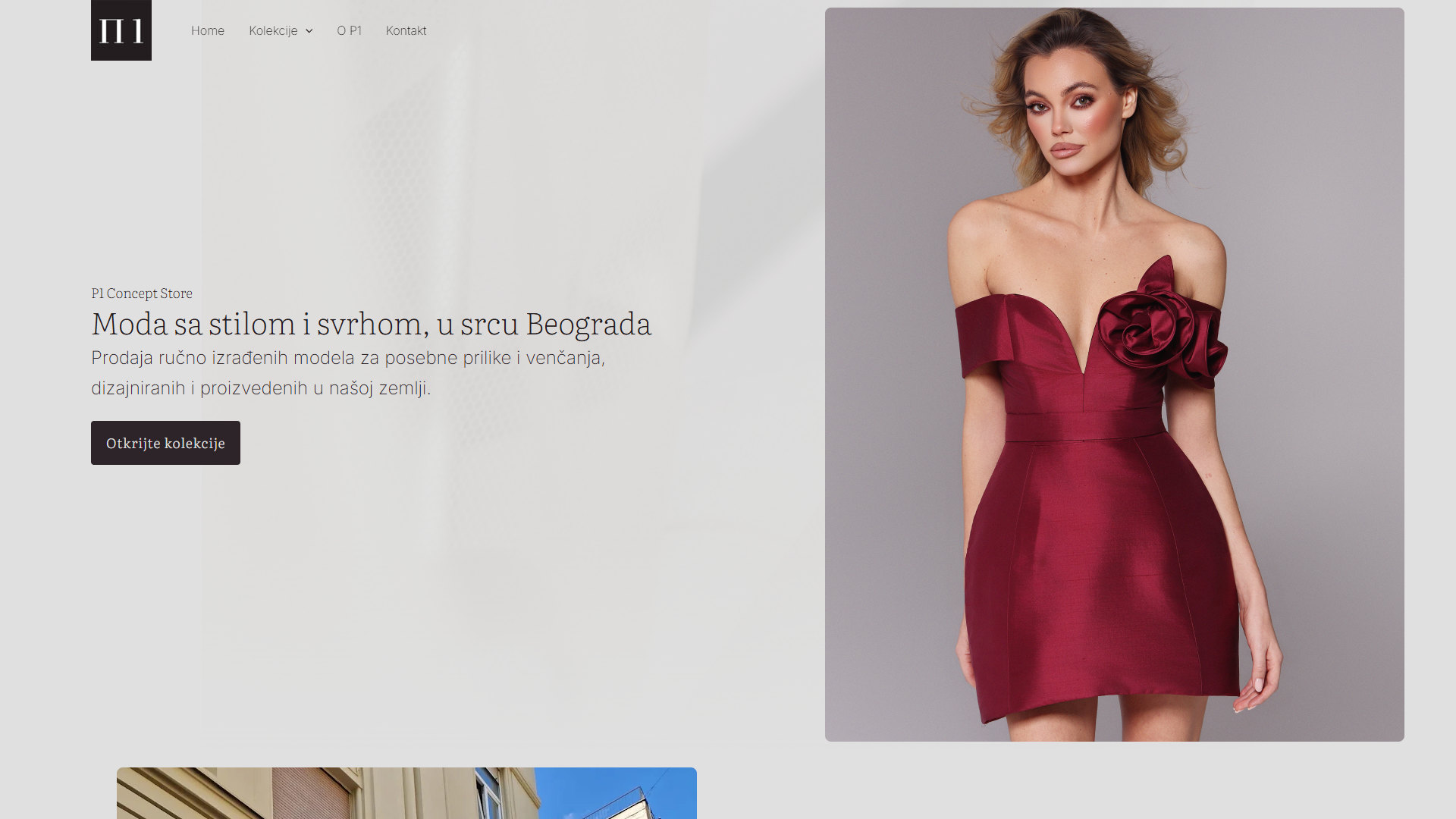
Key Features
Home, Collections, About P1, Contact
A digital shop window, in Serbian
- Home Page: The store's mood in one scroll, from a rotating hero to the collections and the visit.
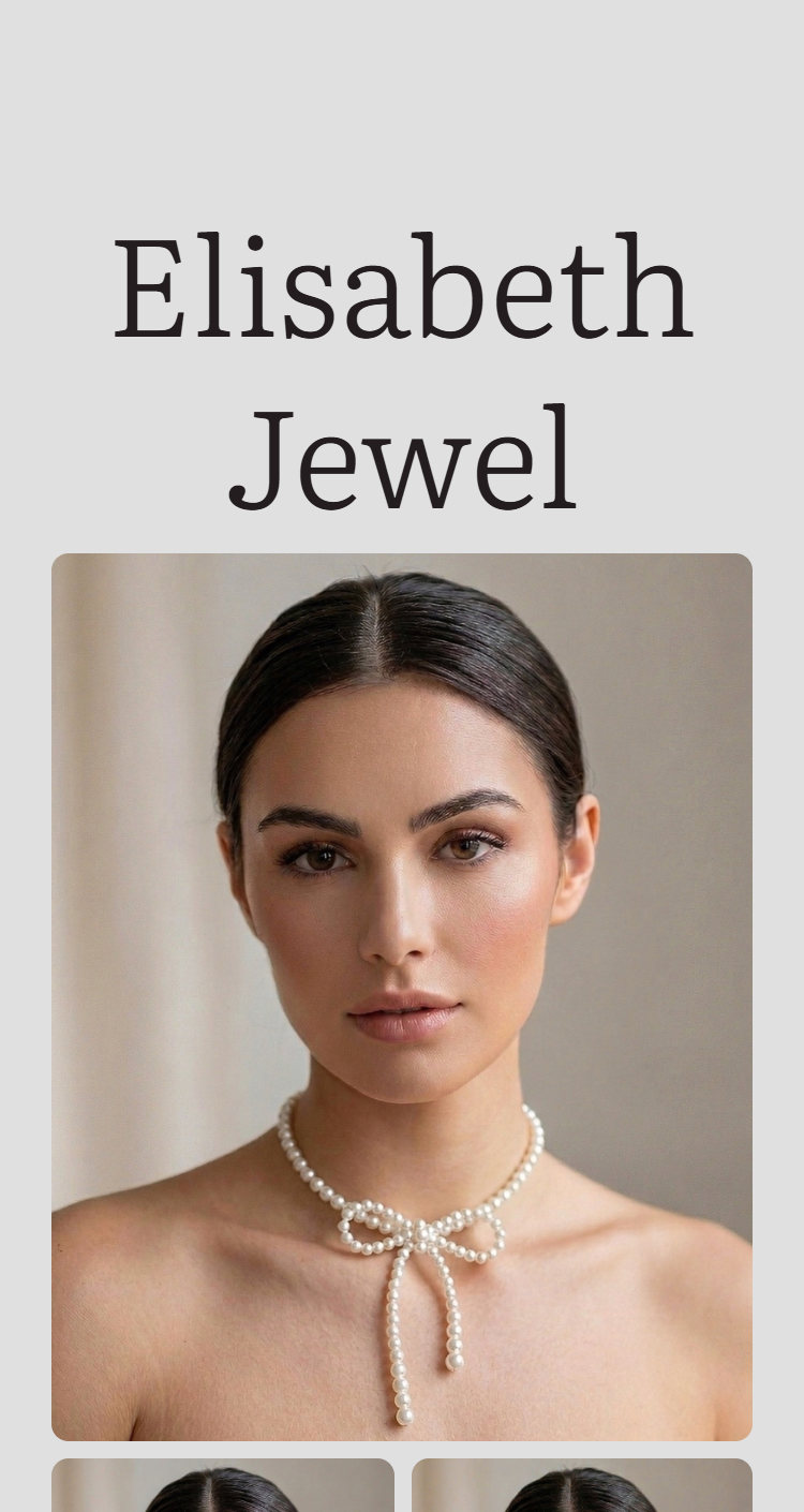
- Collections: Wedding dresses, exclusive dresses and accessories, each with its own page.
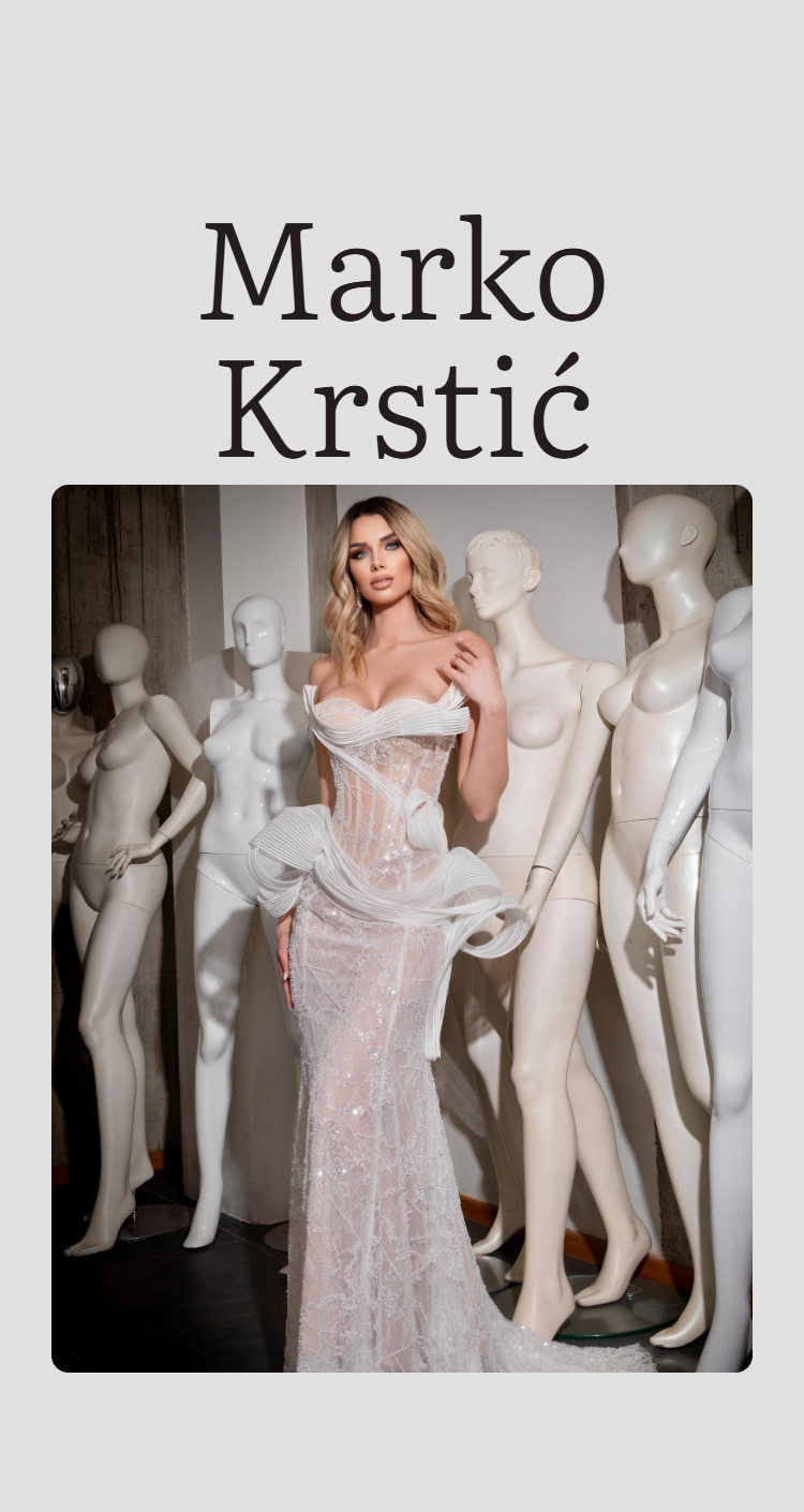
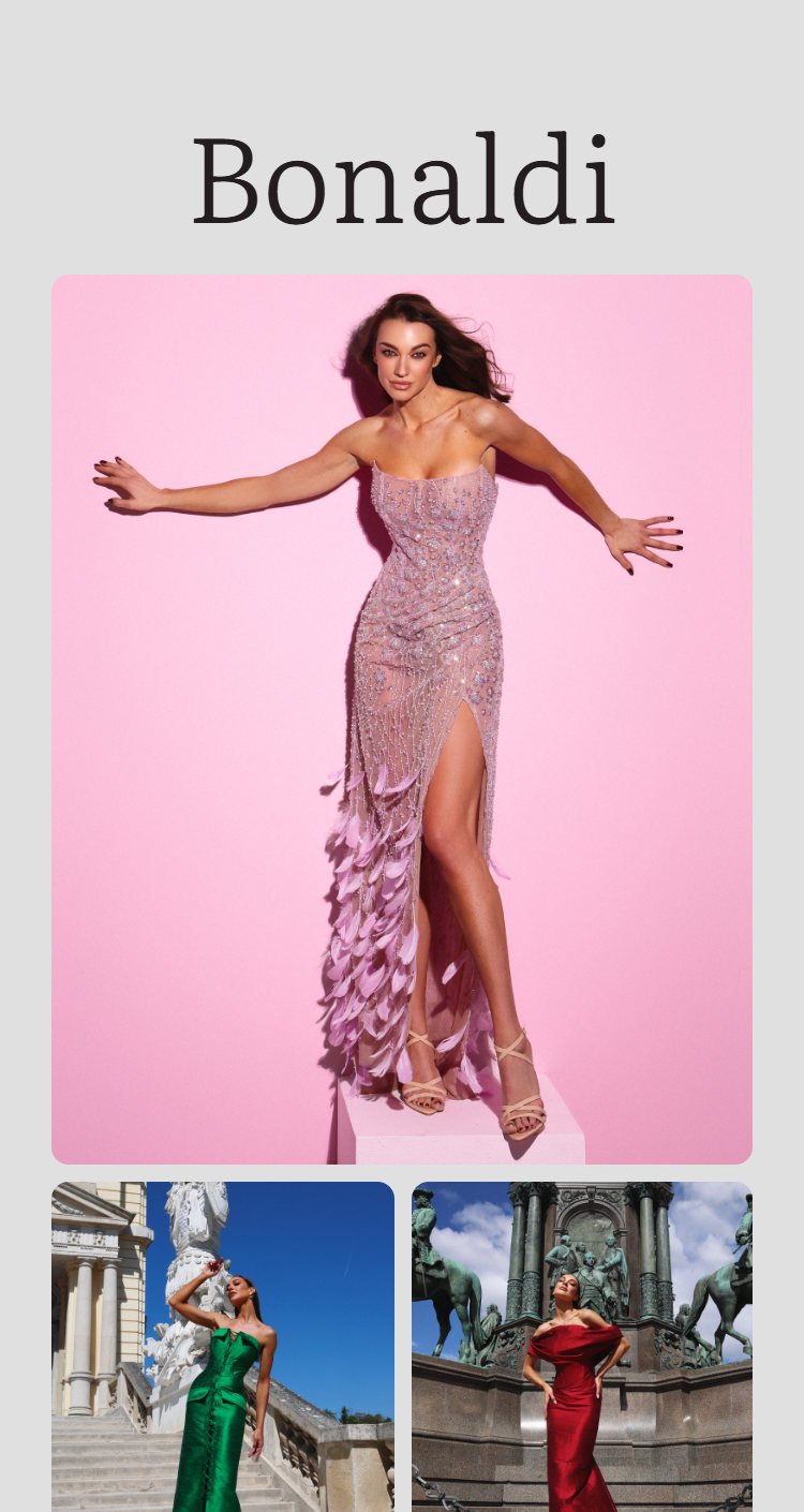
- Designer Galleries: Every designer gets a name and a gallery, from Marko Krstić to Tijana Žunić.
- No Prices, No Cart: The pages show the pieces and lead to a fitting, as the brief asked.
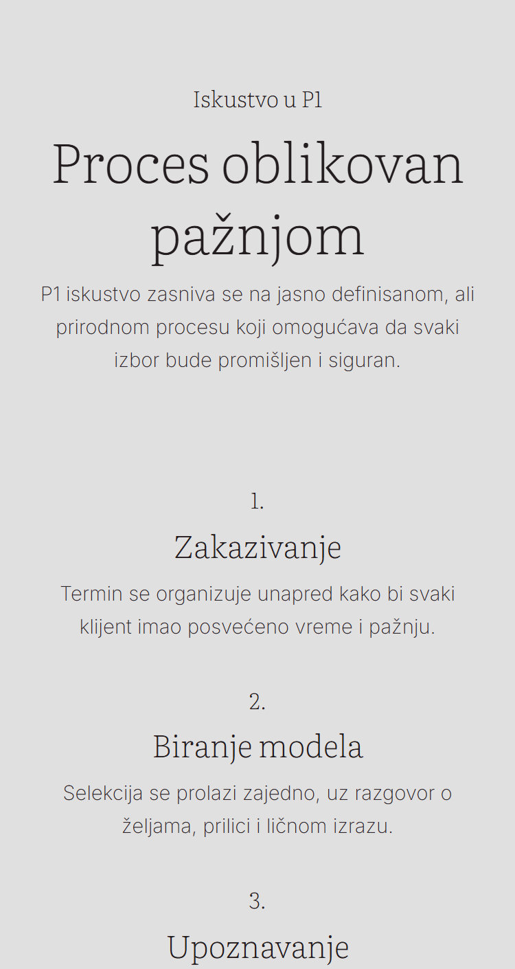
- About P1: Tradition, quality and confidence, then the five steps of a visit.
- Contact and Appointments: Address, opening hours and how fittings are booked.
- Editorial Instagram: Every page links to the feed through a row of editorial photos.
- Responsive Design: The same calm layout on a phone, where most visitors arrive.
About P1
Client and Project
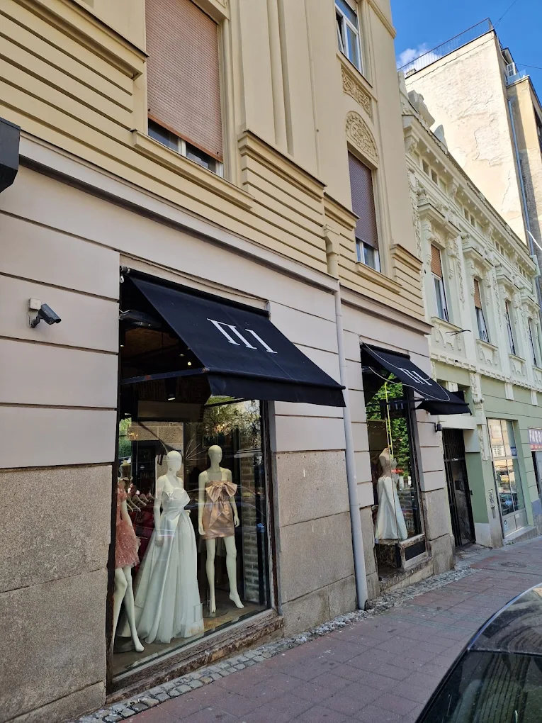
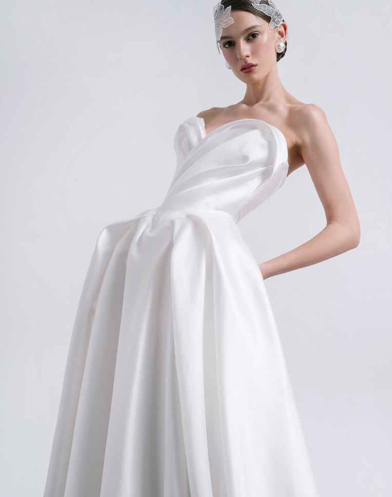
P1 is a concept store at Kralja Petra 75, in the heart of Belgrade. It sells special occasion and wedding dresses designed and made in Serbia, by designers such as Marko Krstić, Tijana Žunić and Predrag Đuknić, with jewelry and accessories alongside.
The old site did not show any of that. It mixed Serbian and English, stacked the categories as plain blocks and said little about the store. The brief was a site that works like a shop window rather than an online store: no prices and no cart, just the collections, the designers and a reason to book a fitting.
My Responsibilities
Website, Presentation and Instagram
- Presentation: the redesign proposal that set the direction, structure and tone.
- Website: UI/UX design and WordPress development, every page and both breakpoints.
- Instagram: post, carousel and story templates, and a four week plan of posts.
Presentation
The proposal that started it
The project began as a proposal: a site that extends the store instead of a generic shop. The deck set out where P1 stood, what the new site should be, its structure, the home page and the four categories, and the type and tone, in the same dark, editorial look the store has. It is shown here without the commercial slides.

Cover
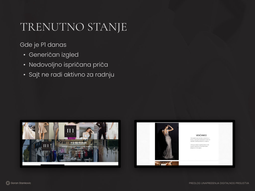
Where P1 stood
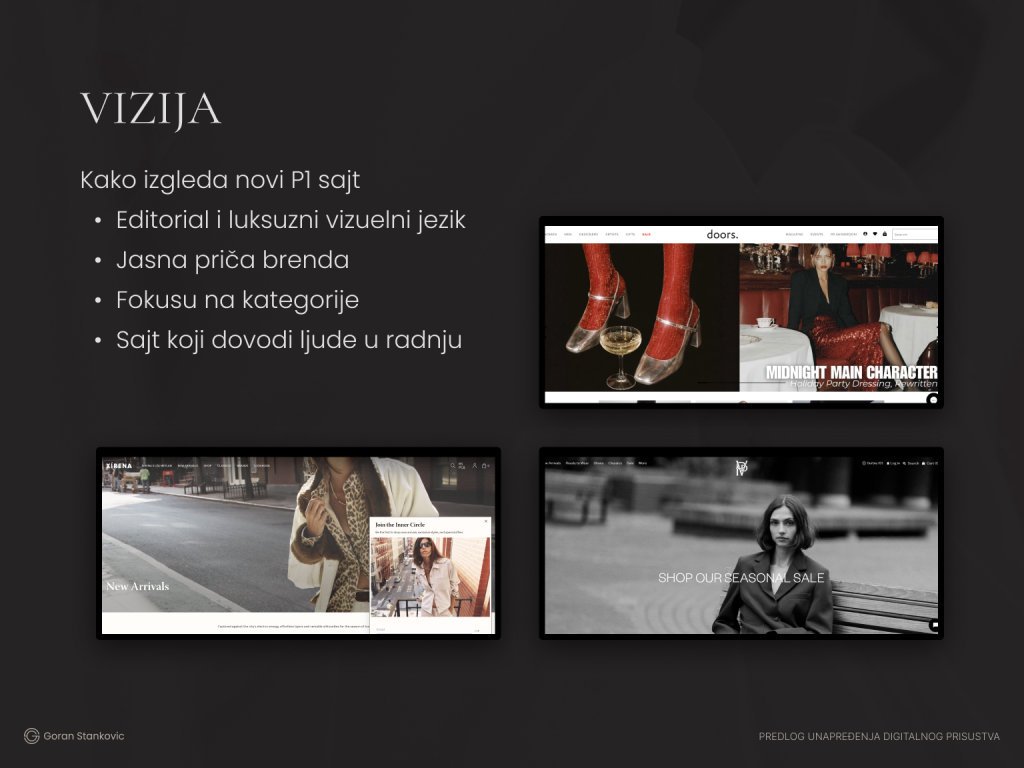
Vision
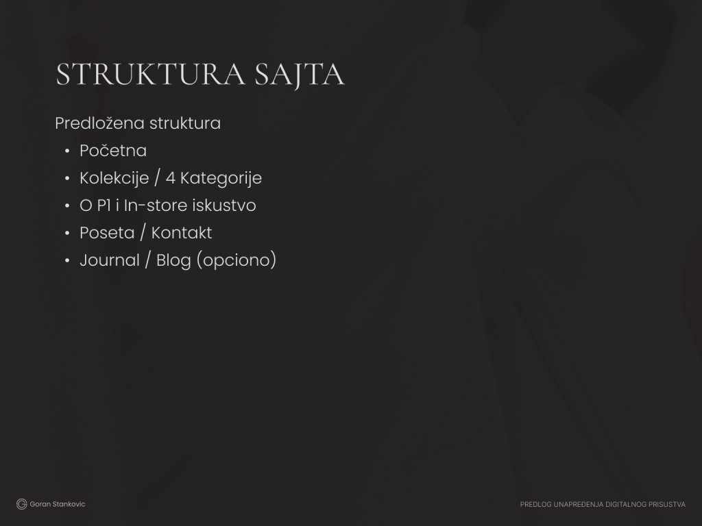
Site structure
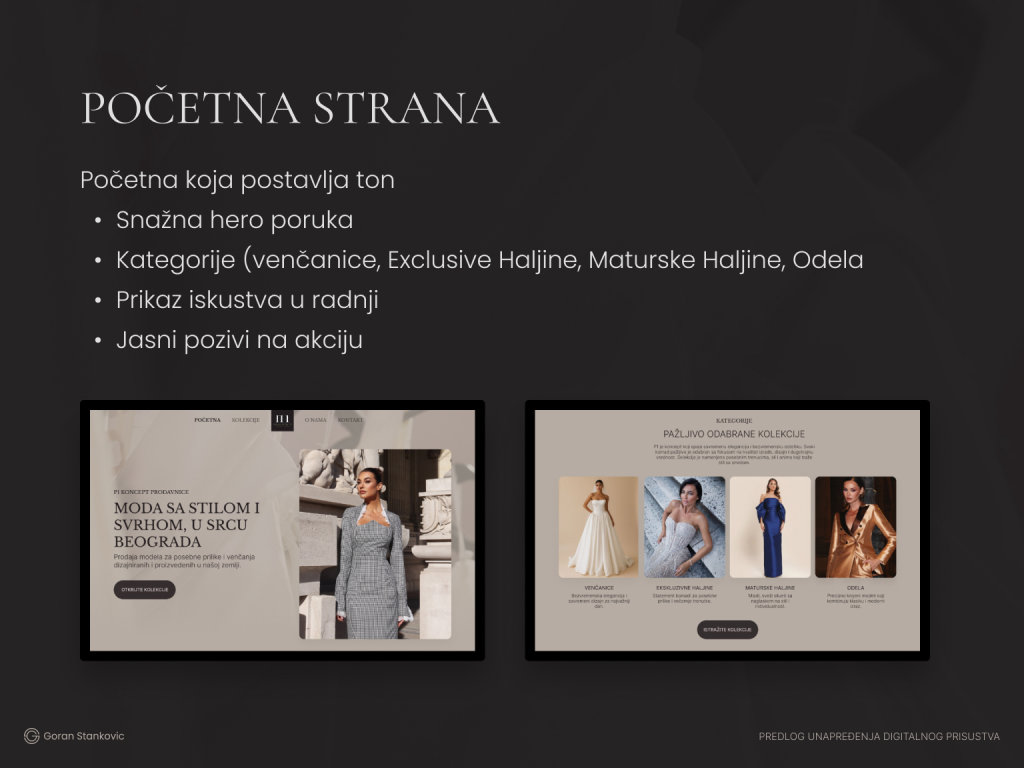
Home page
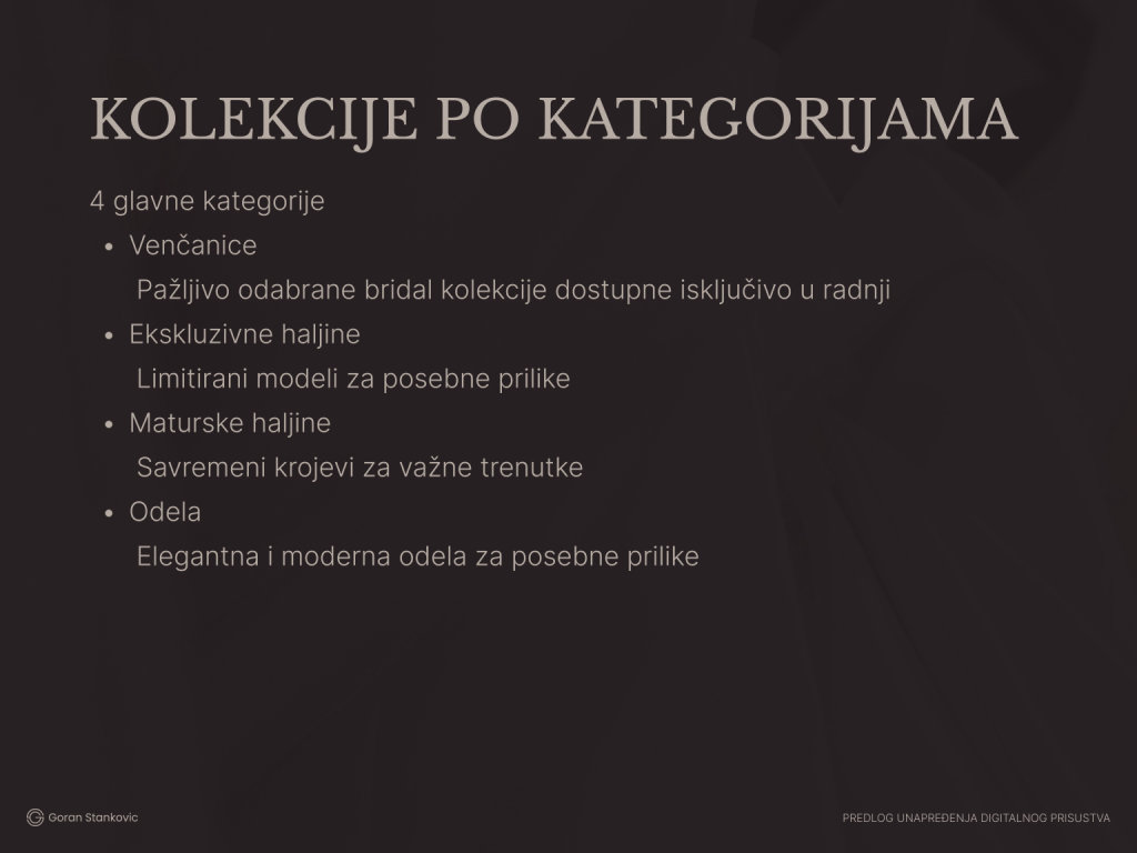
Collections
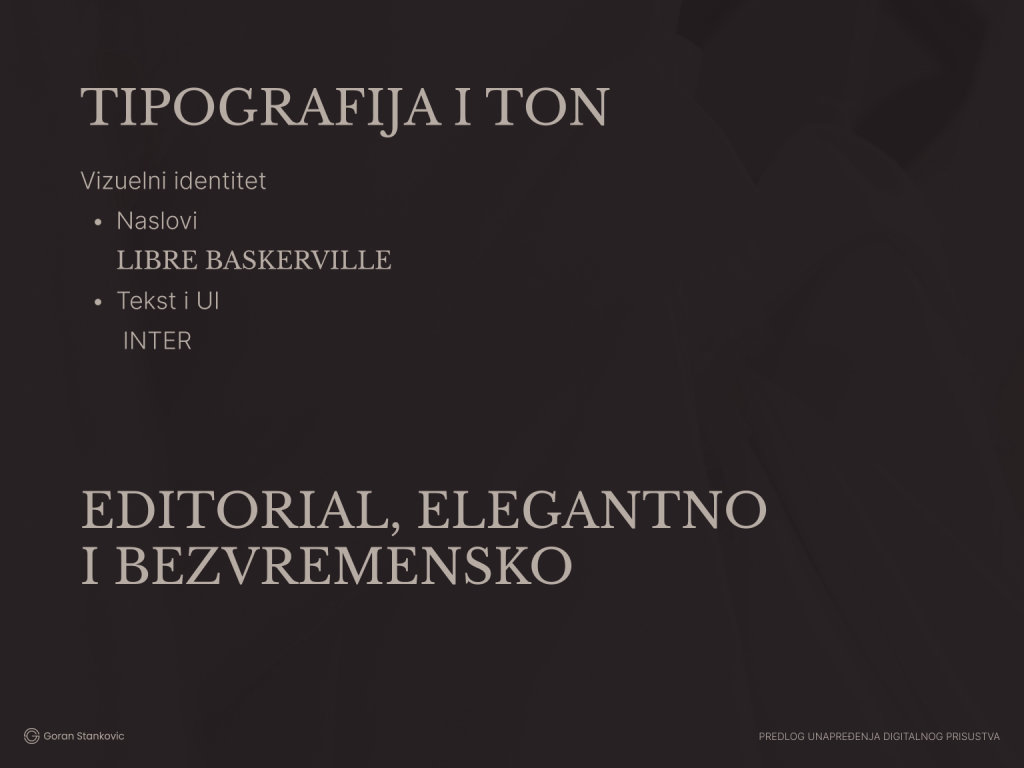
Type and tone
Closing
Home Page
Desktop View
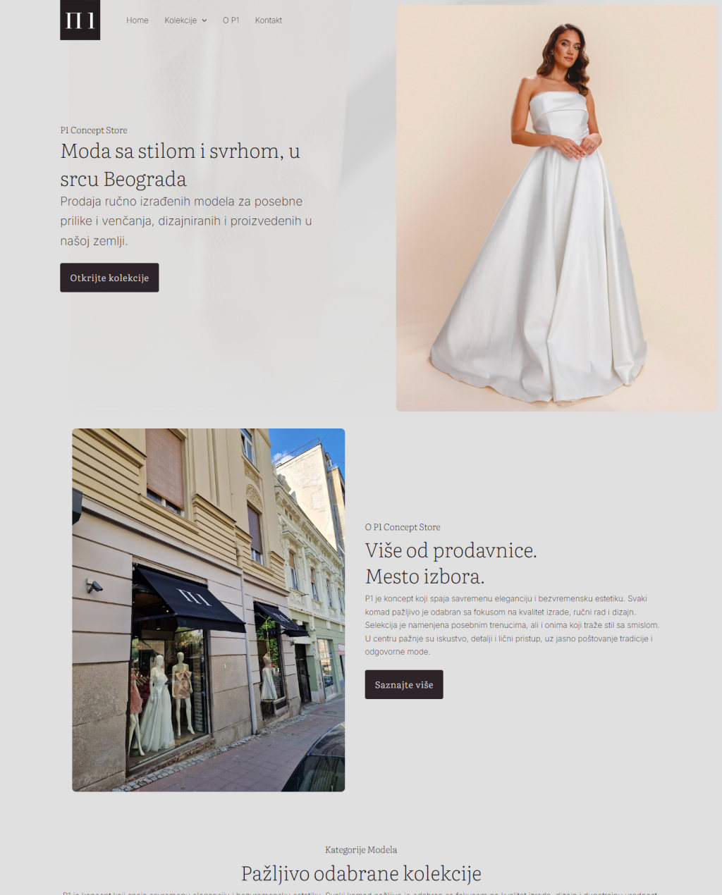
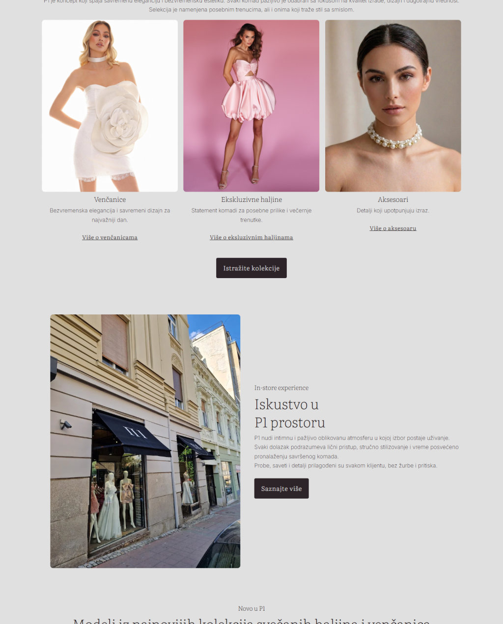
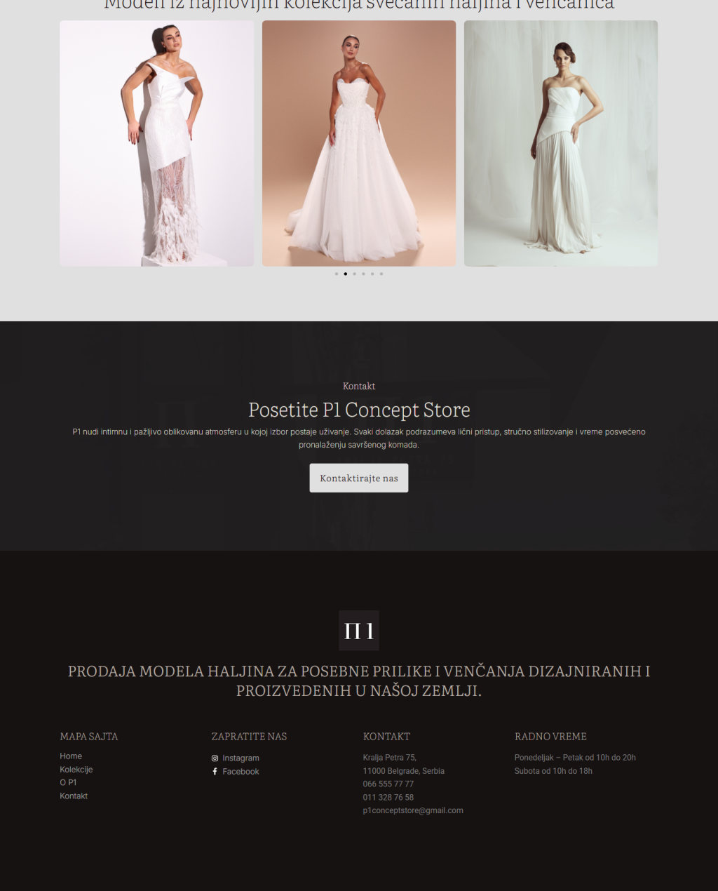
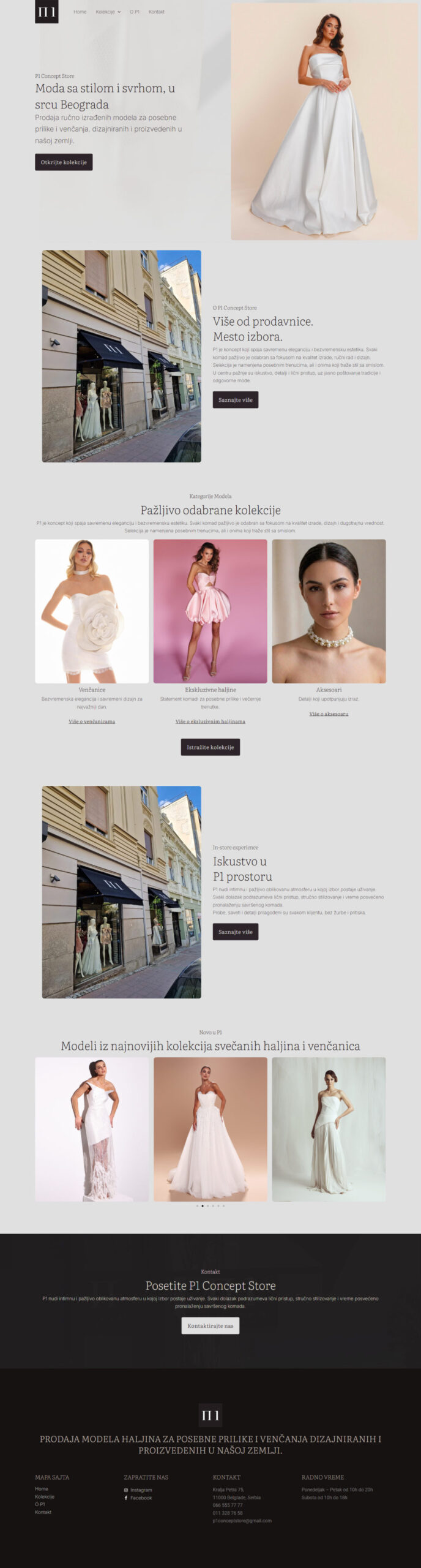
The home page opens on a rotating hero of the designers' pieces and one line: fashion with style and purpose, in the heart of Belgrade. It then introduces the store, the three collections with a short line each, the in-store experience and an editorial row from Instagram, and closes on an invitation to visit, with the address and opening hours in the footer.
Collections and Inside Pages
Collections, Wedding Dresses, Exclusive Dresses, Accessories, About P1, Contact
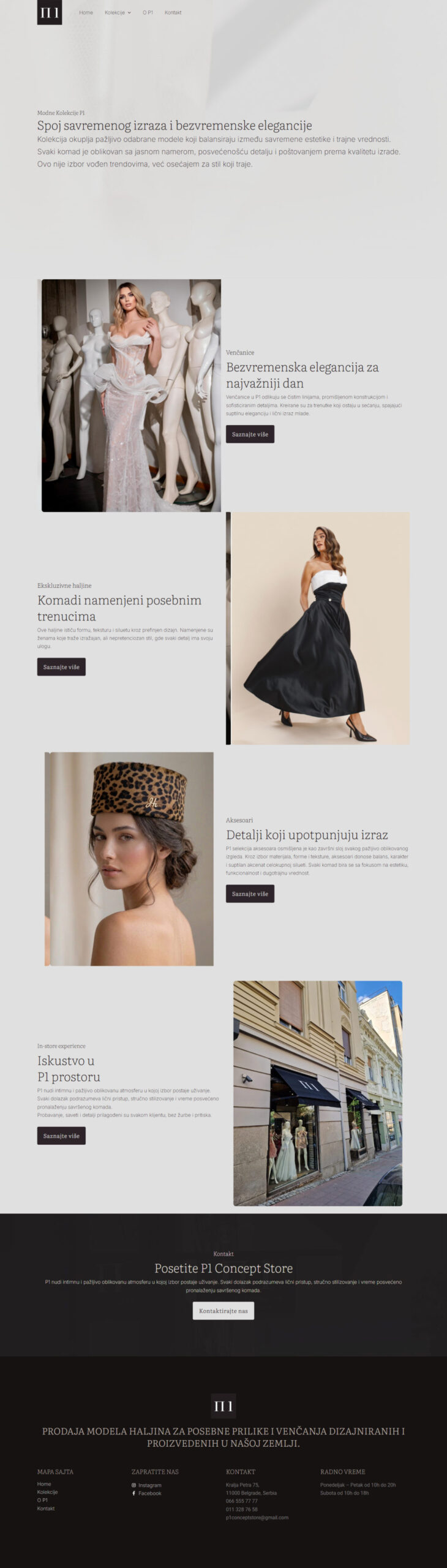
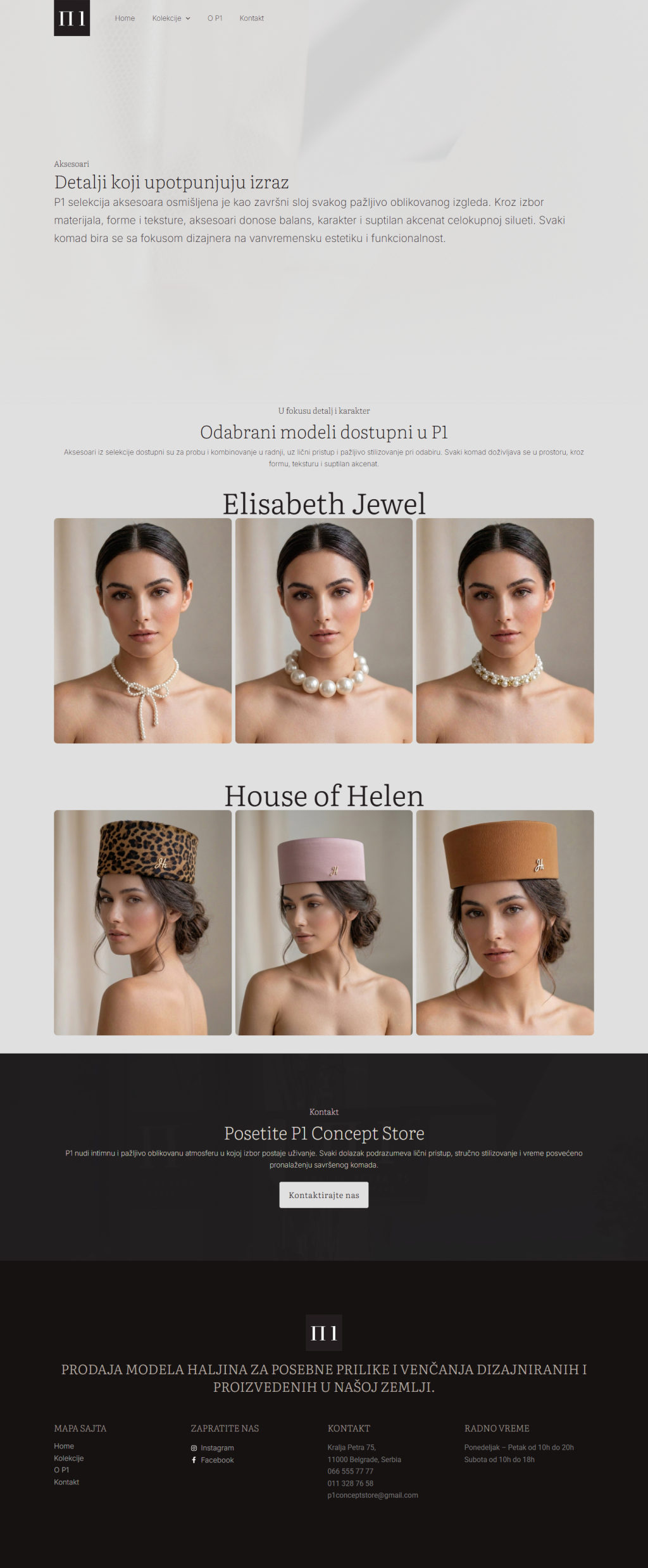
Each collection page opens with a short editorial line, then gives every designer a heading and a gallery, so a bride can look for Tijana Žunić or Marko Krstić by name. About P1 explains the store's values and the five steps of a visit, from booking to the final dress, and Contact tells people how fittings are arranged.
Collections

Wedding dresses

Exclusive dresses
Accessories
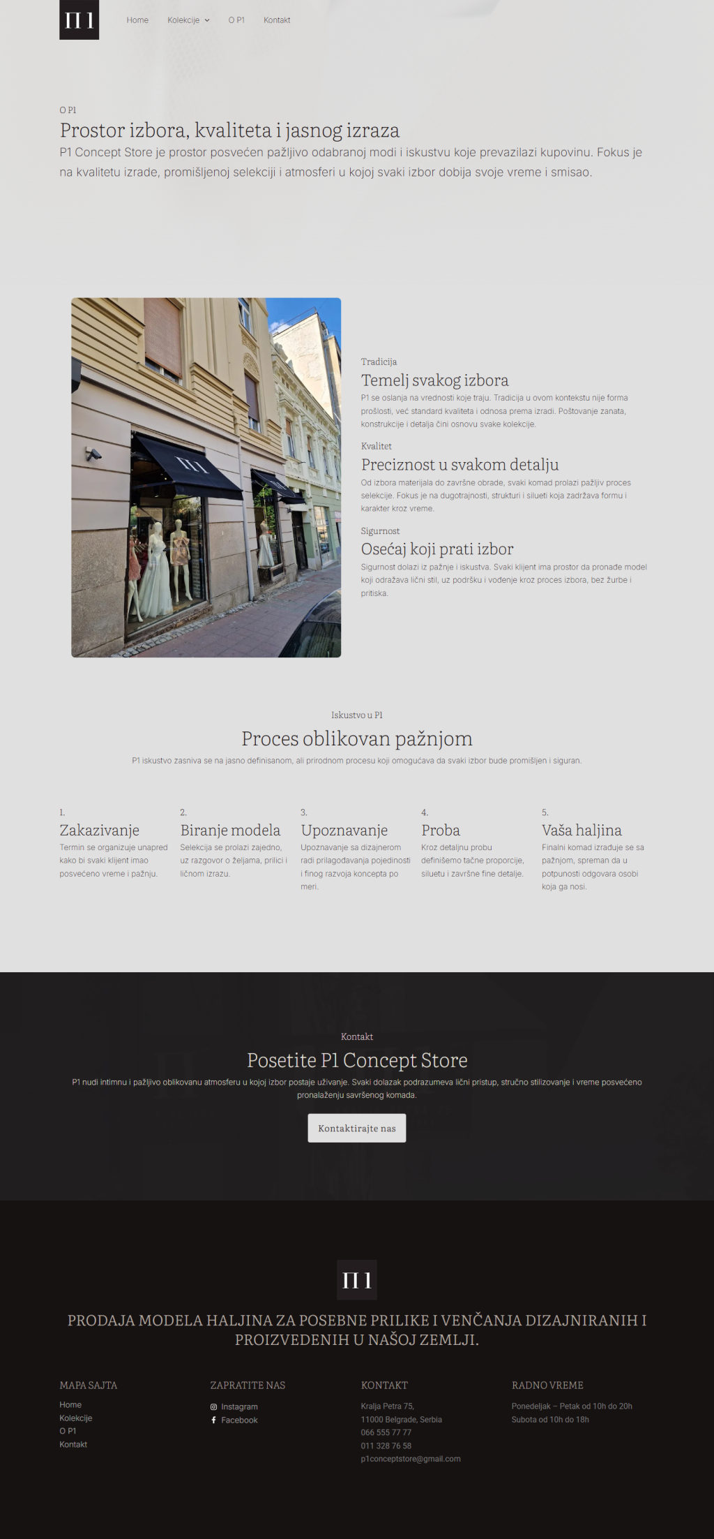
About P1
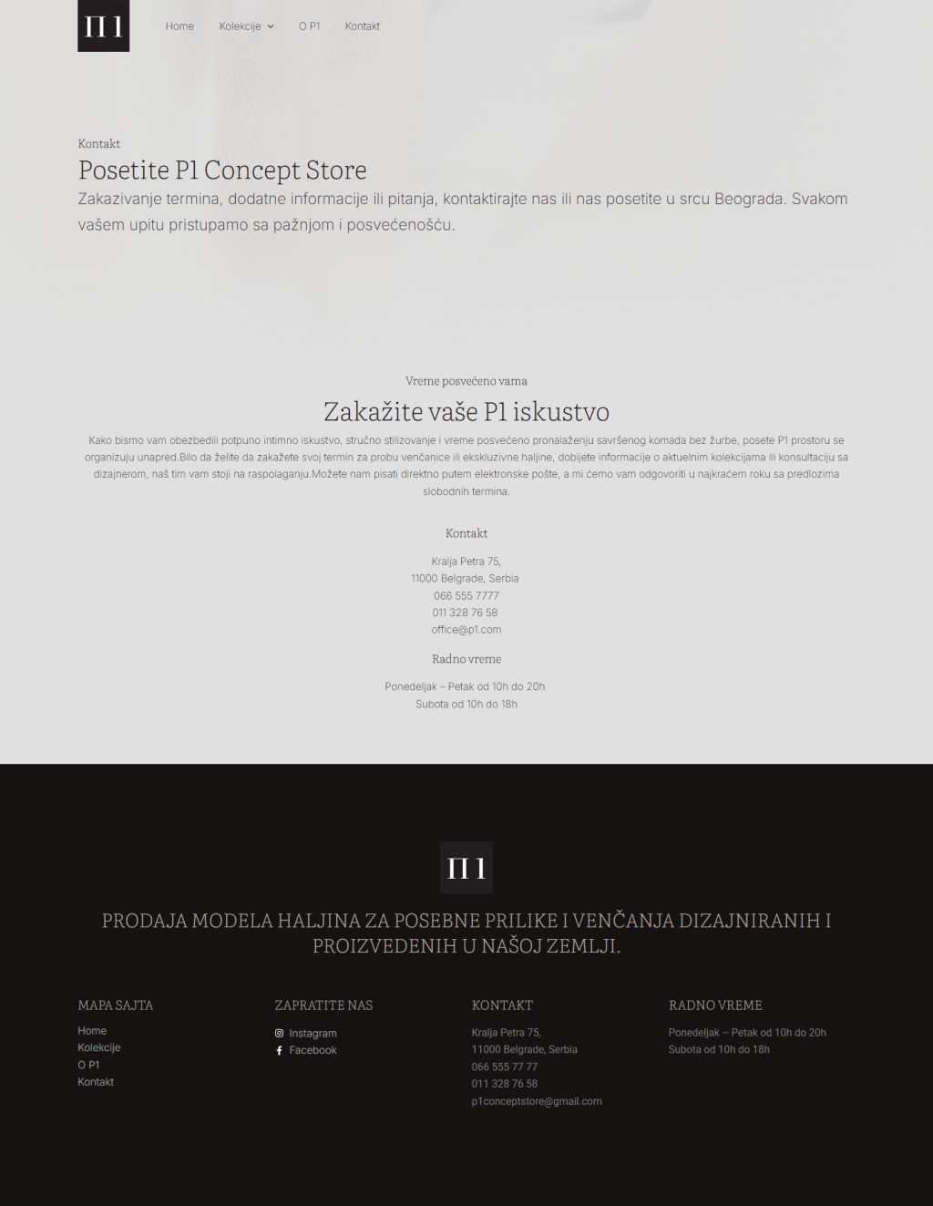
Contact
Responsive Design
Mobile Version
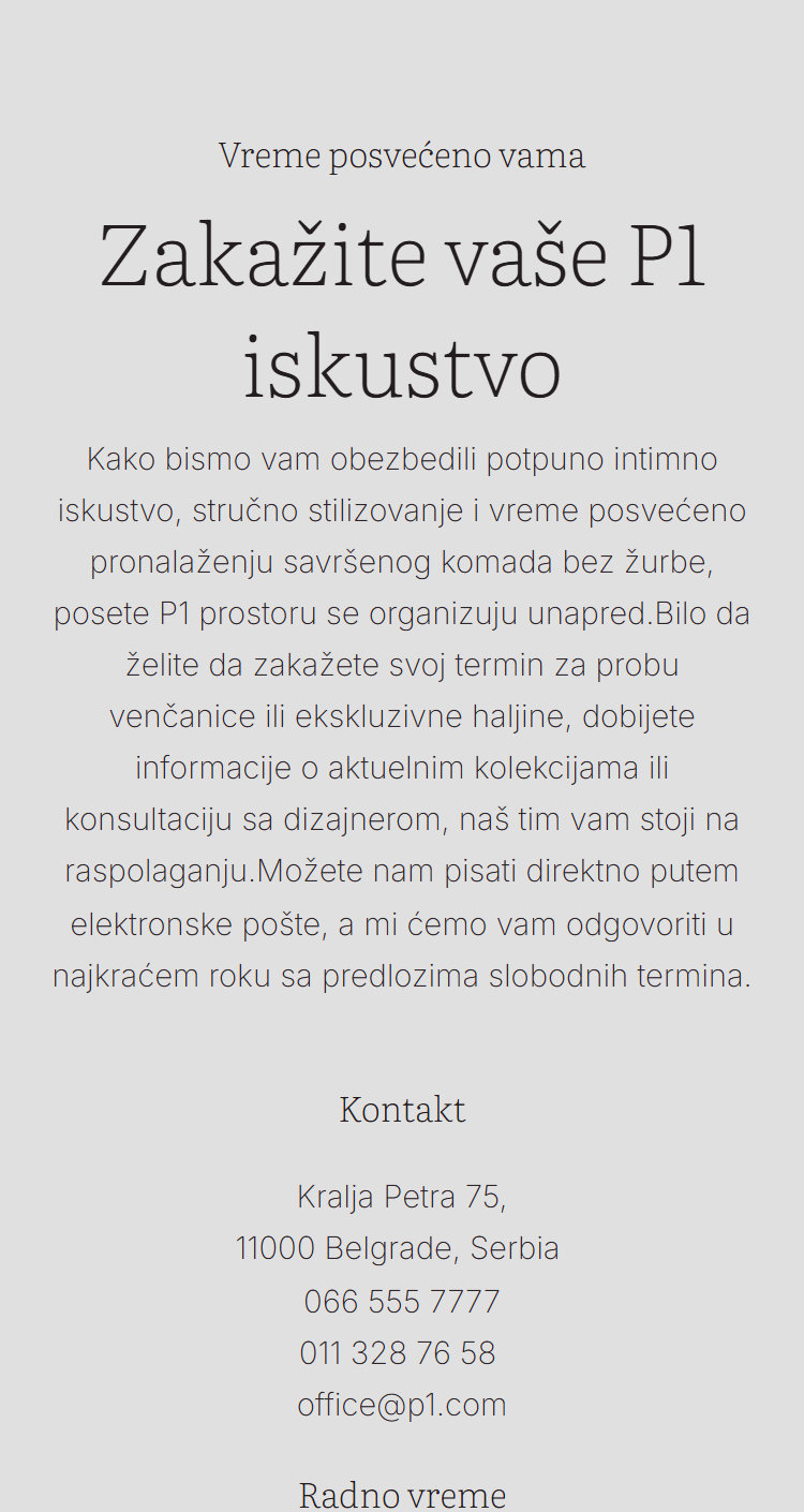
Most visitors find P1 on a phone, from Instagram. On mobile the hero turns into one column with the photograph below the headline, the designer galleries stack, the menu folds behind a single icon, and the address and hours stay one tap away.
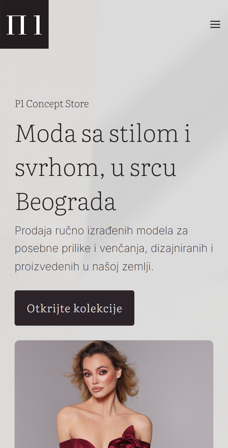
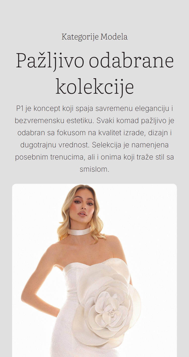
Collections
Wedding dresses
Exclusive dresses
Accessories
About P1
Contact
Templates and a four week plan
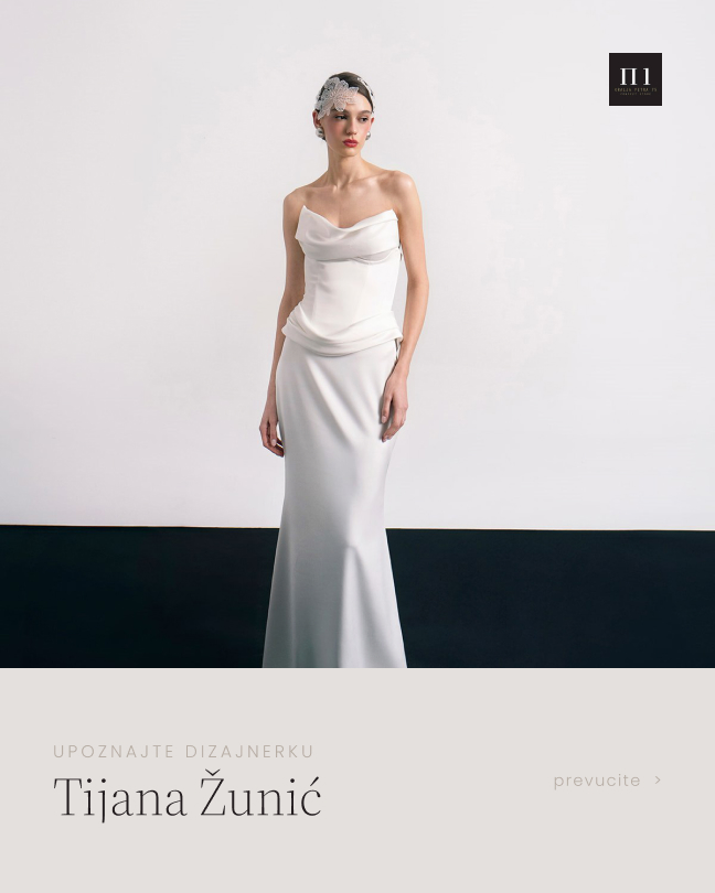
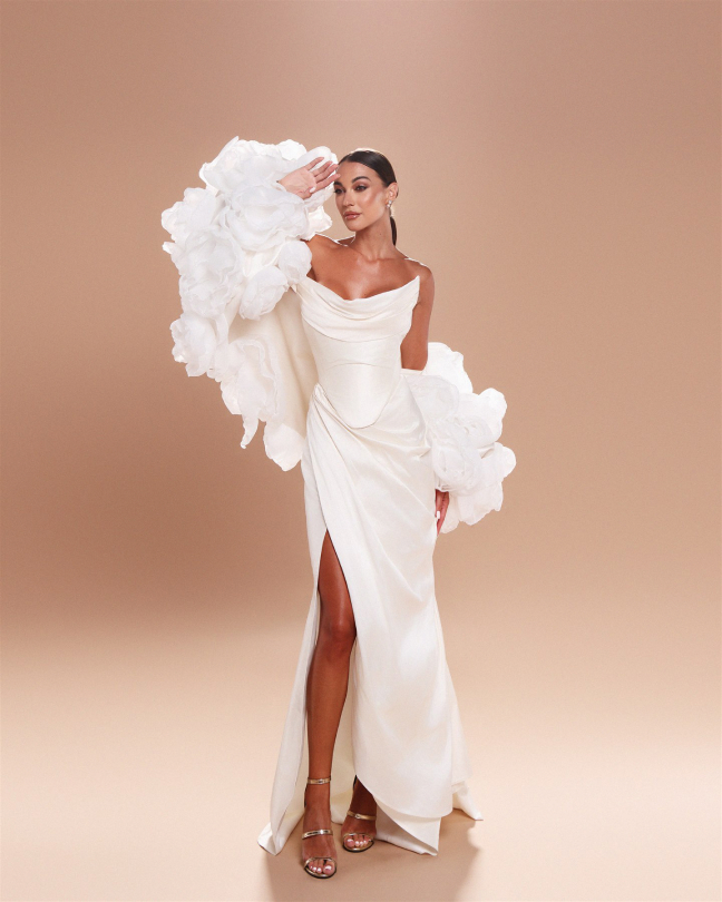
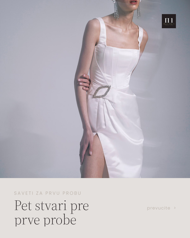
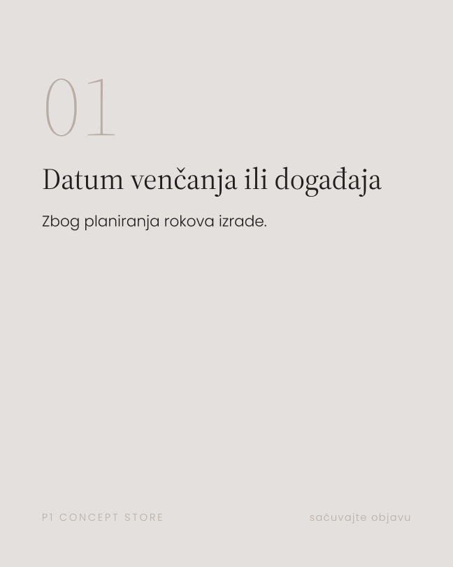
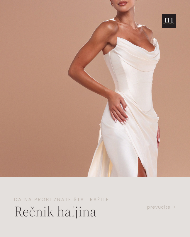
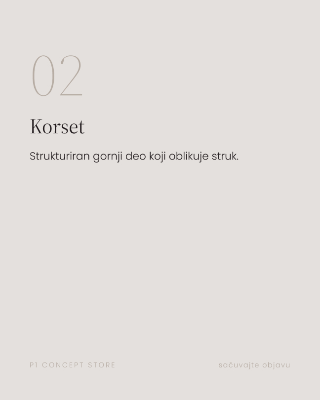
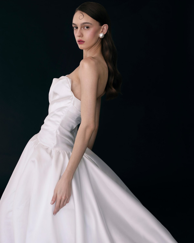
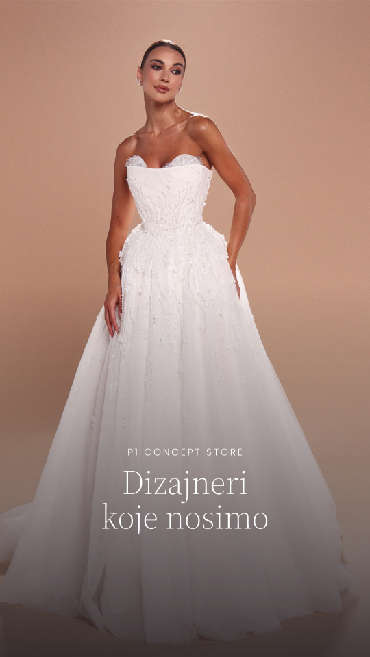
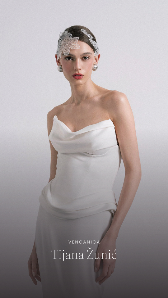
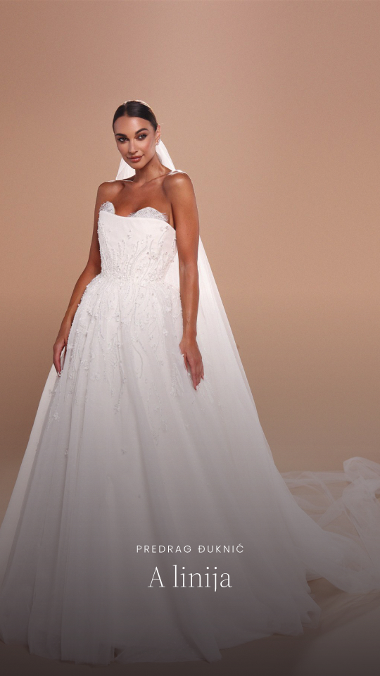
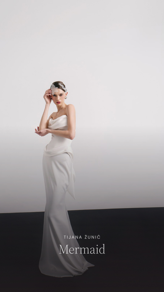
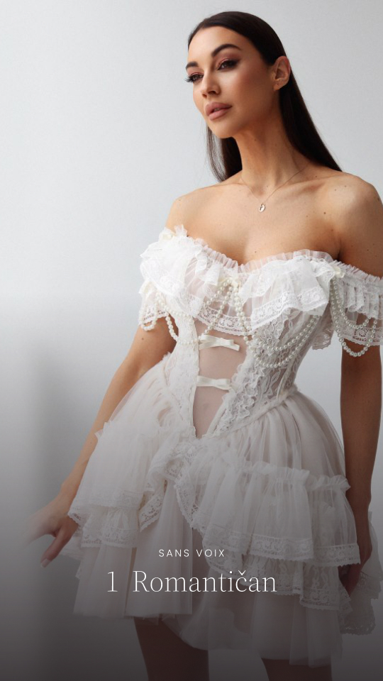
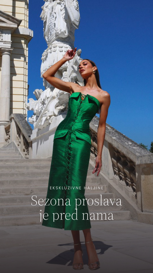
Instagram is where most of P1's visitors start, so it got the site's type and color too. Five templates cover a single photo, a carousel cover, a tip slide, a call to book and a story. A four week plan puts them to work: meet the designers, the dresses, how to choose a silhouette, and the month's favorite styles, each week ending with an invitation to book a fitting.
What P1 gained
Outcomes of the redesign
The new site replaced one that described the store in a few mixed language lines. What follows is what the redesign gave P1, and the evidence for each.
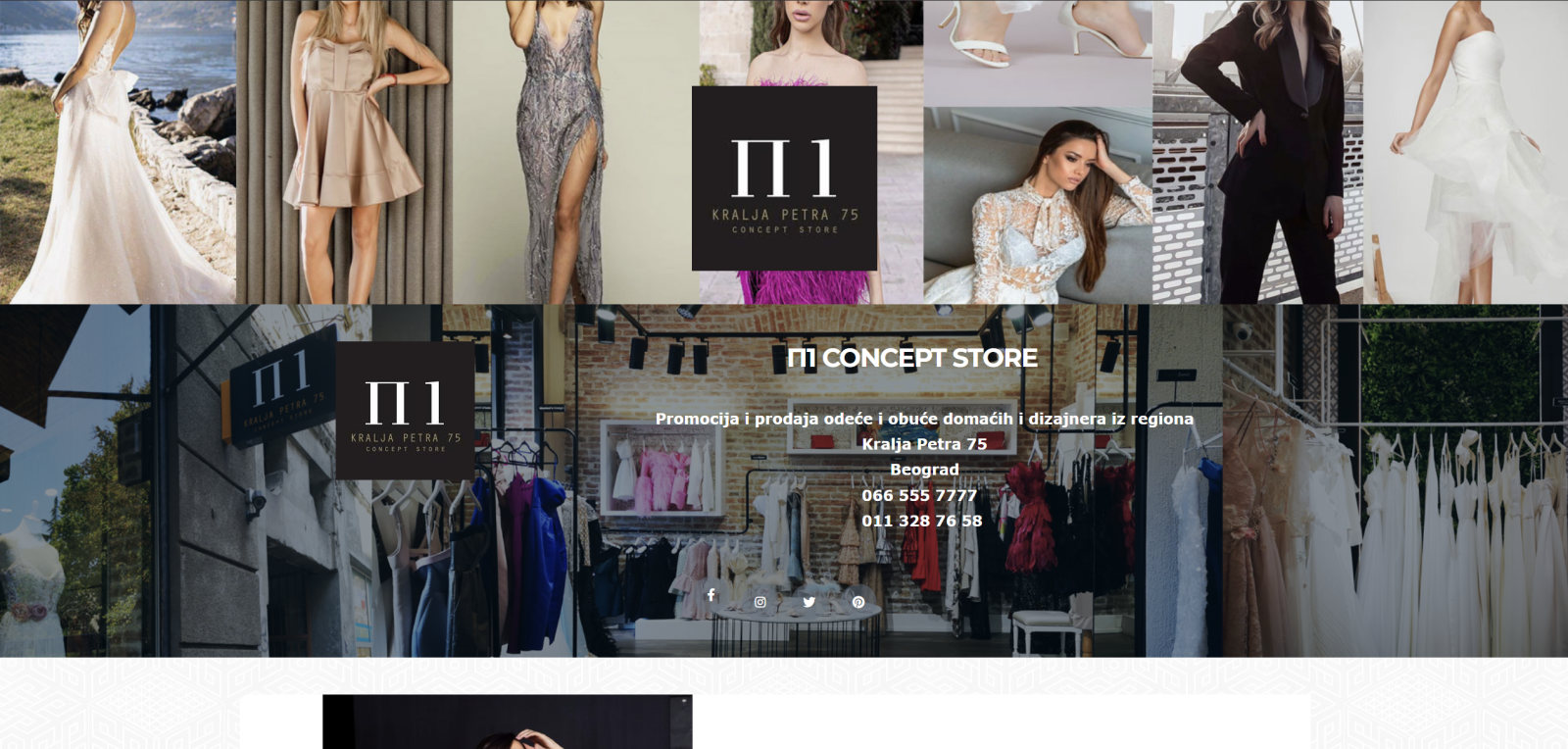
Before, the old site
After, the new home page
A photo collage and stacked category blocks became editorial pages per collection with large photography and no prices or cart, as the brief asked.
Wedding dresses give eight designers their own heading and gallery, exclusive dresses seven and accessories two, so a visitor can look for a designer by name.
Each page closes with an invitation to visit P1, and the contact page explains how fittings are booked, with the address, phone and opening hours.
The old site mixed Serbian and English in the same block, such as "Exclusive haljine". The new one speaks Serbian throughout.
Five templates and a four week plan of posts and stories use the same type and colors, so the feed and the site read as one store.
p1conceptstore.com
Thank you!