
Key Features
Home, The Route, The Why, FAQ, Get the Guide
In English and Romanian, on desktop and phone
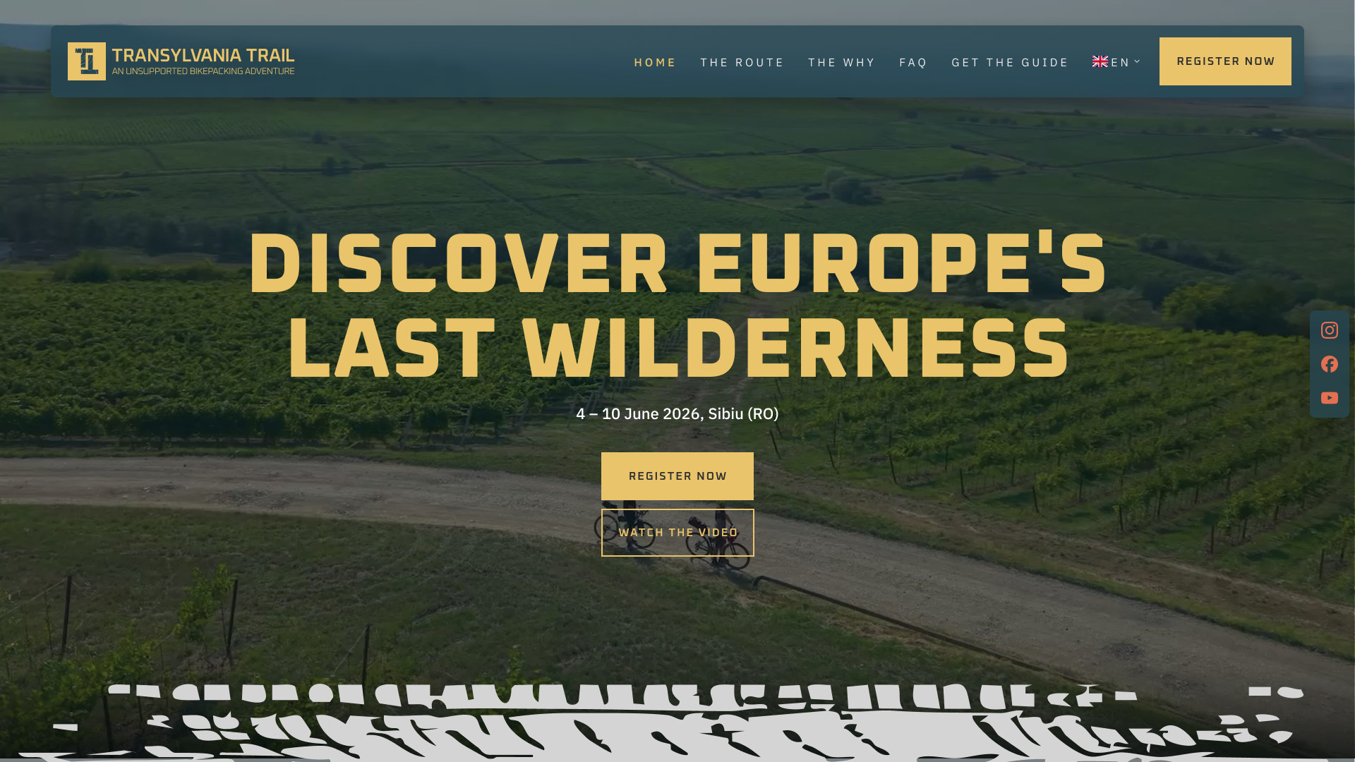
- Home Page: The ride in one scroll, from the opening film to the call to join.
- The Route: A 3D map, the route map and the elevation profile, with the numbers riders plan around.
- The Why: The idea of unsupported riding, written to be felt rather than sold.
- FAQ: Bikes, sleeping, getting to Sibiu, safety, and what to do if something breaks.
- Get the Guide: A free guide in exchange for an email, so interest turns into a list.
- Two Languages: Every page in English and Romanian.
Introduction
Client and Project
About Transylvania Trail
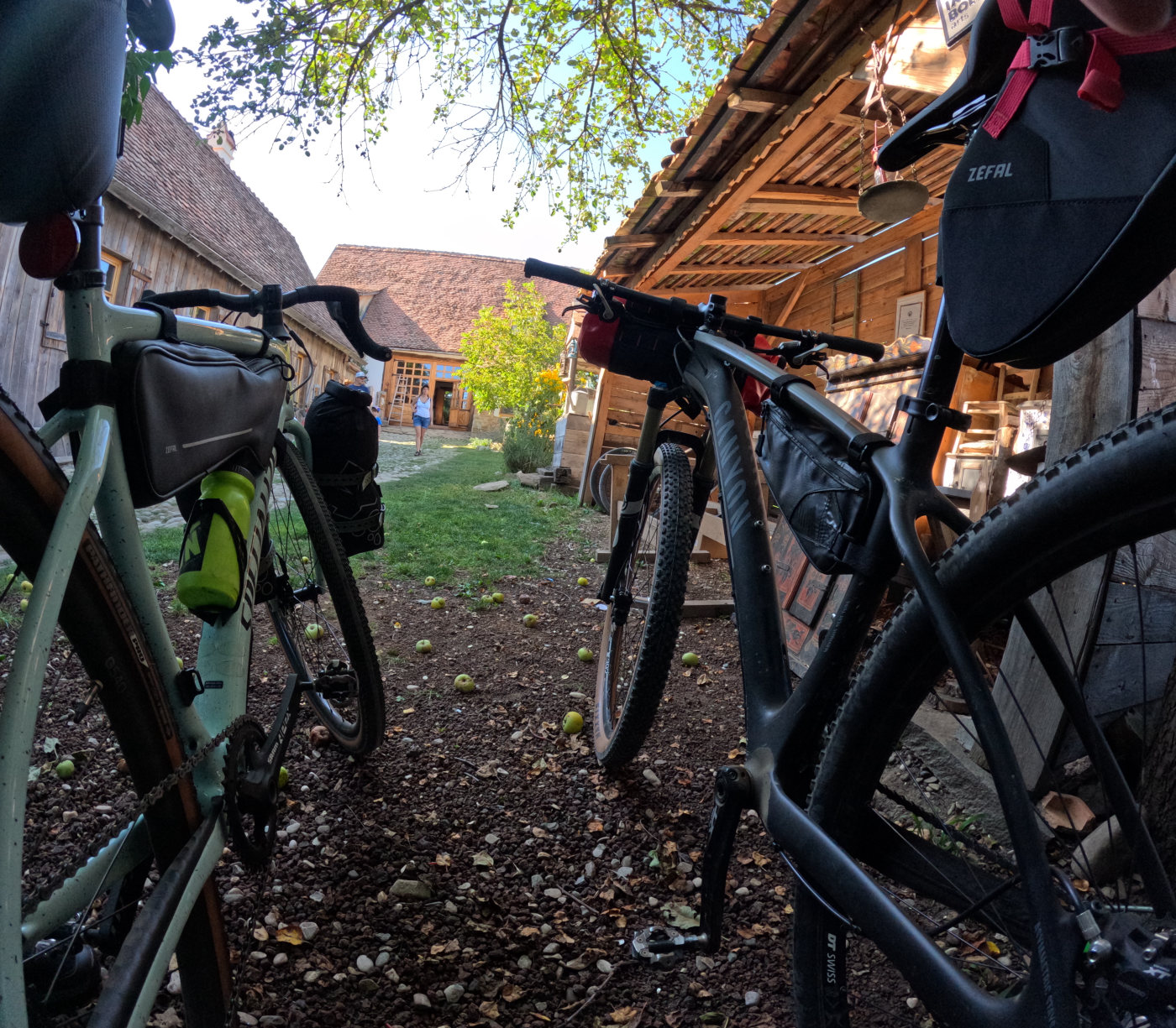
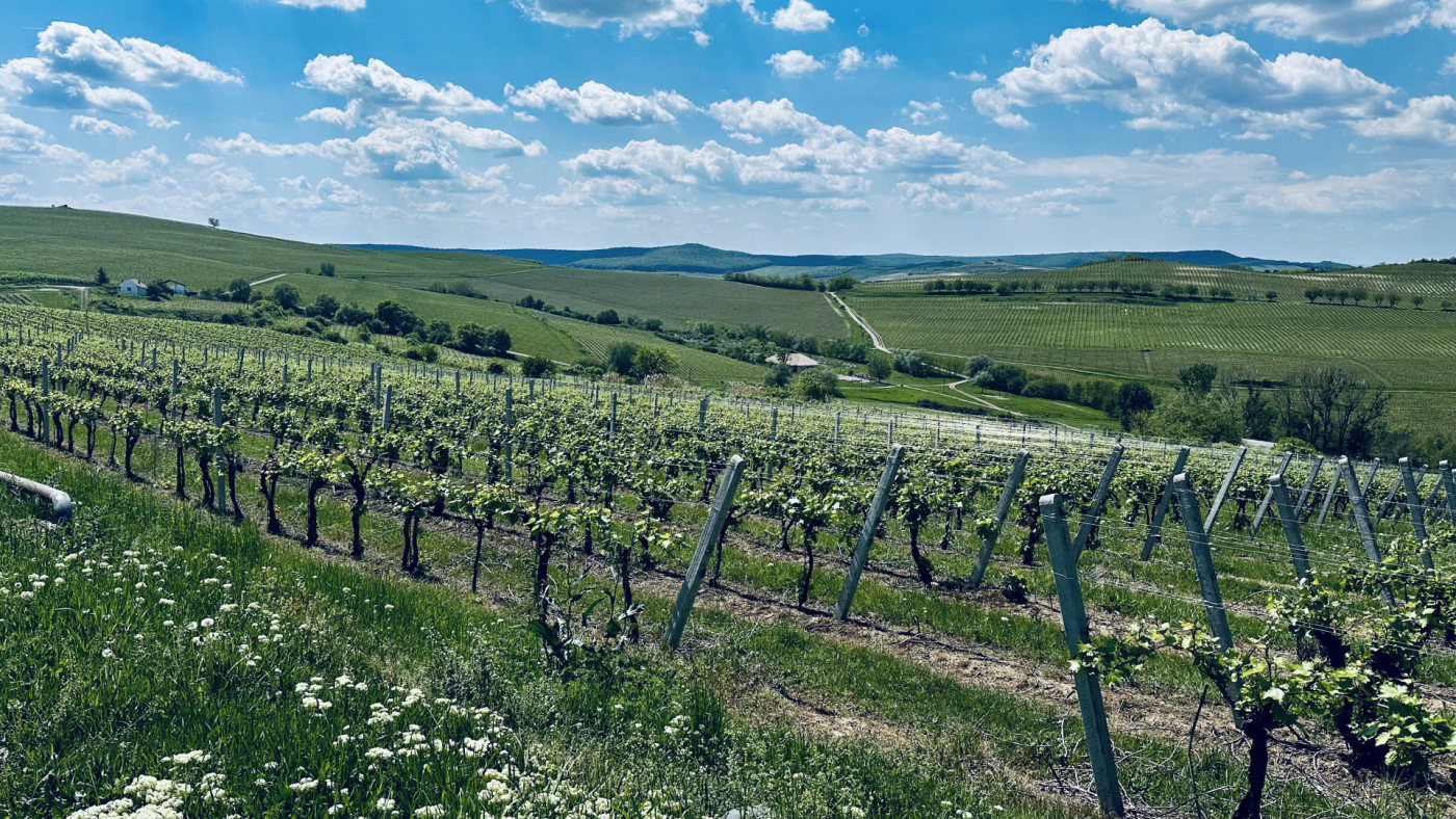
Transylvania Trail is a 520 km self-supported bikepacking loop through the heart of Romania, starting and finishing in Sibiu. It links gravel tracks, forest roads and quiet country lanes with Saxon villages, fortified churches and working farms, over more than 7,200 meters of climbing.
It is not a race. Riders carry what they need, choose where to eat and sleep, and ride at their own pace. The first edition ran from 4 to 10 June 2026.
The organizers had a route and a clear idea of the experience, but nothing to show it with: no name on the map, no identity and no website. They needed a brand that felt as wild as the trail and a site that could turn curiosity into riders.
My Responsibilities
- Brand identity: logo, color palette, typography, brand guidelines.
- Website: UI/UX design and WordPress development, English and Romanian, guide sign-up.
- Campaign: social media posts, event print, and the promo video’s creative direction and graphics.
Brand Exploration
From concept to final mark
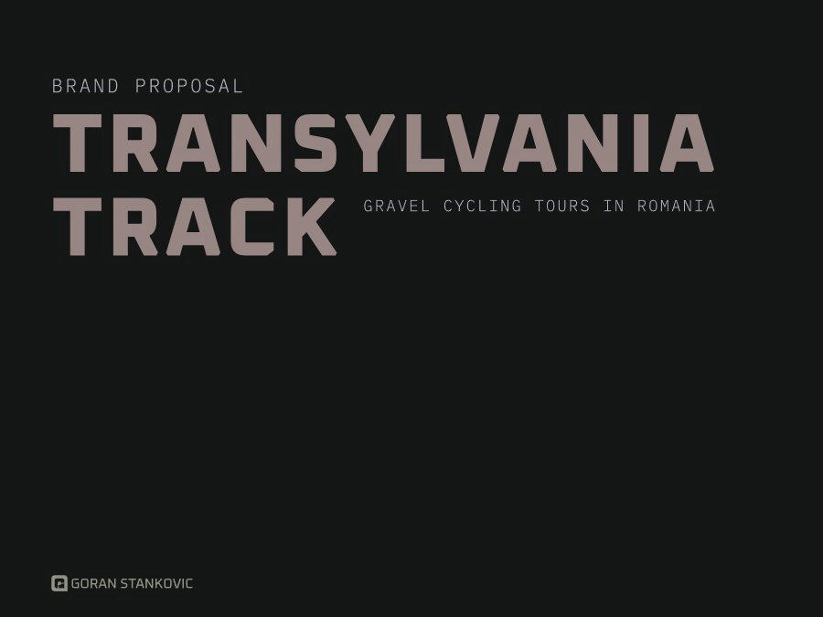
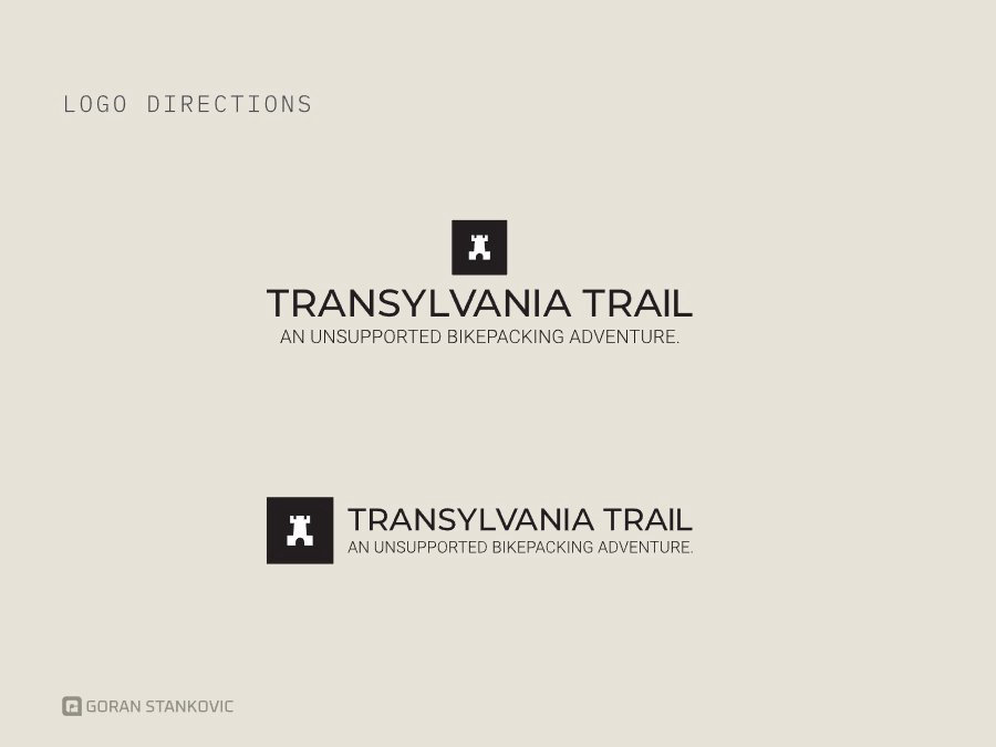
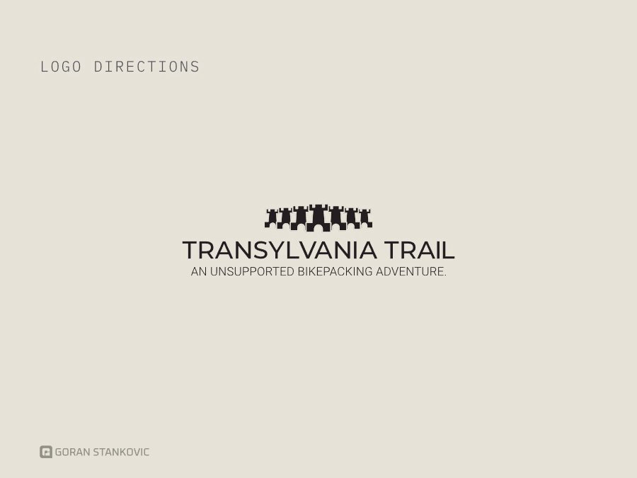
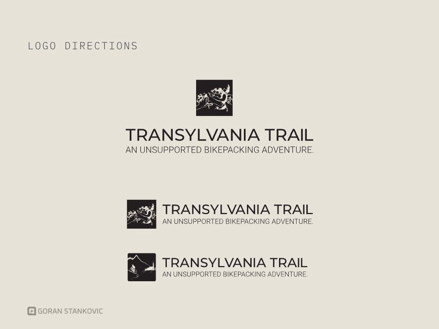
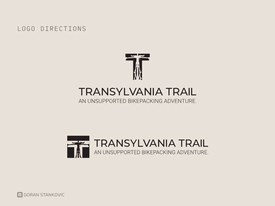
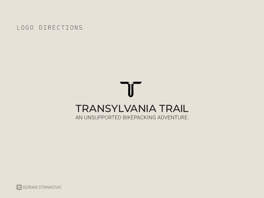
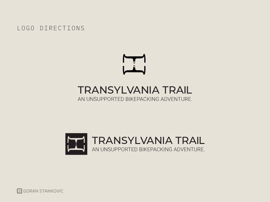
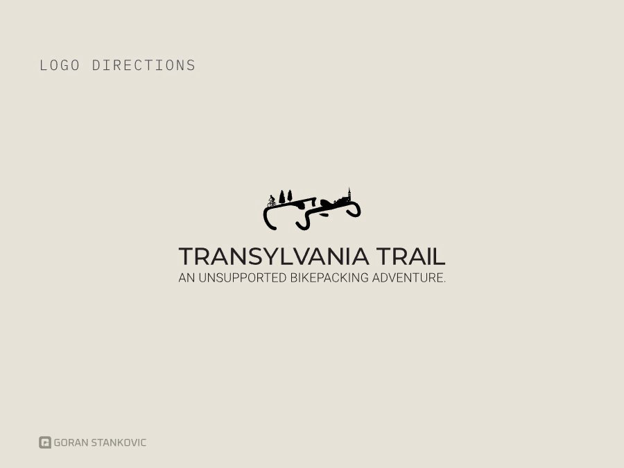
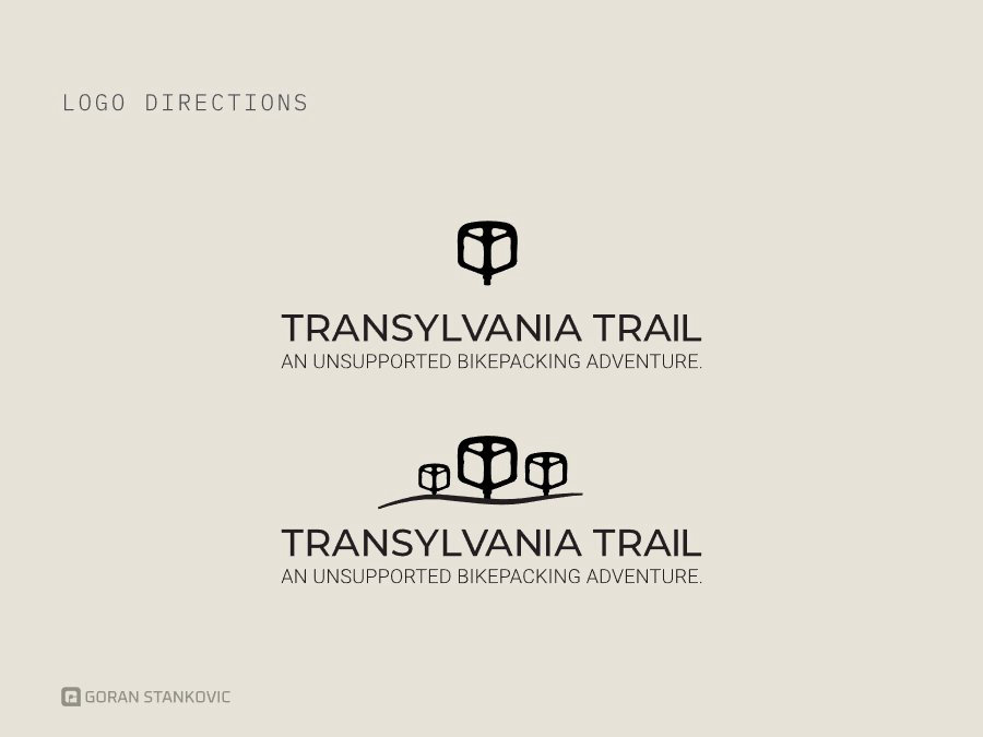
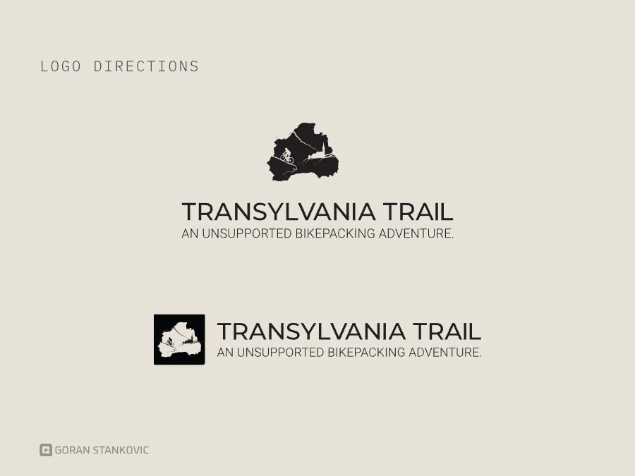
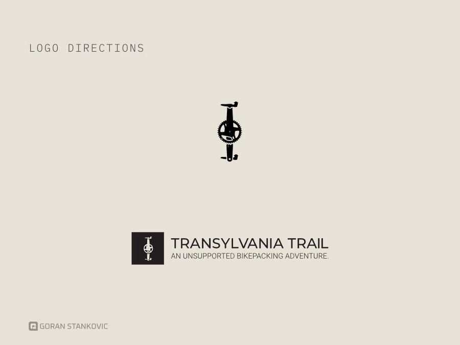
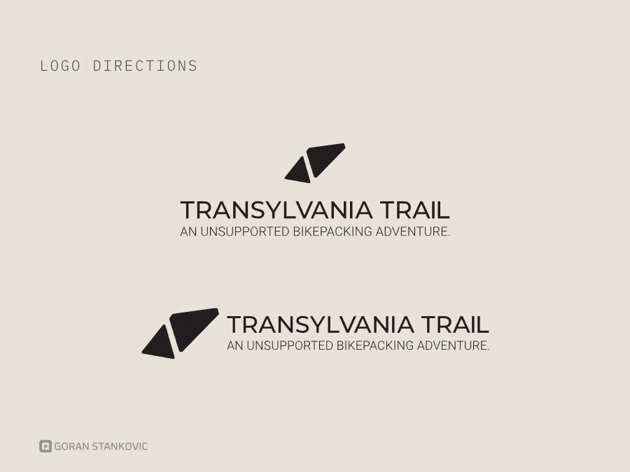
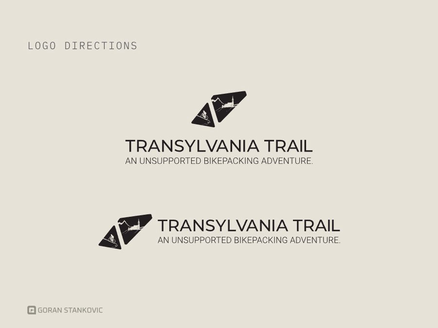
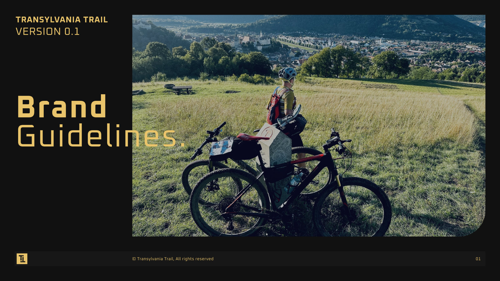
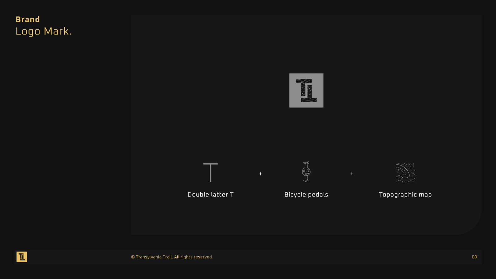
The identity was found in three rounds. A first concept tested the name Transylvania Track with two mark ideas, a rider and a folded map. Twelve logo directions followed, from fortified churches to bike parts, and the chosen TT mark was then set out in brand guidelines covering the logo, color, type and imagery. Each round was shown to the organizers, so the final mark was their choice and they could see what it was chosen over.
Name and vision
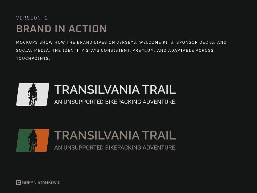
Version 1, the rider
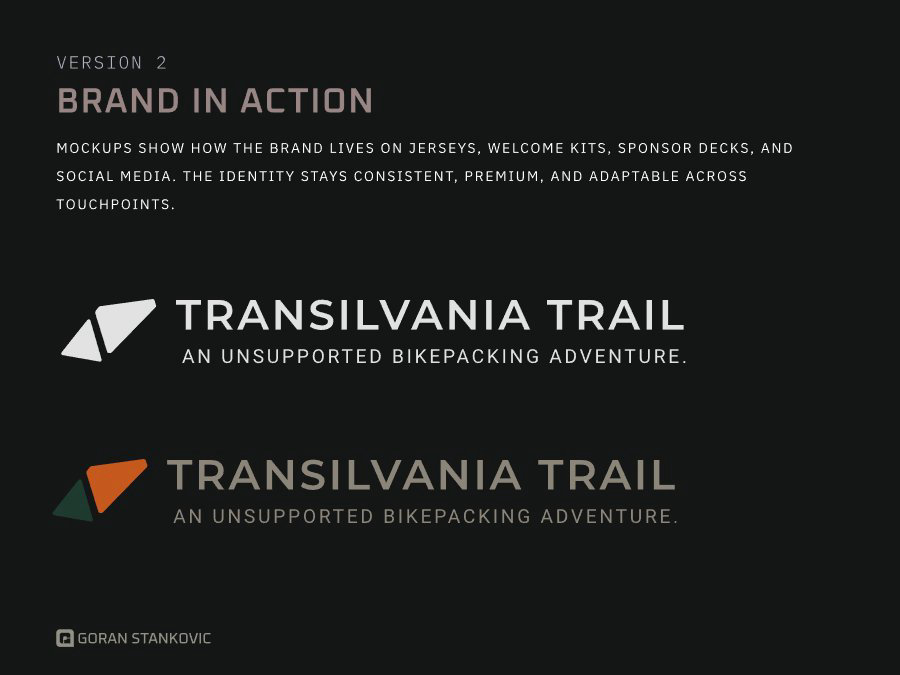
Version 2, the folded map
Cover
Logo mark
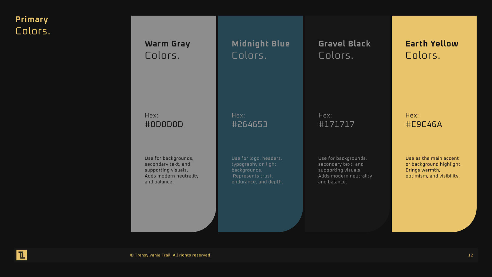
Primary colors
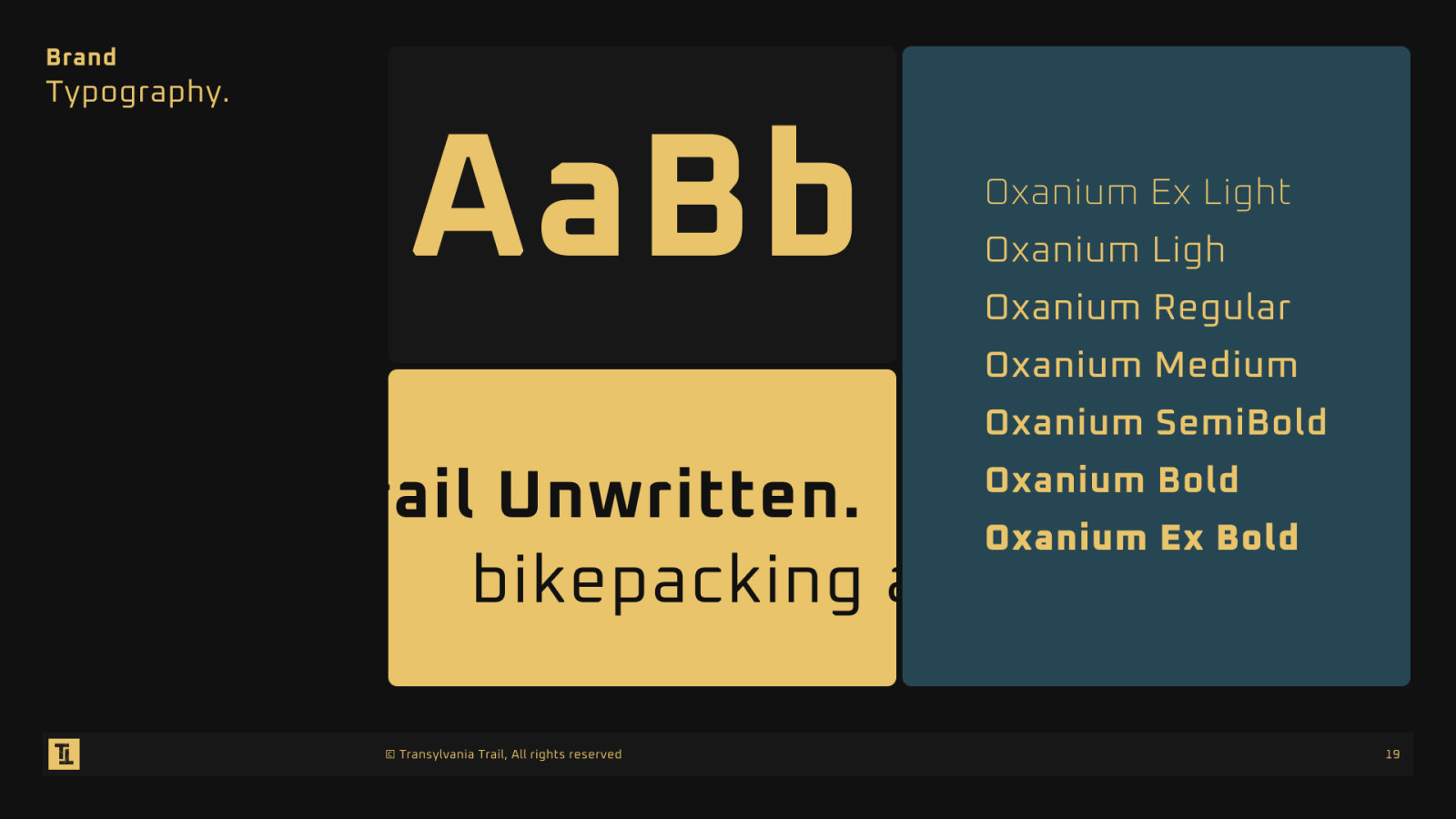
Typography
Branding
Mood board
One identity from the start line to the feed. The rider jersey carries the contour lines across the chest, the bottle and billboard take the mark in a single color, and the ads and the website use the same petrol ground, so every touchpoint looks like part of the same ride.
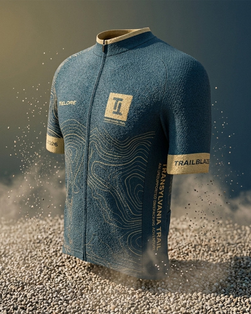
Rider jersey
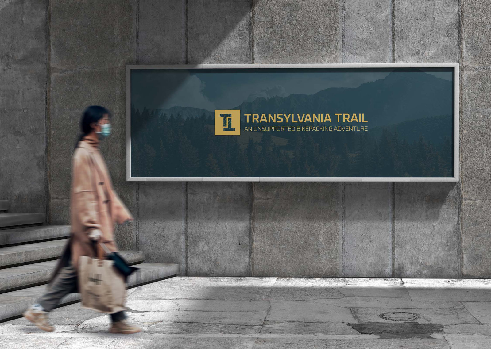
Billboard
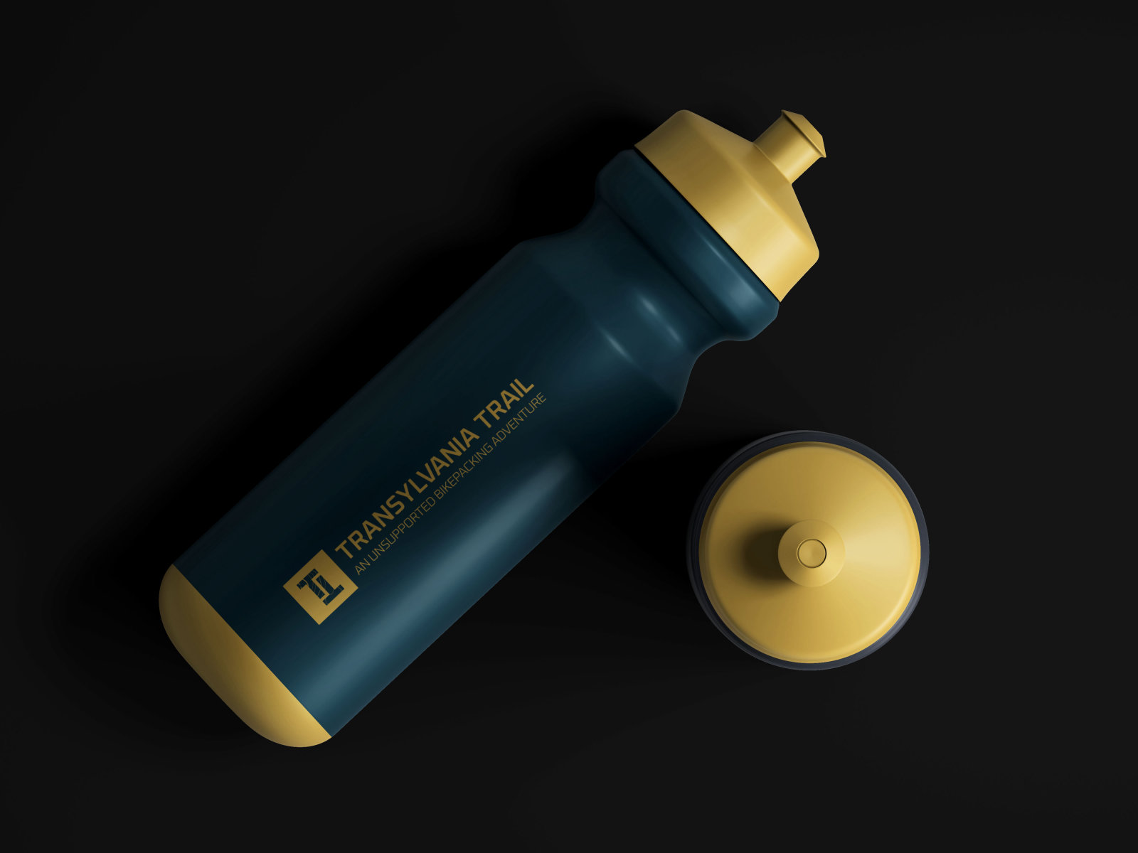
Bottle
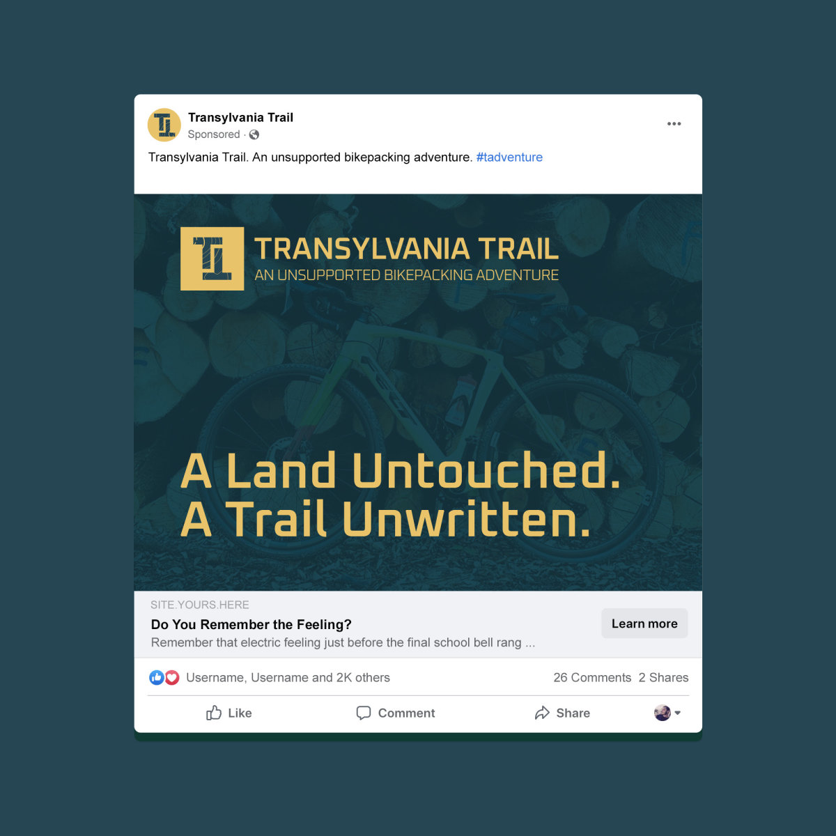
Social ad
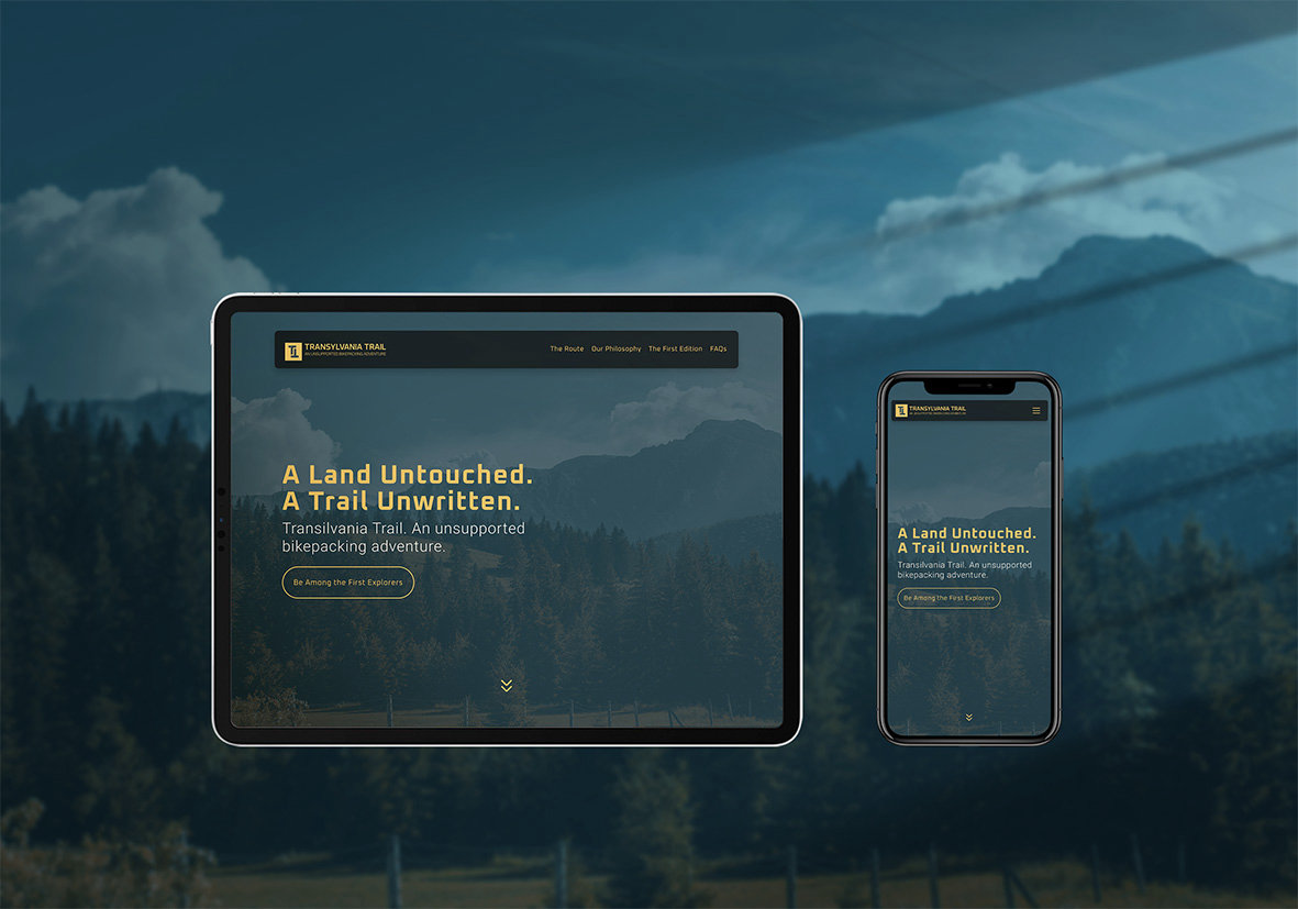
Website on every screen
Event Print
First edition, Sibiu
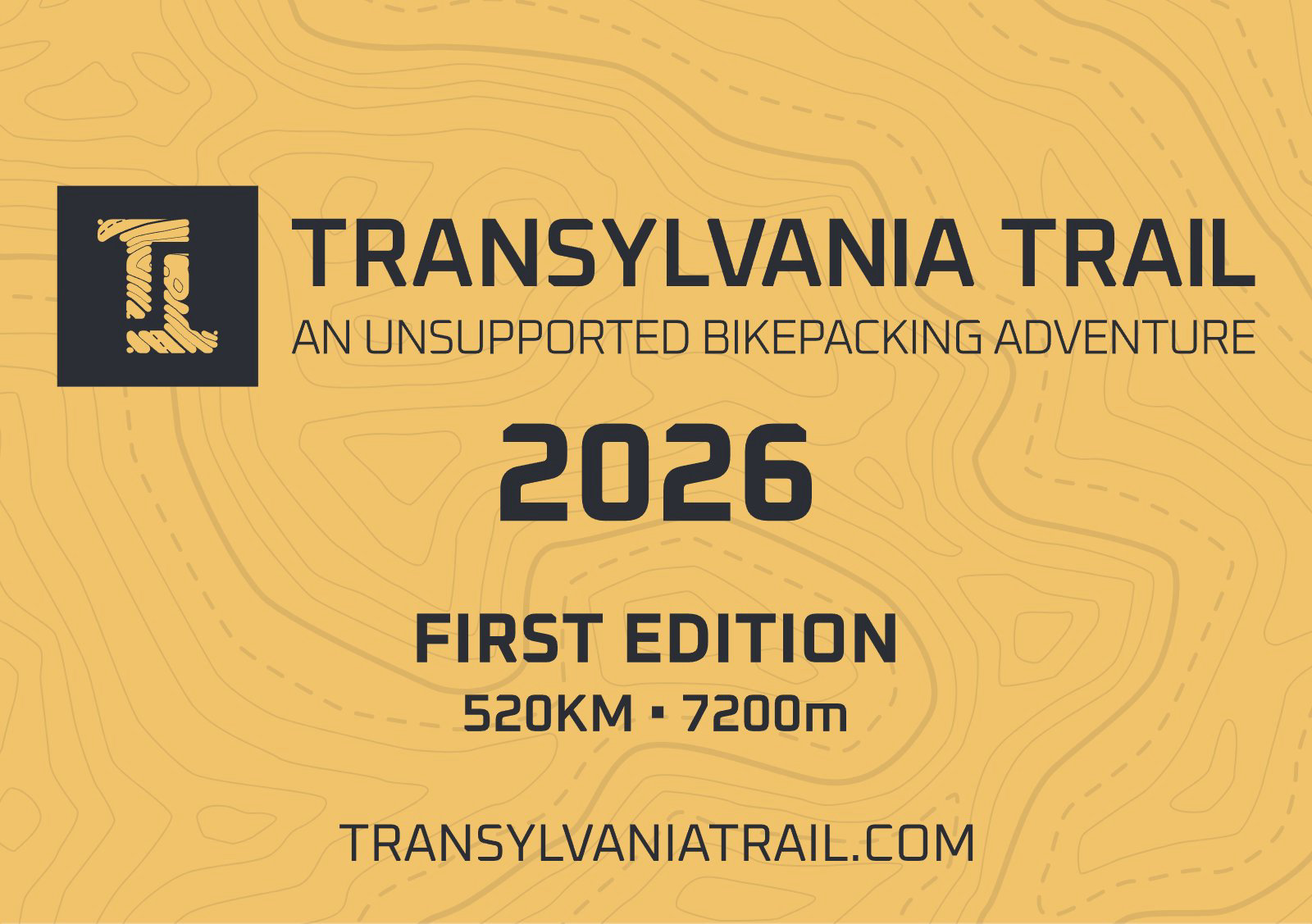
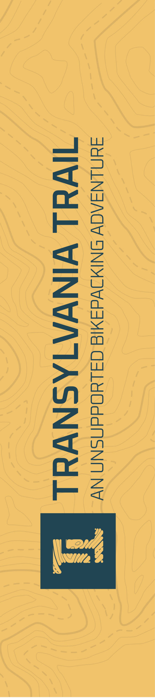
For the first edition the brand had to work in a field in Sibiu, not only on a screen. The start and finish backdrop, the finisher and trail flags, frame stickers and A5 plates for bikes and bags were all set up for print with bleed and cut lines.
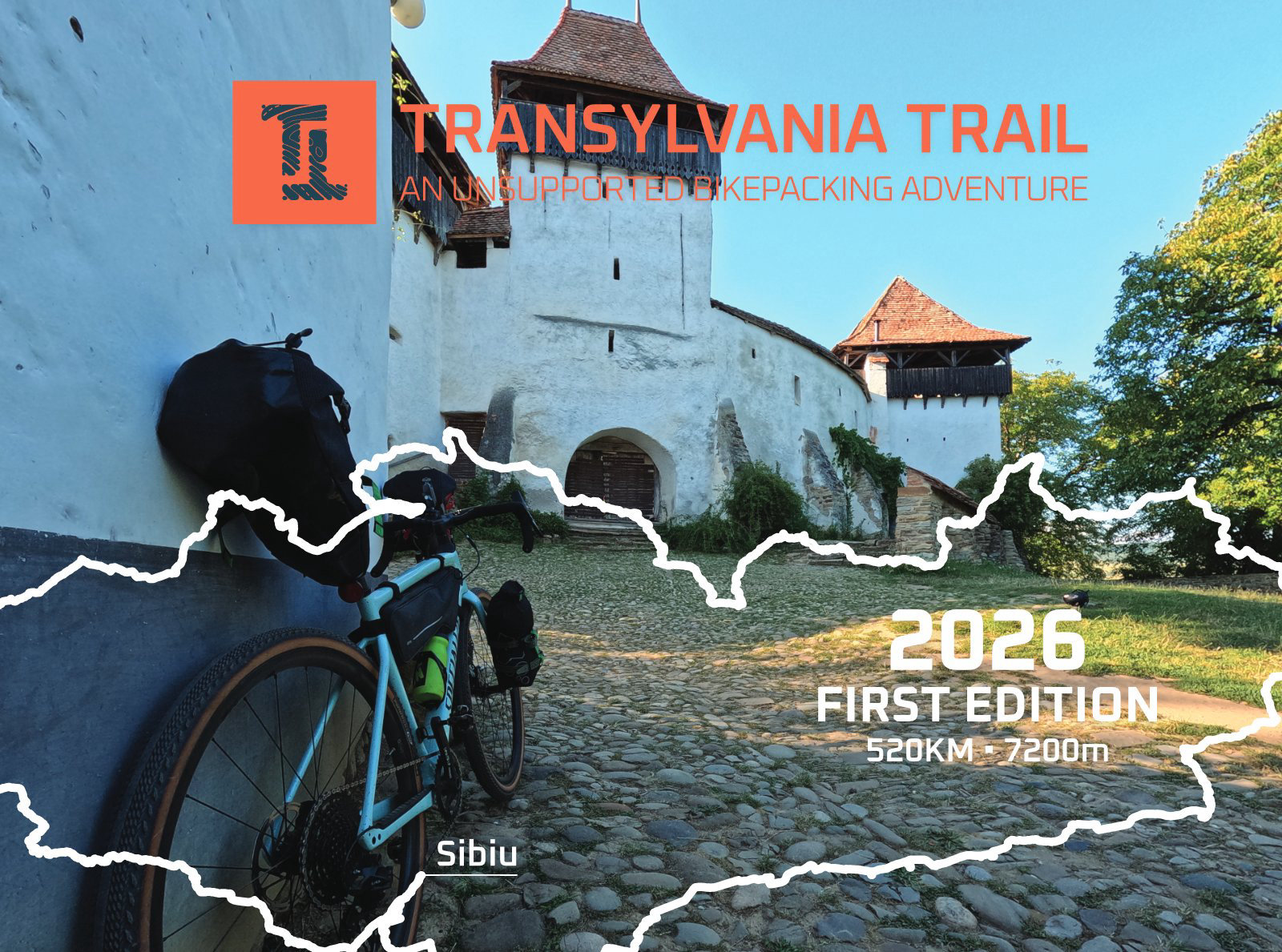
Start and finish backdrop
A5 bike plate
A5 bag tag

Finisher and trail flags
Circle sticker
Frame sticker
Home Page
Desktop View
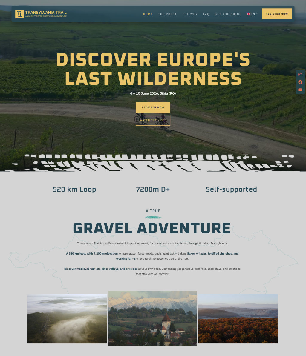
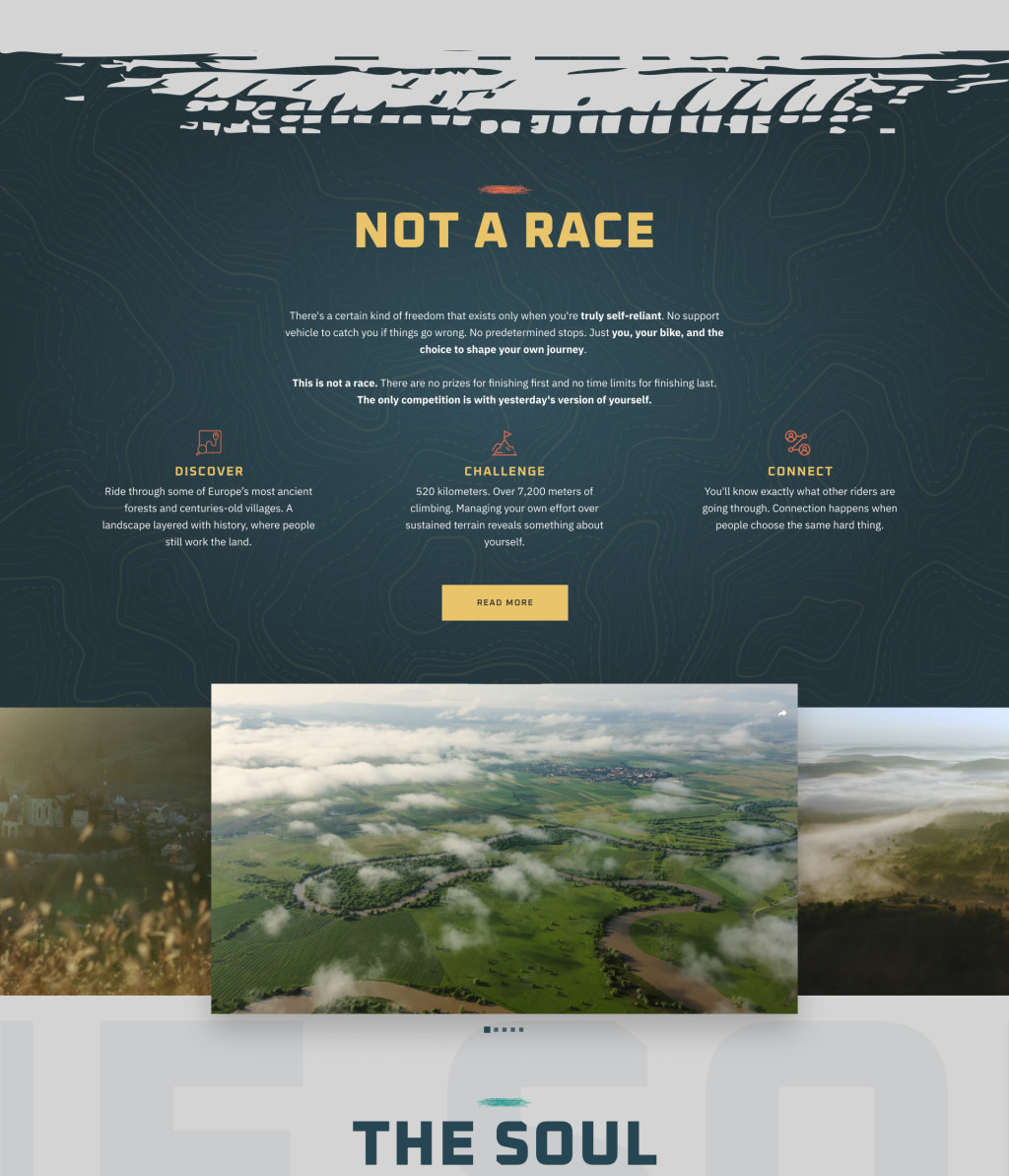
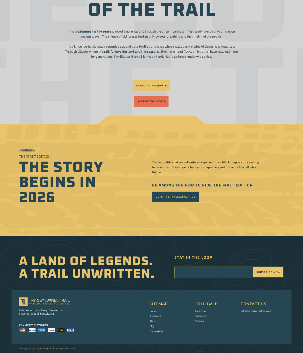
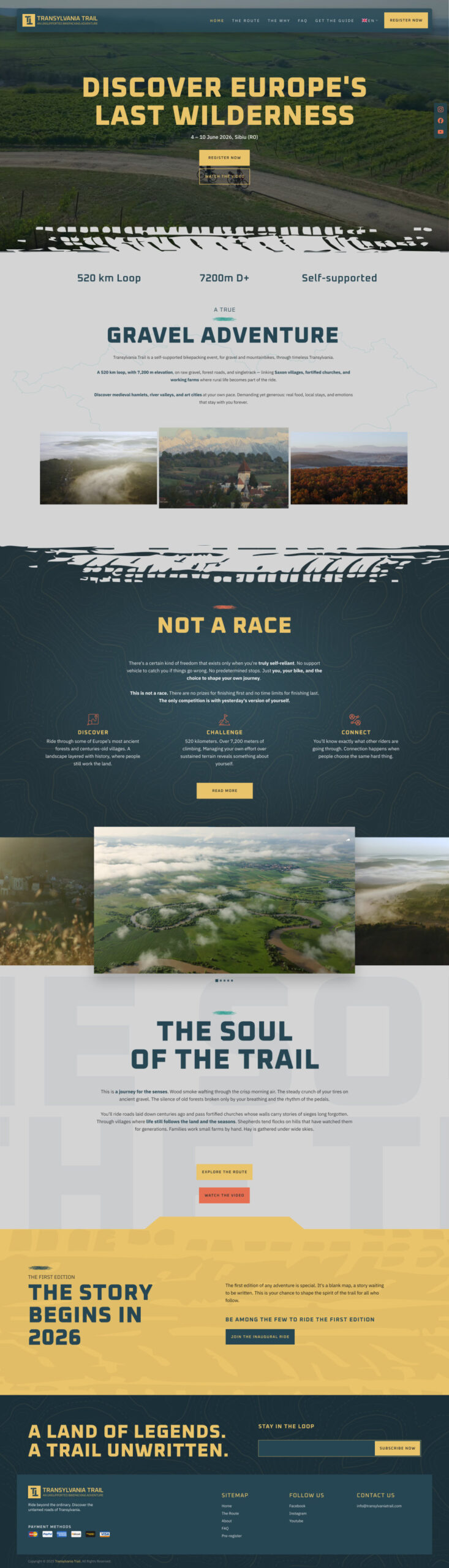
The home page opens on a drone shot of riders on a gravel road through the vineyards and a single line: Discover Europe’s last wilderness. Three numbers follow, 520 km, 7,200 m and self-supported, then the story moves from the gravel to the philosophy to the first edition, with a way to register or watch the film at every turn.
The Route
The loop and its stops
Riders plan a 520 km ride around three questions: where it goes, how hard it climbs, and what the surface is like. The route page answers each with a picture before a paragraph: a 3D relief map that places the loop in Romania, then a route map that names the stops worth riding for, from the Alba Carolina citadel to Sighișoara and Viscri, with Sibiu as the start and finish.
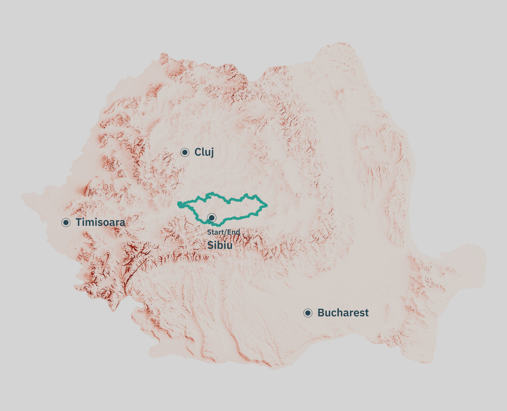
3D relief map, the loop in Romania
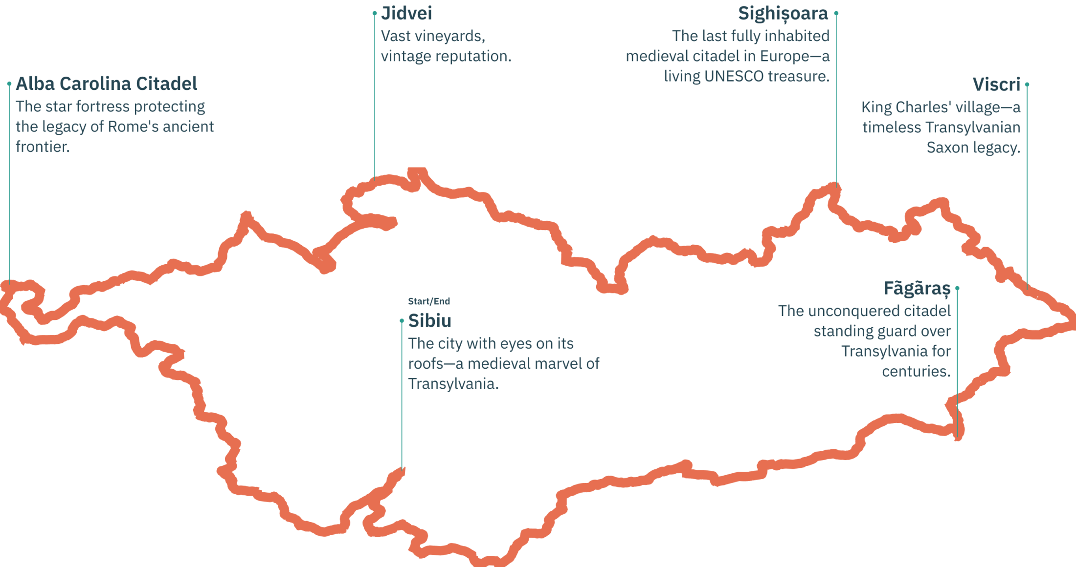
Route map, with the stops worth riding for
Inside Pages
The Route, The Why, FAQ, Get the Guide
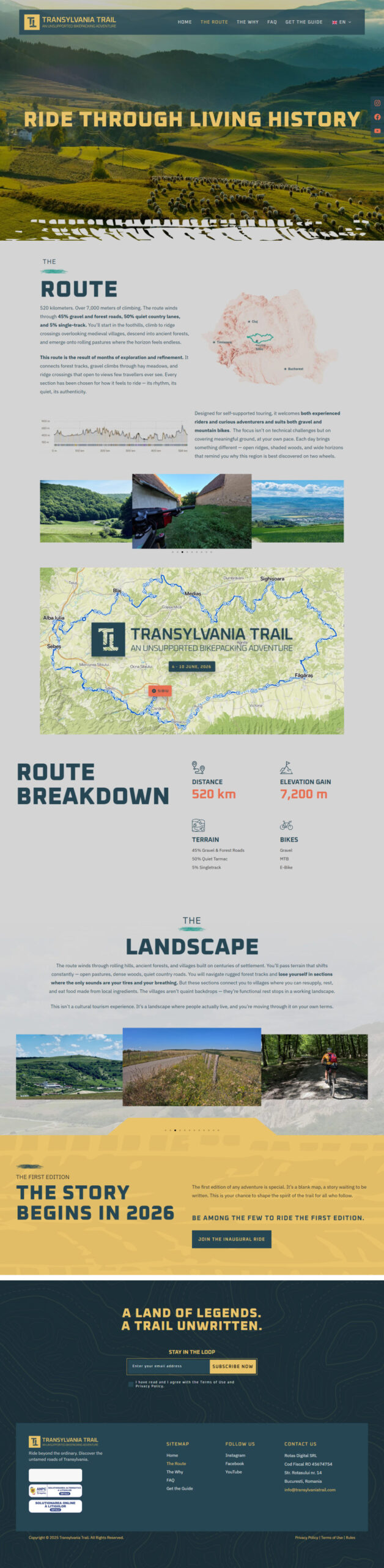
The inside pages share one frame: a full-width photograph with the title in mustard capitals, then the content on a light ground marked with contour lines. The FAQ sets every question in coral so it can be scanned, and the guide page asks only for a name and an email.
The Route
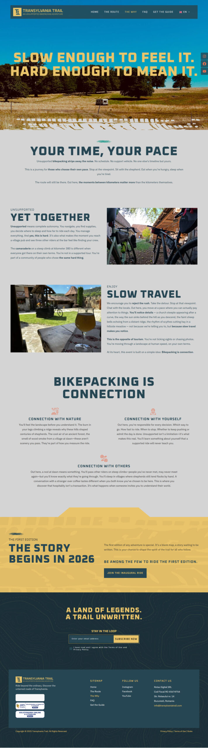
The Why
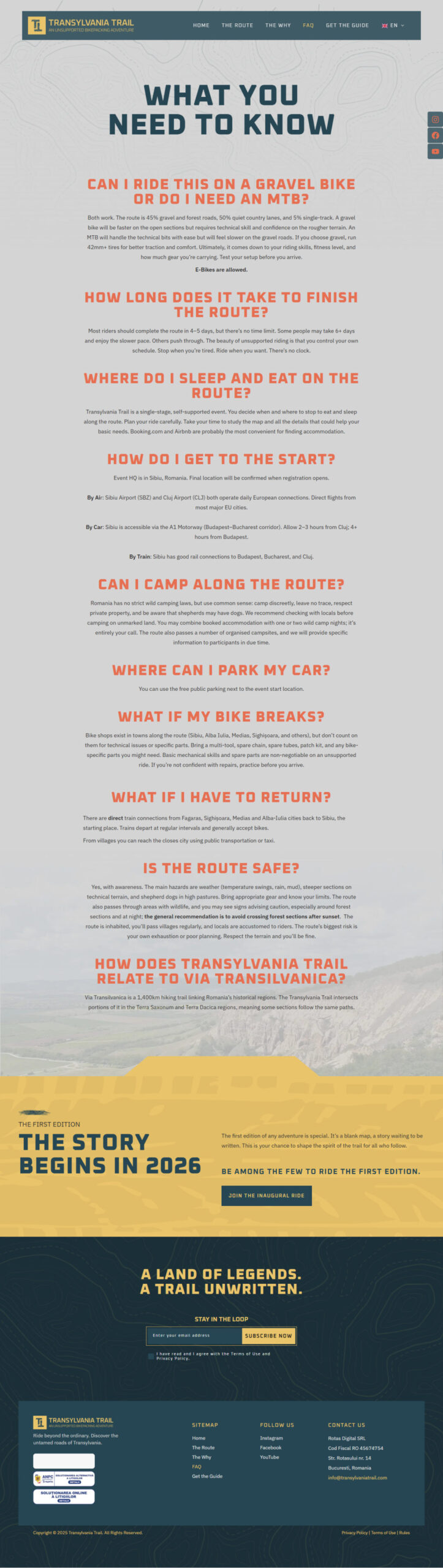
FAQ
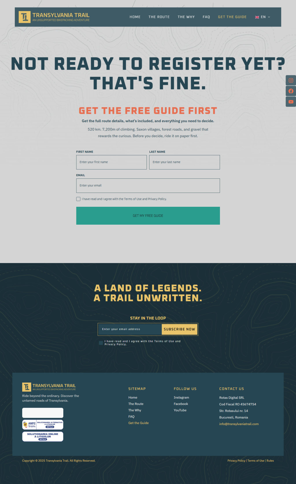
Get the Guide
Responsive Design
Mobile Version
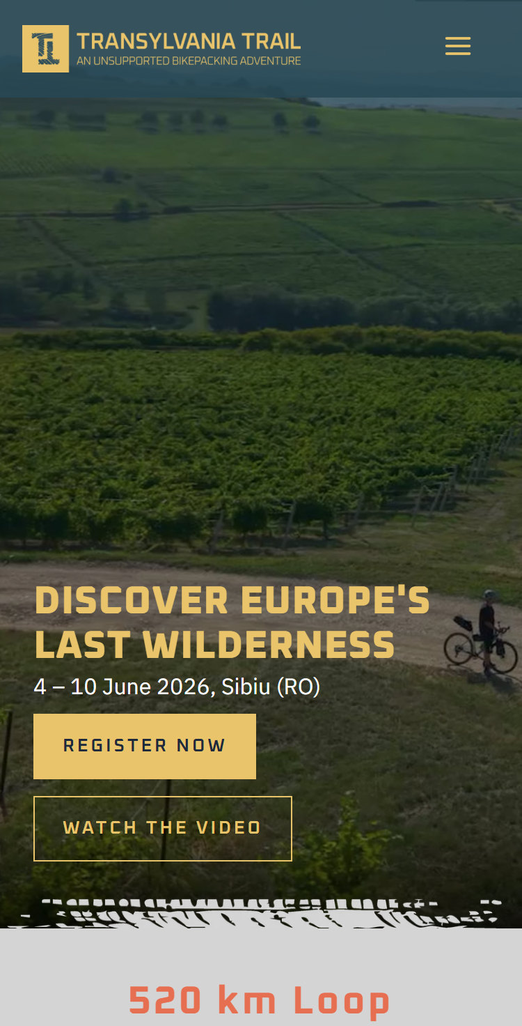
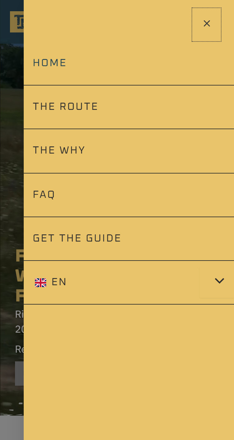
Most riders find the trail on a phone, from a post or a friend’s link. On mobile the film still opens the page, the stats stack into one column, the menu folds into a mustard panel, and the route map and guide form stay full width so nothing has to be zoomed.
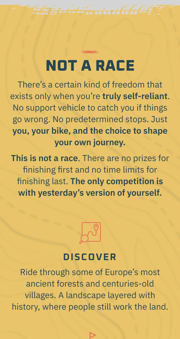
Not a race

Route breakdown
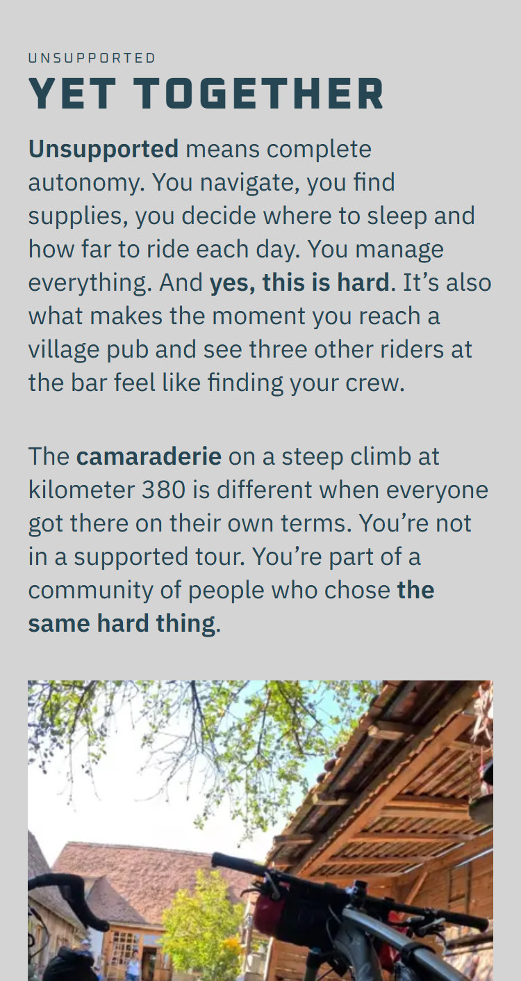
Yet together
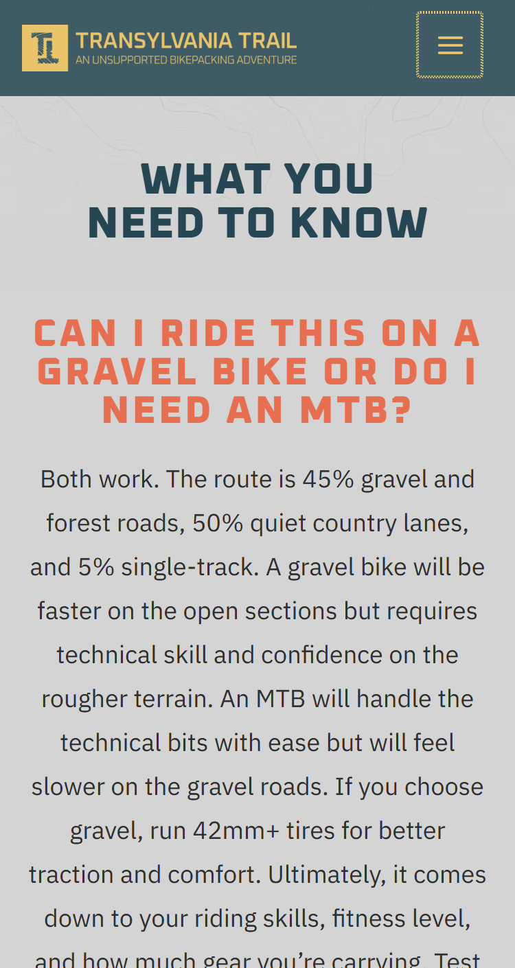
FAQ
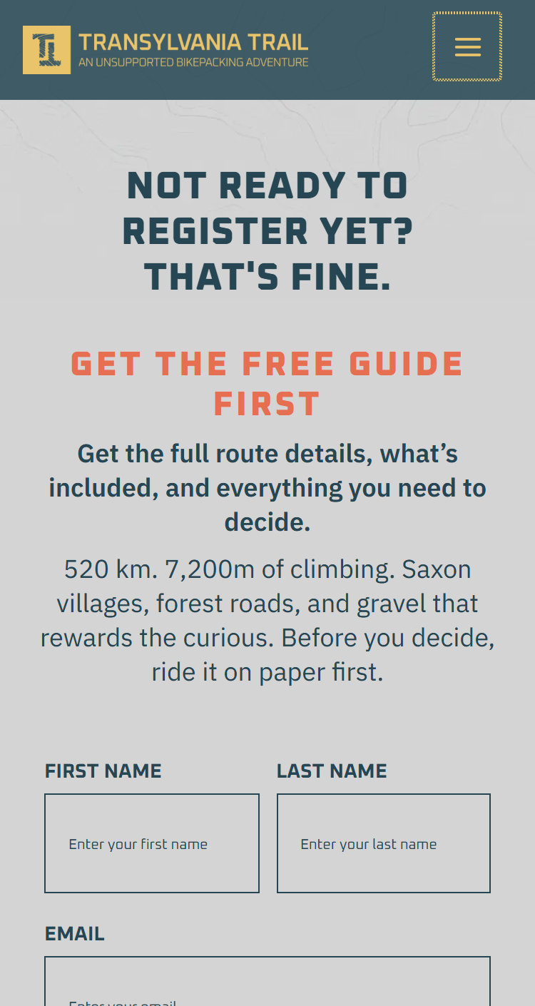
Get the guide
Navigation menu
Social Media
Launch campaign
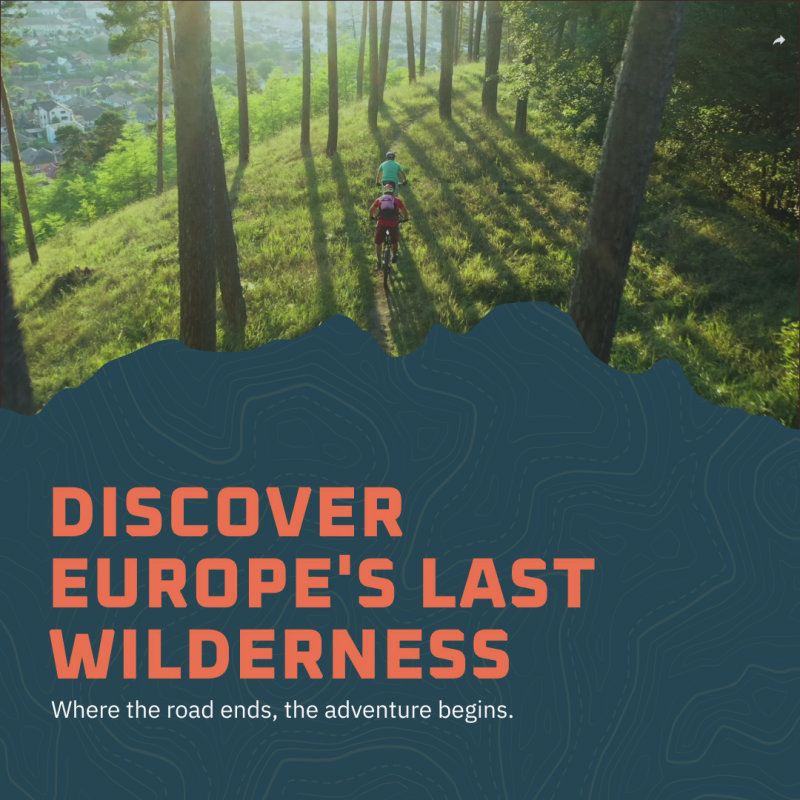
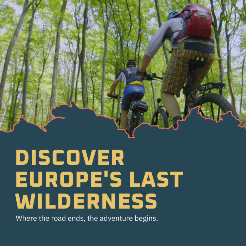
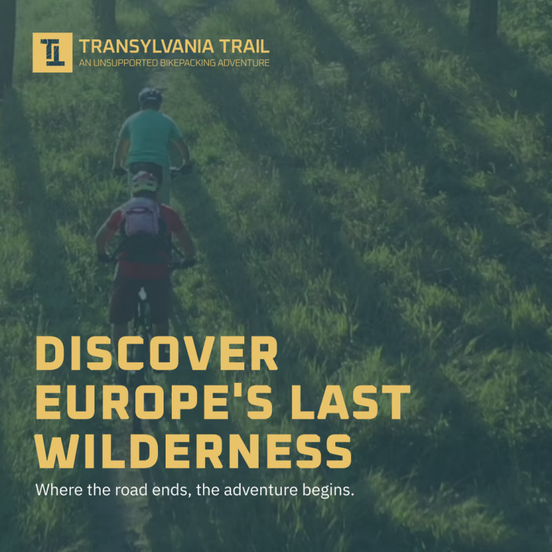
The launch campaign ran on Instagram and Facebook before there were riders to show. The posts carry the same petrol ground, mustard headlines and torn edge as the website, and a four slide carousel reads as one panorama when swiped, walking from a fabled land to the riders who will cross it.
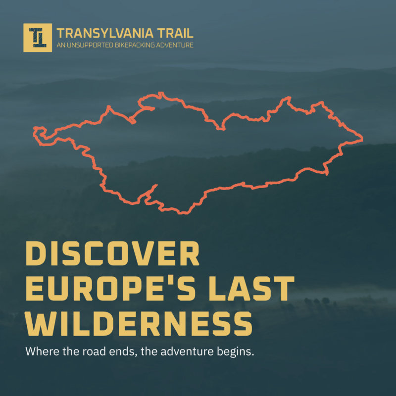
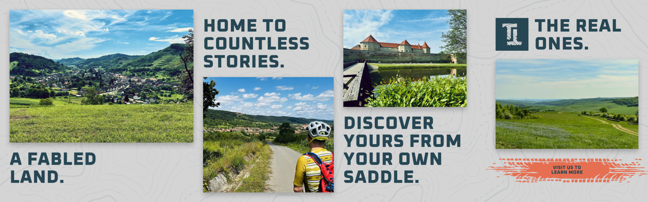
Carousel post, four slides that read as one panorama
Promo Video
Creative direction and graphics
The film was shot by the organizers’ crew. I set the direction for how it should look and be cut, from wide drone shots of the villages to riders on the gravel, and designed the title cards and the closing frame in the brand’s type and color, so the video reads as part of the same campaign.
Transylvania Trail promo film, 1:28
Title card, Discover
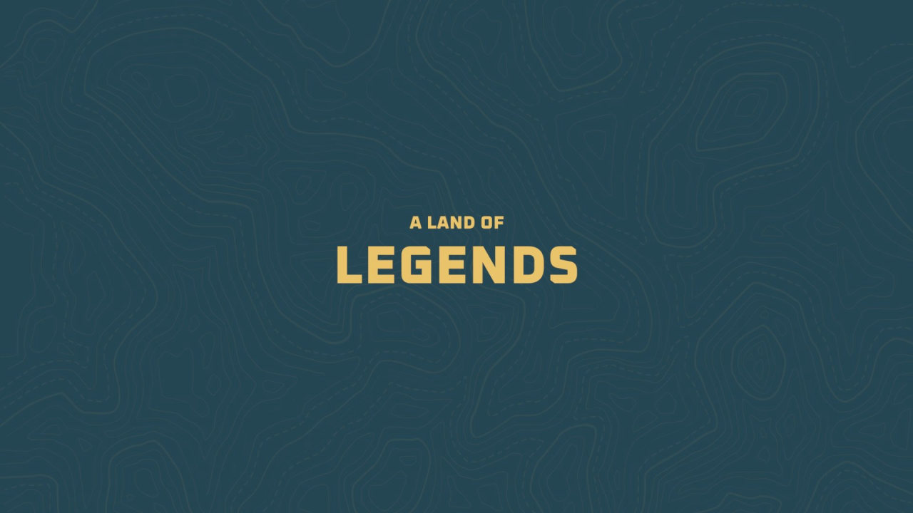
Title card, A land of legends
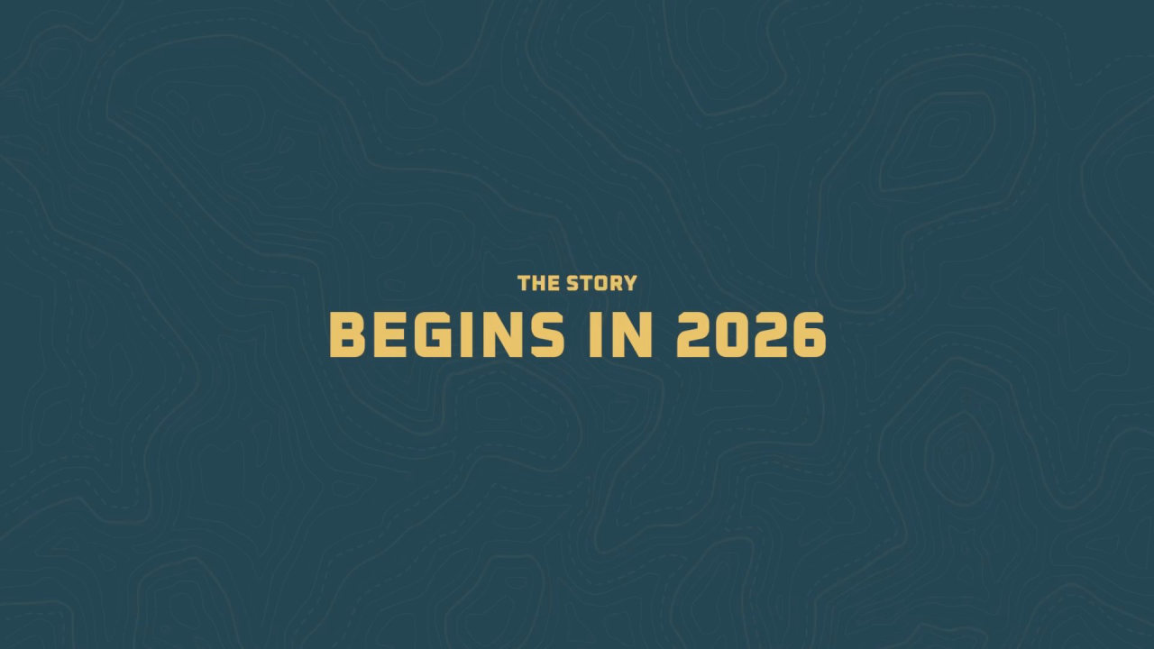
Title card, The story begins in 2026
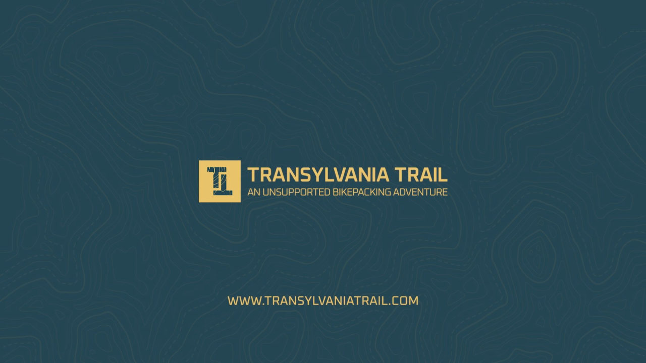
Closing frame