


Key Features
Video production, showreel, single film pages, contact
Fast, easy to navigate, clean
- Impactful Homepage: Hero video, intro tagline.
- Portfolio: Film grid, single film pages.
- Services: Production service, incentives, region.
- About Us: Company story, team.
- Contact Page: Contact details, form.
- MORE: Partner agency showcase.
- Trusted Brands: Client logo wall.
- Interactive Elements: Video backgrounds, animations.
- Social Media: Vimeo, Facebook and Instagram links.
- Responsive Design: Mobile-friendly layouts.
- Security: SSL throughout.
- Call to Action: Clear CTAs closing each page.
- Company Presentation: One-click download.
- Studio Counters: Years in business, projects.
- Awards: Housekeeping festival laurels.
Introduction
Client and Project
About Focused Production
Let’s be Focused!
We are a boutique production house, small enough to pay super close attention to every single detail, but big enough to handle every task.
We don’t see ourselves as just a team. It’s more of a dream team. We know our job and we know each other. Experience, expertise and energy are our main strengths.
We focus on what’s important: quality, cost-effectiveness and professionalism.
Showreel
Showreel Mood
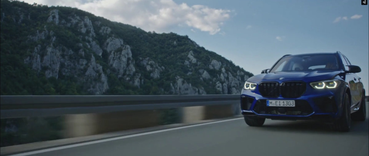
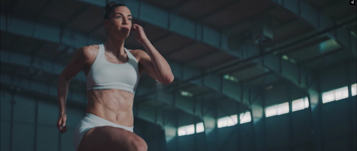
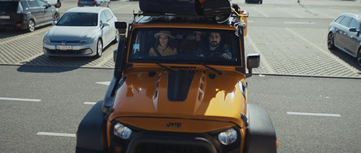
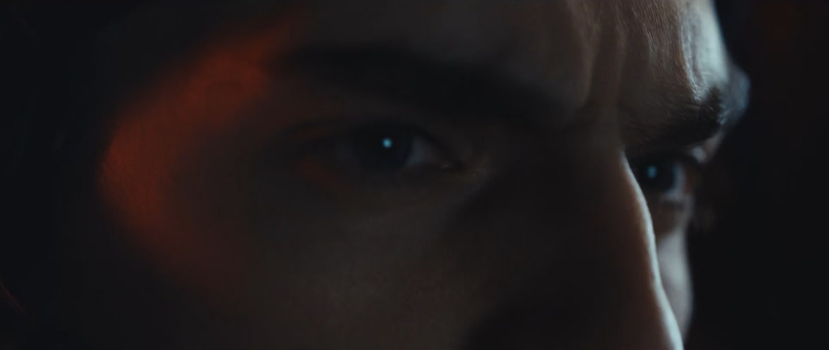
Six commercials from the Focused catalogue set the mood for the design. The dark, quiet interface exists to let footage like this lead, so every page gives the films the most room and the interface the least.
 TVC Big Fashion K2Client: Big Fashion
 TVC Big Fashion HeistClient: Big Fashion
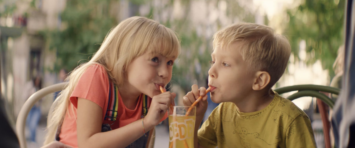 TVC Cedevita ono nesto CEClient: Atlantic Grupa / Cedevita
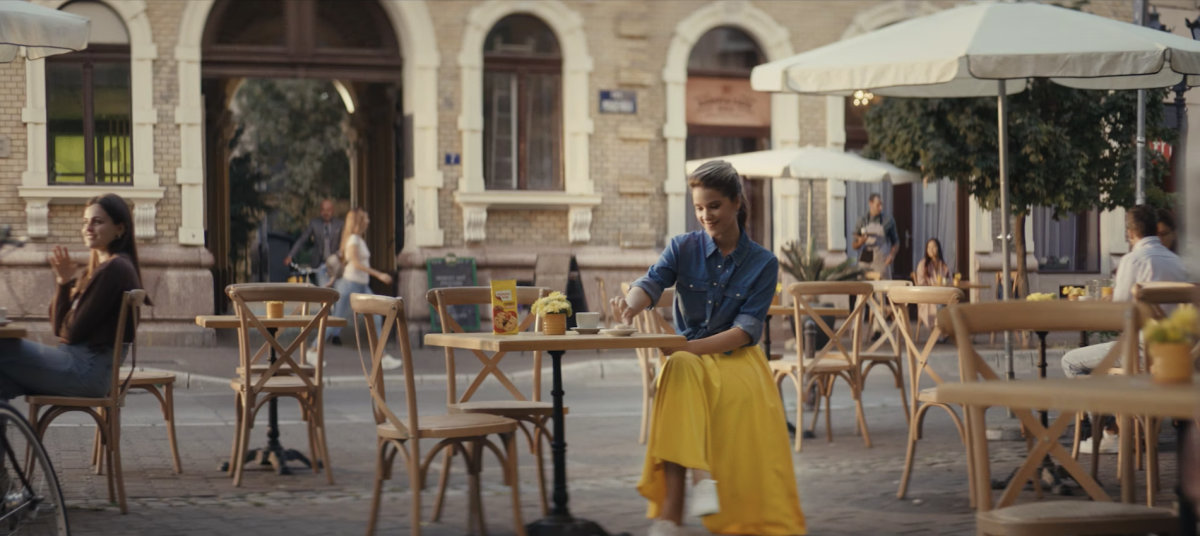 TVC Najlepse Zelje CookieClient: Atlantic Grupa / Najlepse Zelje
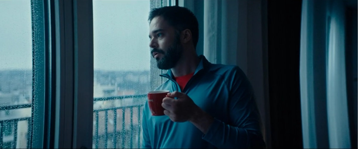 TVC Doncafe MomentClient: Doncafe
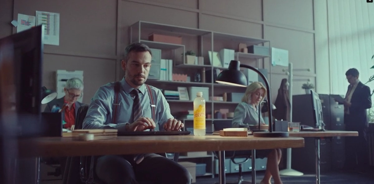 TVC Cedevita Vitamin WaterClient: Atlantic Grupa
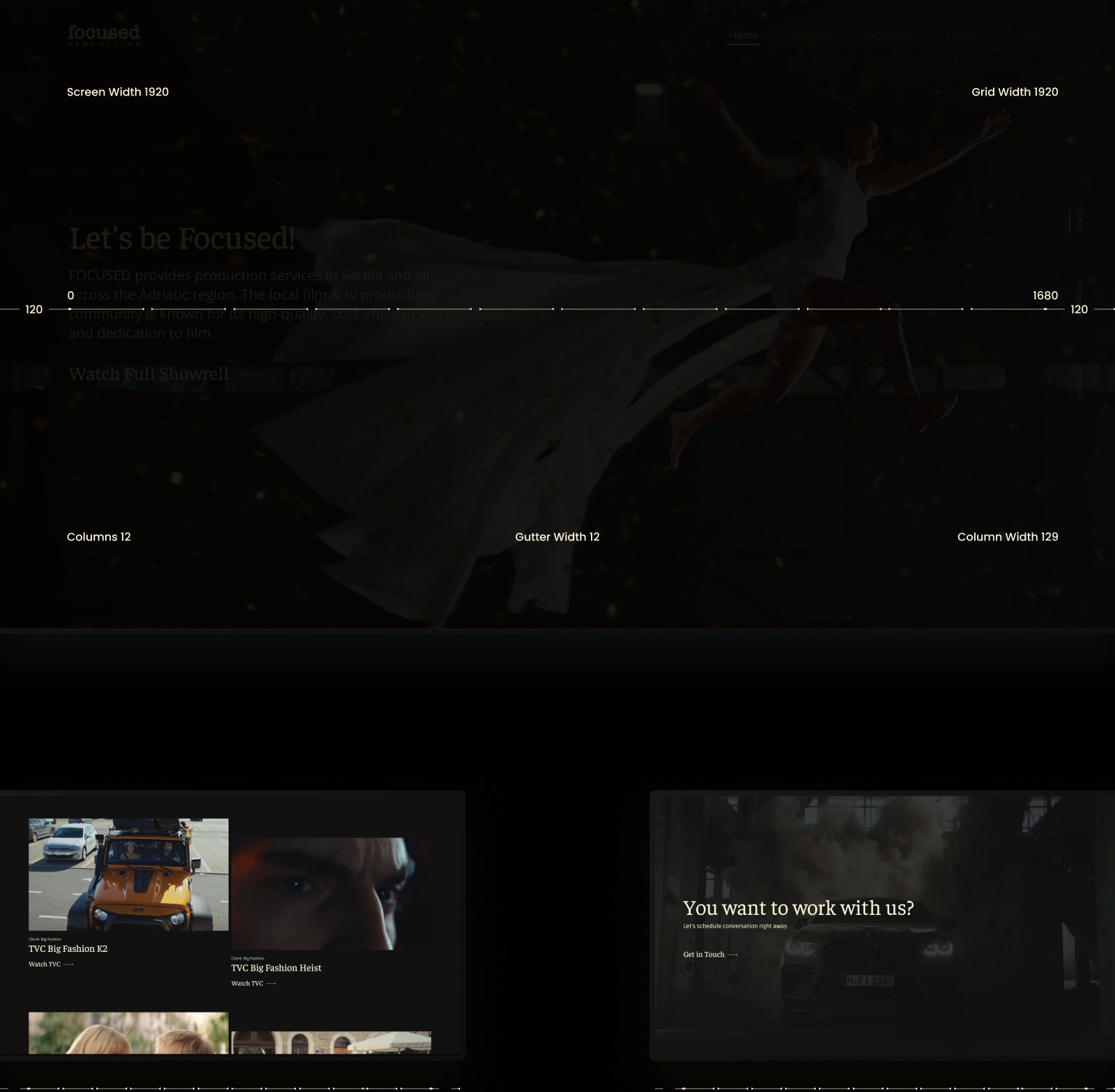
12 Column Grid
Layout grid
Every page is laid out on a 12 column grid: 1920px wide with 120px margins, twelve 129px columns and 12px gutters, giving a 1680px content width.
Home Page
Desktop View
The home page opens on the showreel itself, playing full screen behind one line of introduction and a single call to action. Below it the page answers the questions a producer asks, in the order they ask them: the work, the team and its track record, the brands that have trusted it, and the award winning short film Housekeeping, before closing on an invitation to get in touch.
Interior Pages
Work, Services, About Us
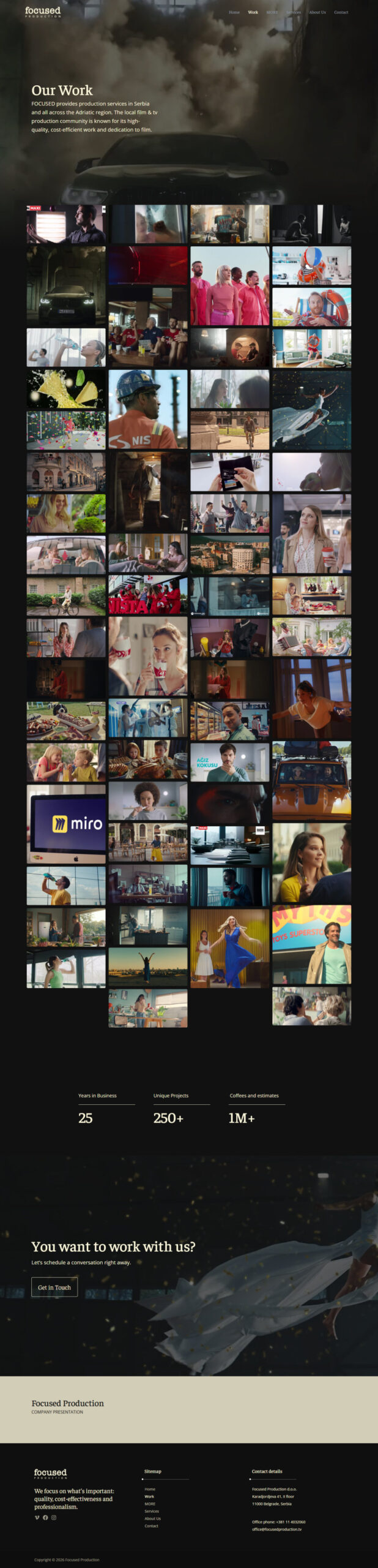
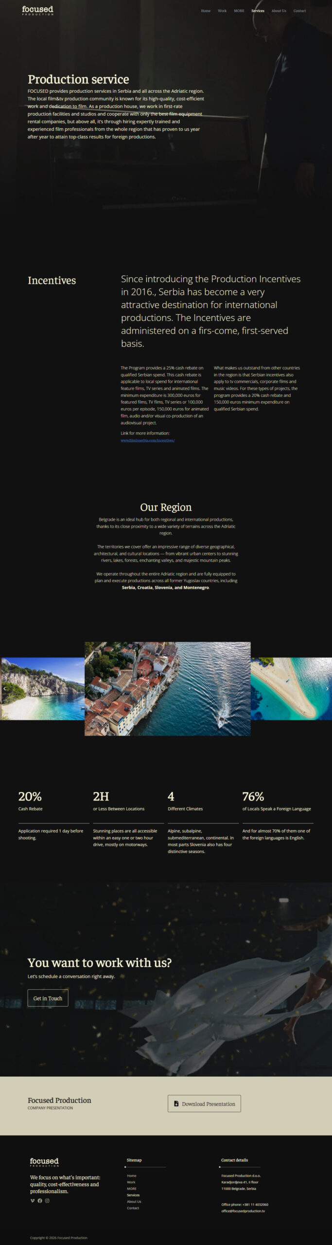
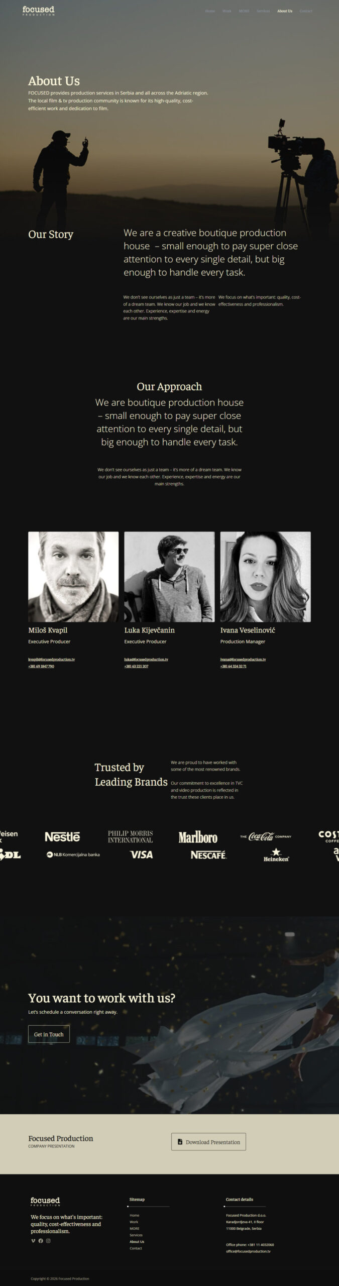
Every interior page follows the same spine: a full width hero with the page title and one line of introduction, the content itself, then the shared close of a call to action and the presentation download. Work lays out the full catalogue as a dense grid of stills, so a producer can scan it in one scroll. Services explains the Serbian production incentives and the region, and About Us puts faces and direct contacts to the team.
Work
Services
About Us
Responsive Design
Mobile Version
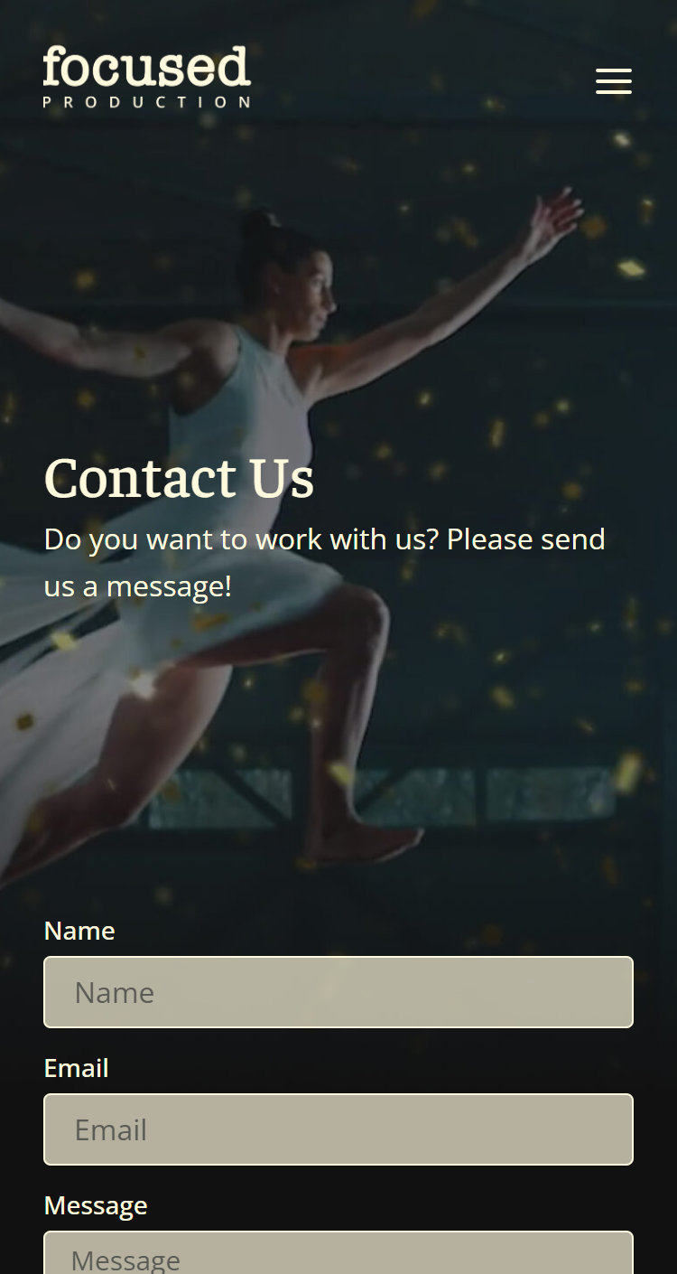
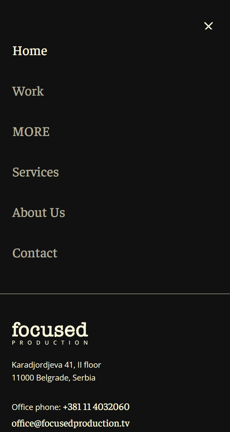
On a phone the showreel still leads, with the introduction and the call to action kept together in one block over the footage. The multi column grids collapse to a single column, so every film still reads at full width, and the navigation folds into a full screen menu that also carries the office address, phone and email, so a producer can call straight from the menu.

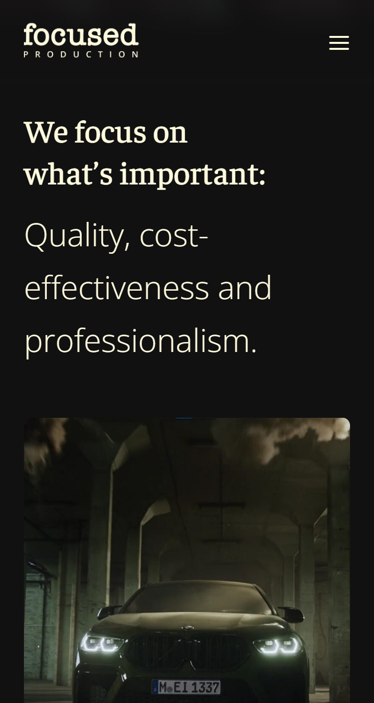
Featured work
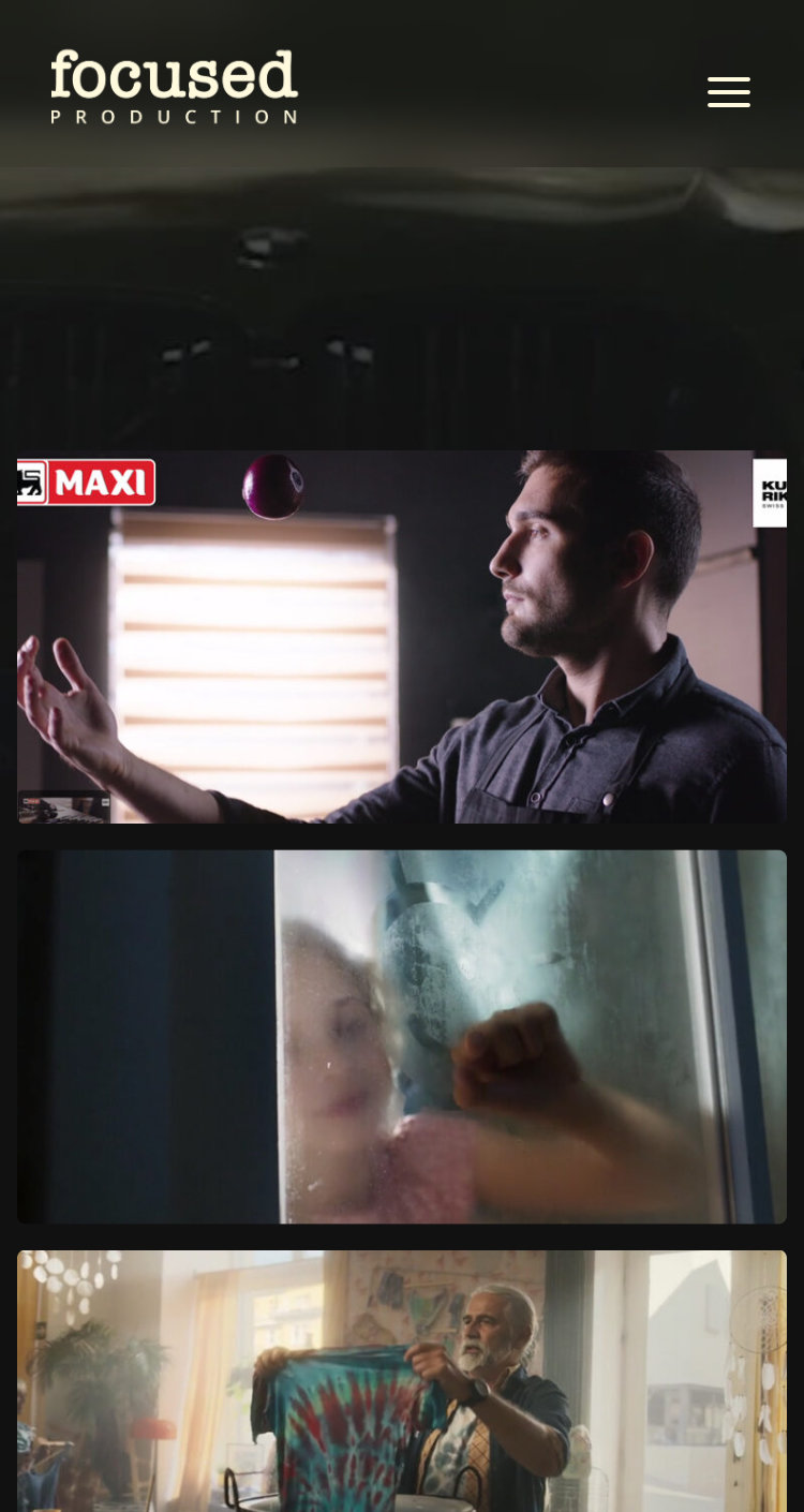
Work
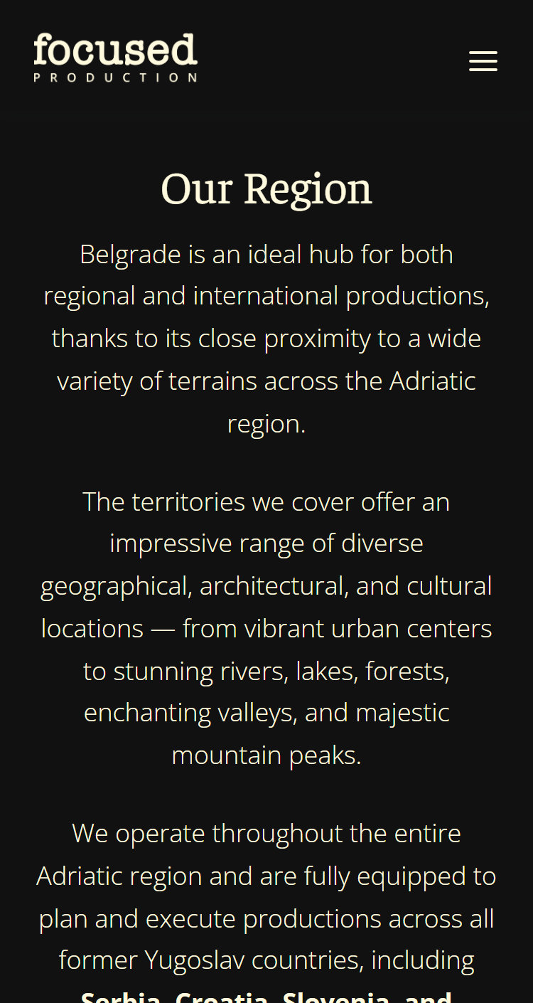
Our region
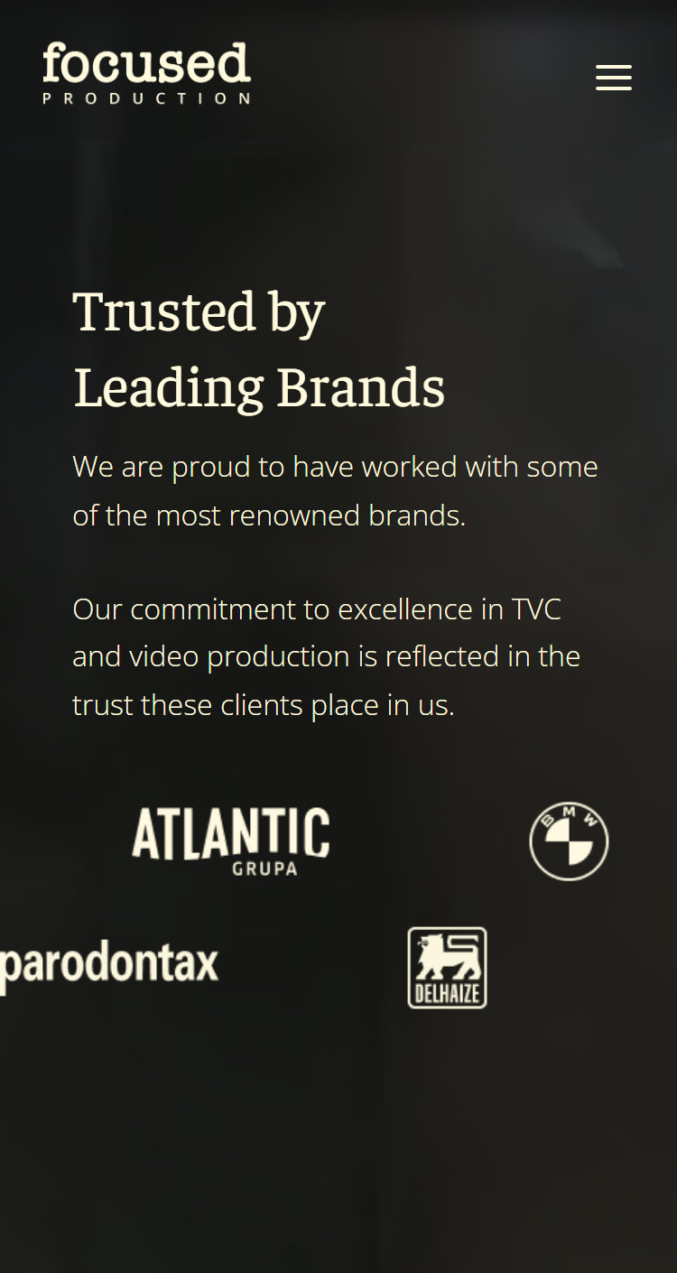
Trusted brands
Contact
Navigation menu
focusedproduction.tv
Thank you!