
Artfromdhart
Branding and Website Design
Key Features
Home, About, Gallery, Contact
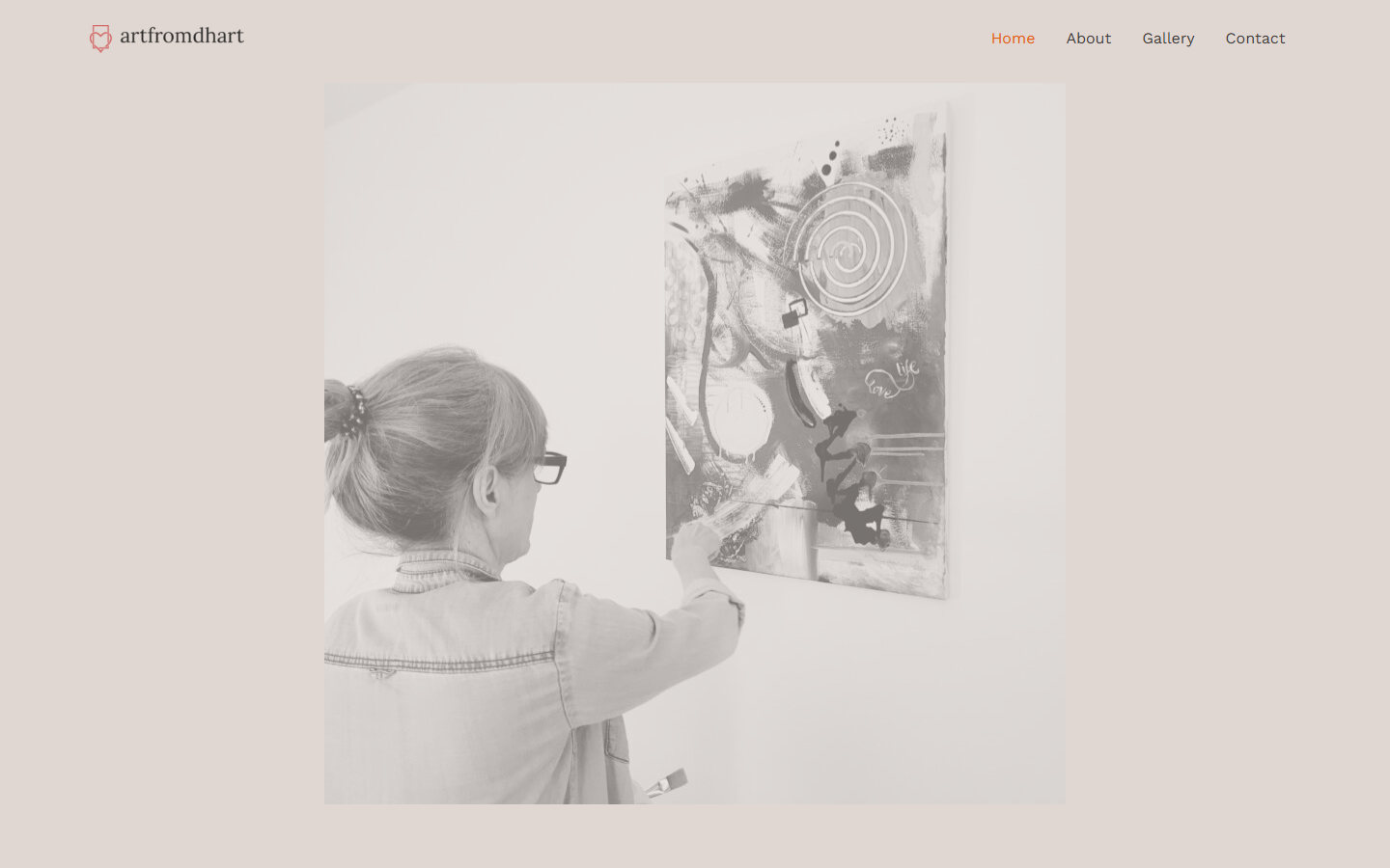
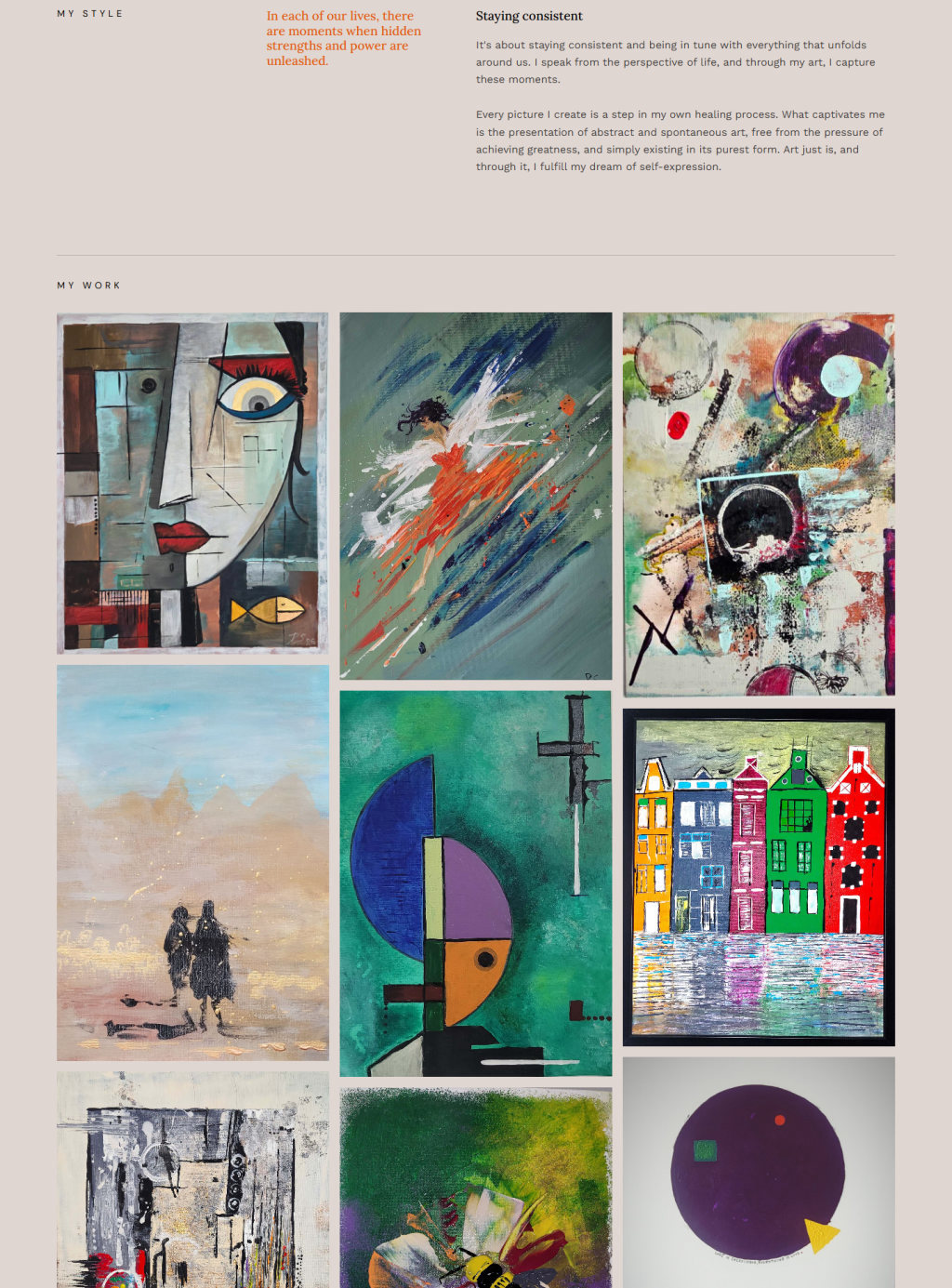
- Home Page: A quote, a short introduction and a grid of recent paintings.
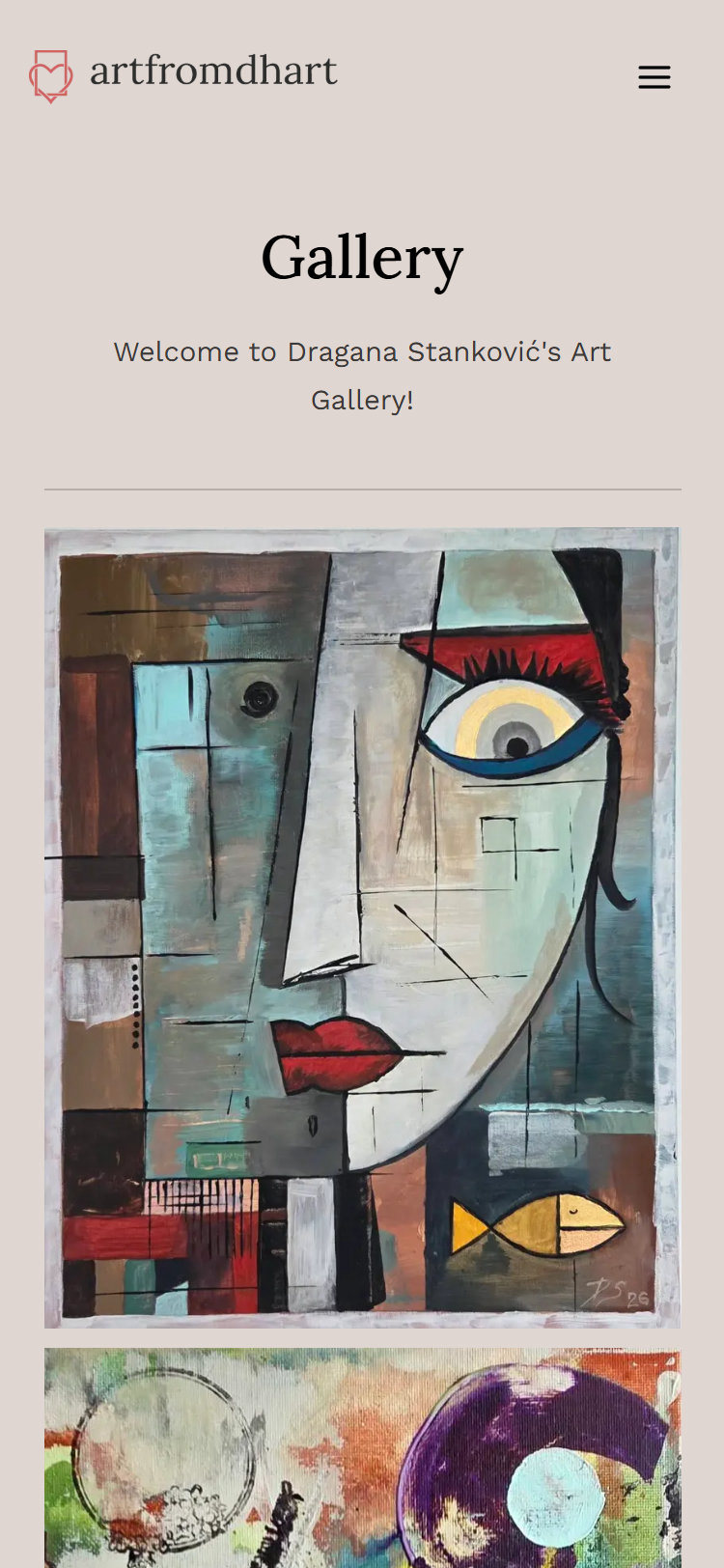
- Online Gallery: 59 paintings in a masonry grid, each opening full screen.
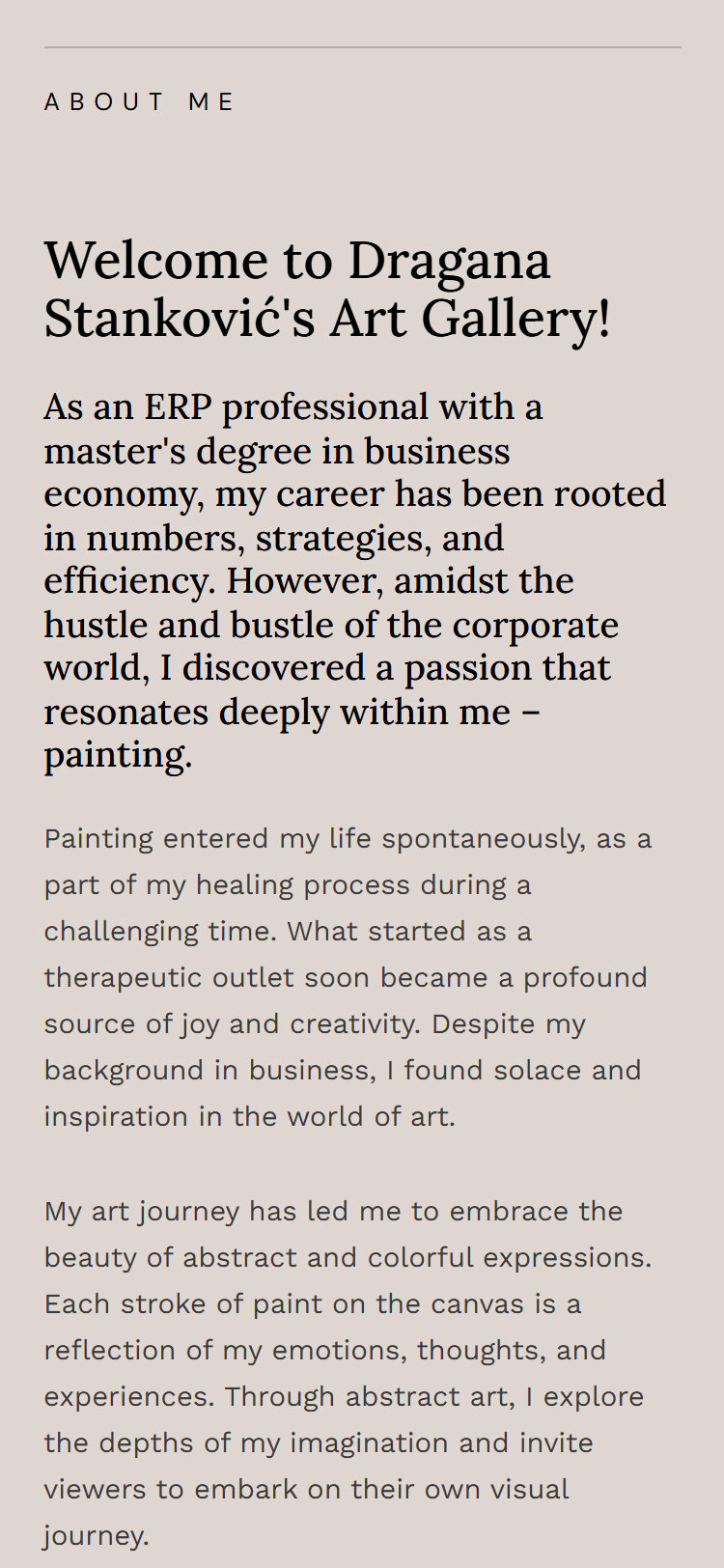
- Artist Story: Her background, with photos from the studio and exhibitions.
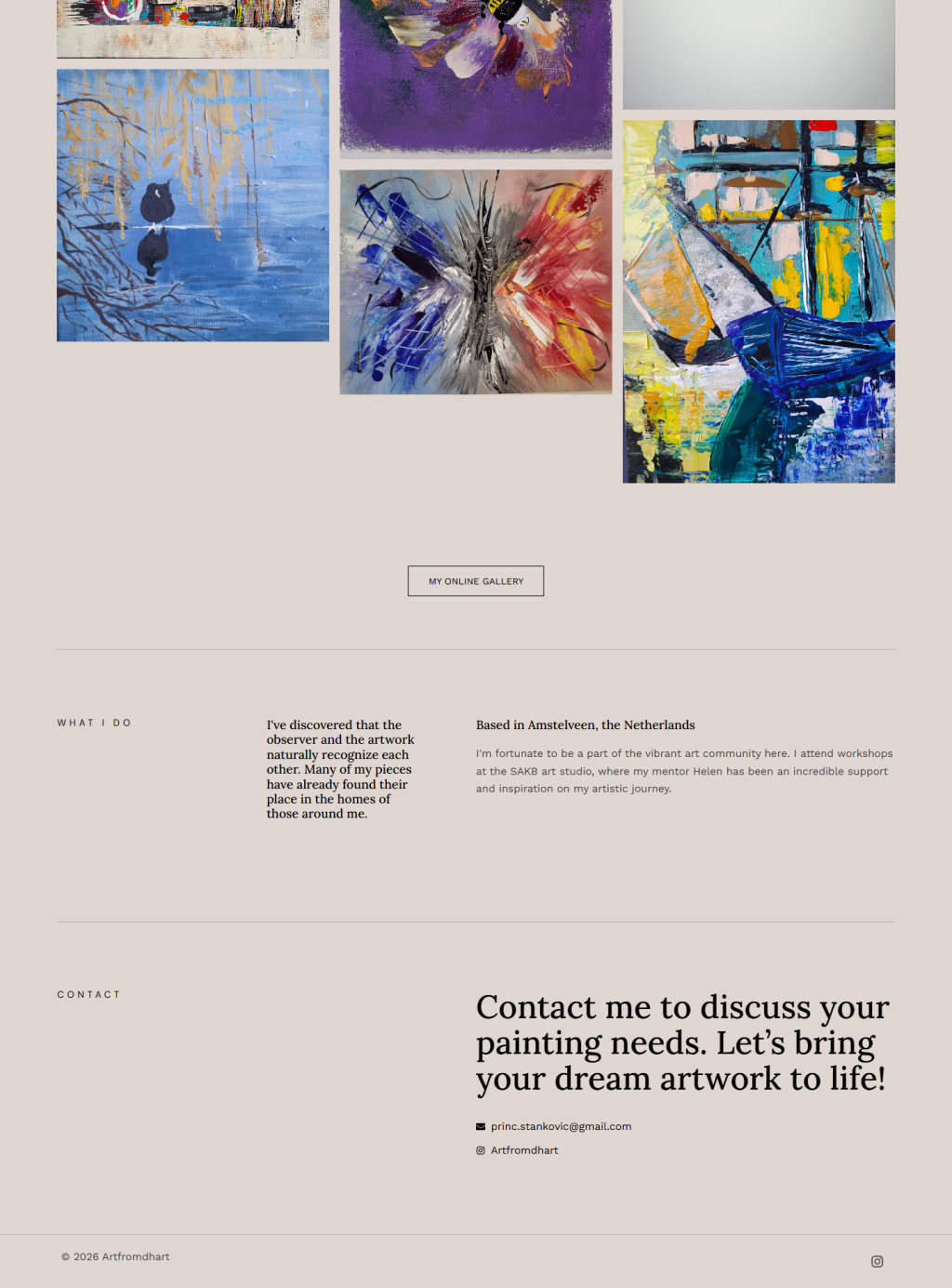
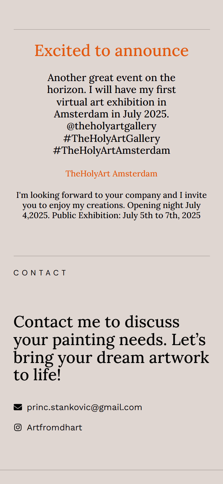
- Announcements: Shown on the home page whenever an exhibition is coming up, with a link to tickets.
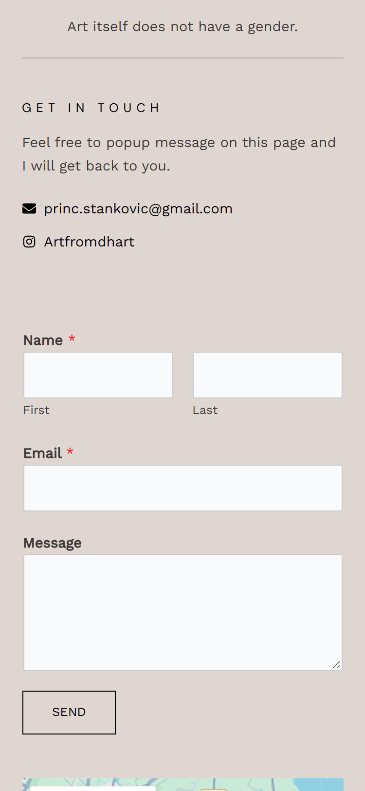
- Contact Page: Enquiry form, Instagram and a map of Amsterdam.
- Responsive Design: The whole gallery works on a phone.
Introduction
Client and Project
About Artfromdhart
Artfromdhart is the online gallery of Dragana Stanković, an independent painter based in Amstelveen, just outside Amsterdam. She came to painting from a career in business, as an ERP professional with a master’s degree in business economics, and it began as part of her recovery during a difficult time before it became the center of her creative life.
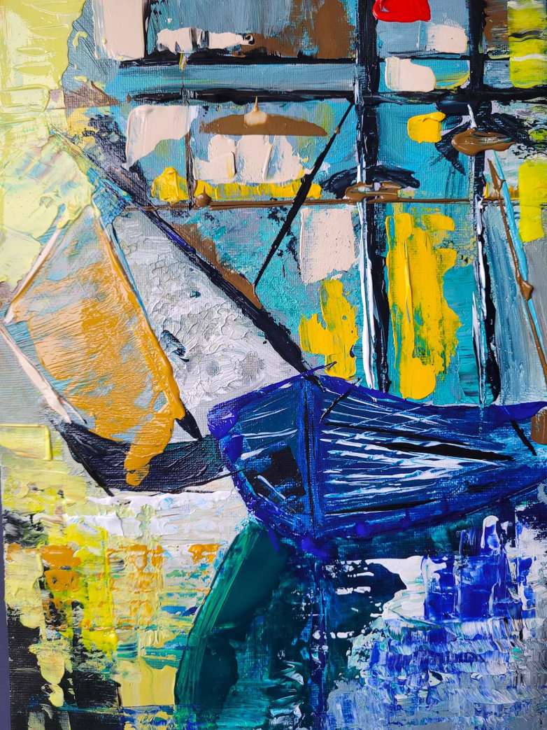
Her work is abstract and colorful, from bold compositions to quiet studies, and she exhibits with the art community around Amsterdam.
She needed a name and a mark of her own, and a website that puts the paintings first and makes it easy for buyers and galleries to get in touch.
My Responsibilities
- Brand identity: logo, color palette, typography.
- Brand applications: stationery, shopping bags, wall poster, brochure.
- Website: UI/UX design, WordPress development, gallery with full screen view, SEO basics.
Branding
Mood board
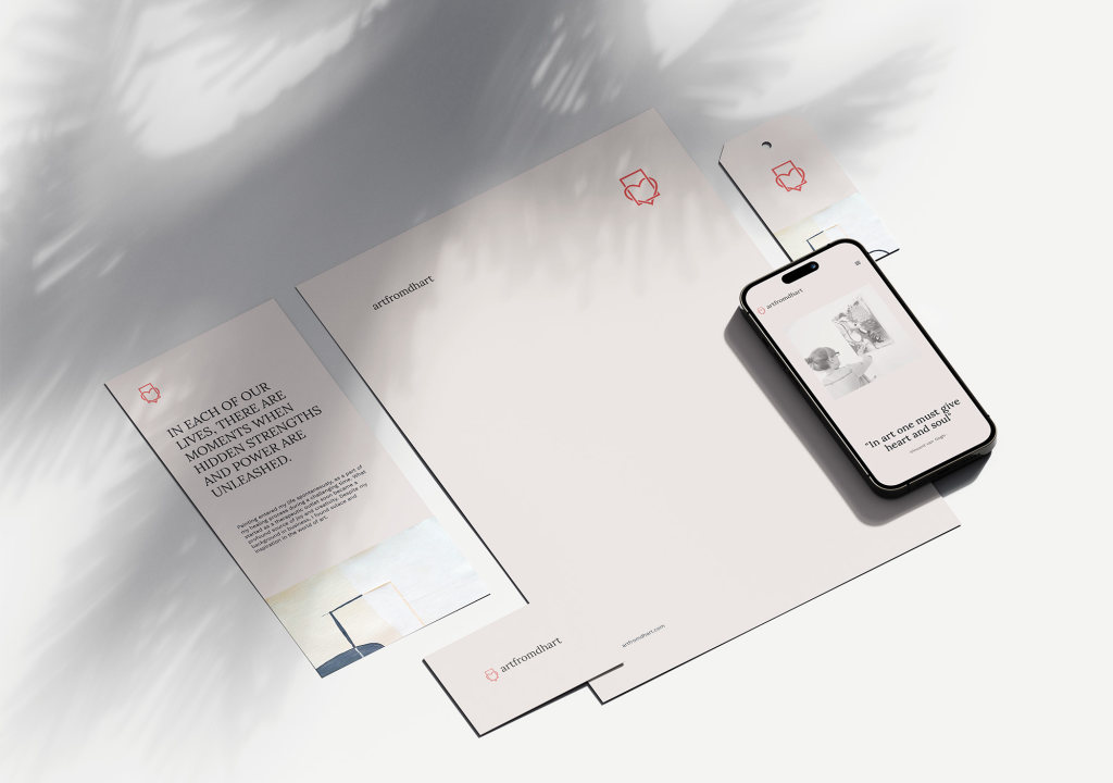
The identity carries from the screen to everything a buyer takes home: stationery and cards for letters and certificates, shopping bags for sold work, a poster for exhibitions and a brochure of the collection. Each piece keeps the linen ground and the coral heart, so a painting arrives with the same quiet presentation the website gives it.
Stationery
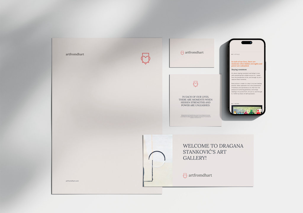
Stationery
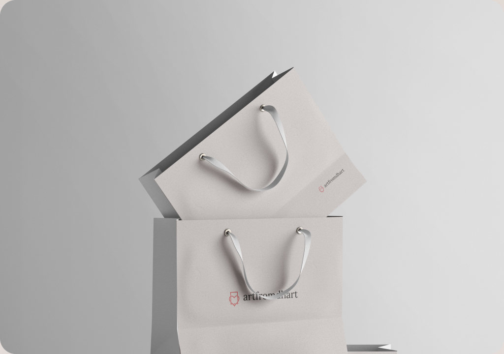
Shopping bags
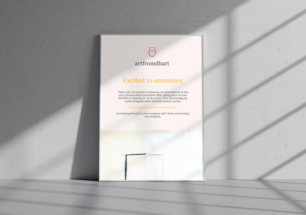
Wall poster
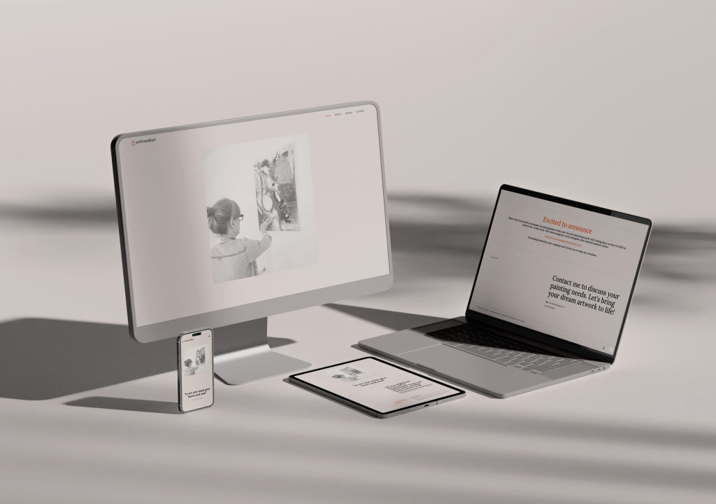
Website
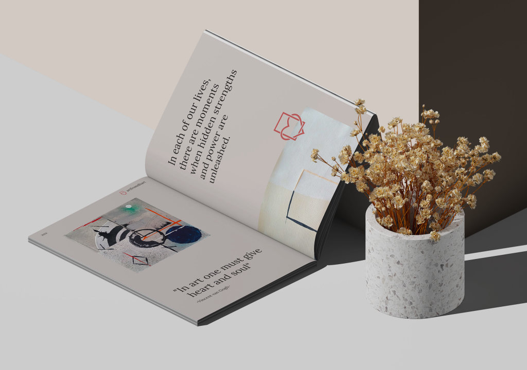
Brochure
Home Page
Desktop View
The home page opens on a quote and a single photograph, then lets the artist introduce her style in her own words before the paintings take over. A grid of recent work leads to the full gallery, an announcement appears whenever an exhibition is coming up, and the page closes with an invitation to talk about a commission. Shown here at full length, top to bottom and left to right.

Inside Pages
About, Gallery, Contact
The inside pages share the same calm frame: a centered Lora title over a short line, then the content on a linen ground. The gallery is a masonry grid that keeps every painting at its own proportions, About sets her story beside photographs from the studio and exhibitions, and Contact keeps the form to name, email and message beside a map of Amsterdam. Each preview scrolls through the whole page.
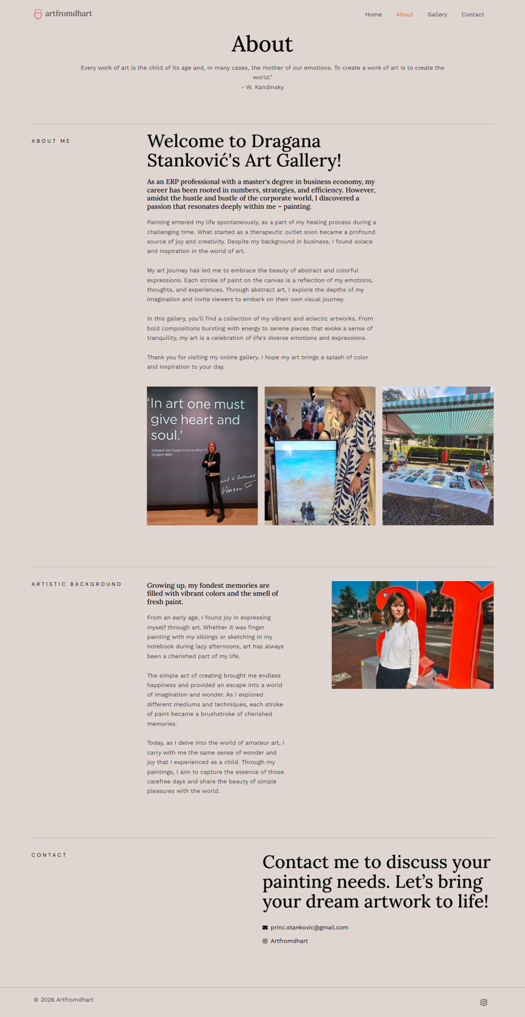
About
Her story and studio photos
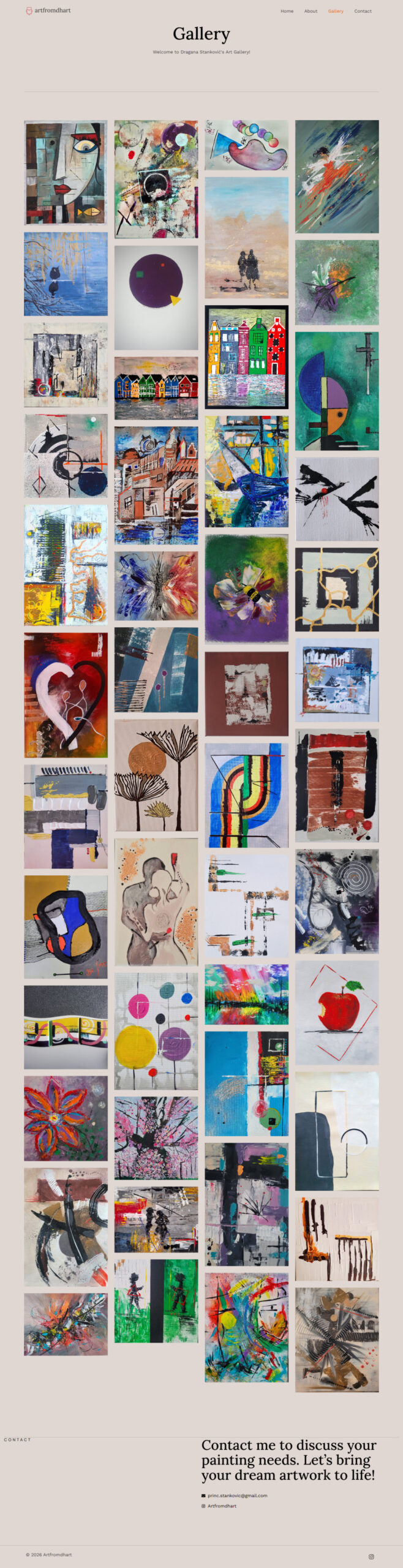
Gallery
59 paintings in a masonry grid
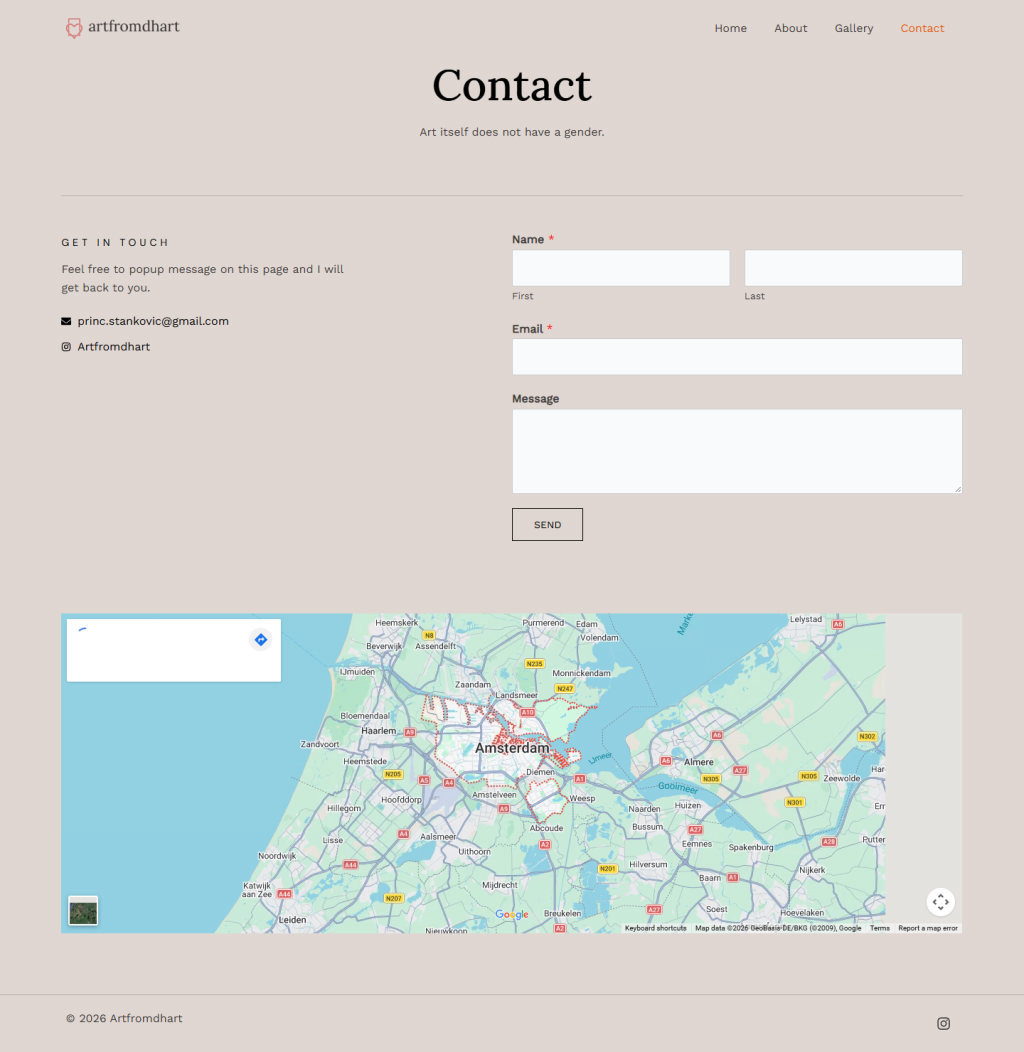
Contact
Form, Instagram and map
Responsive Design
Mobile Version
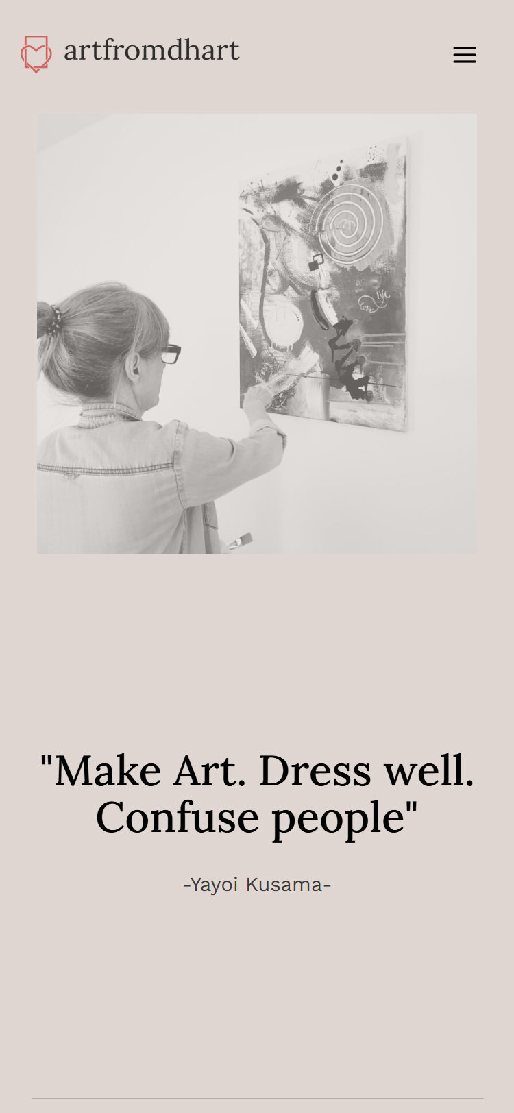
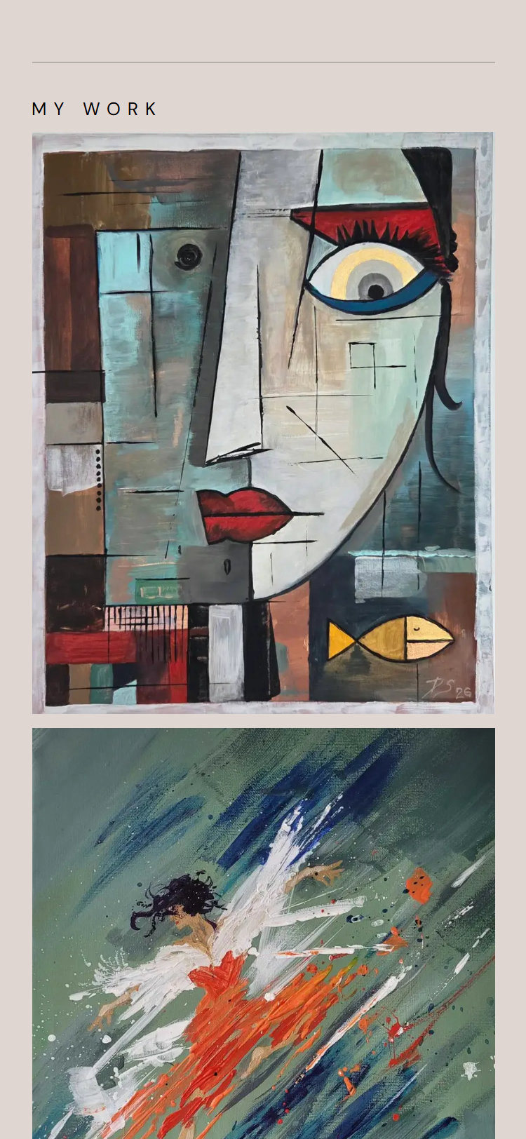
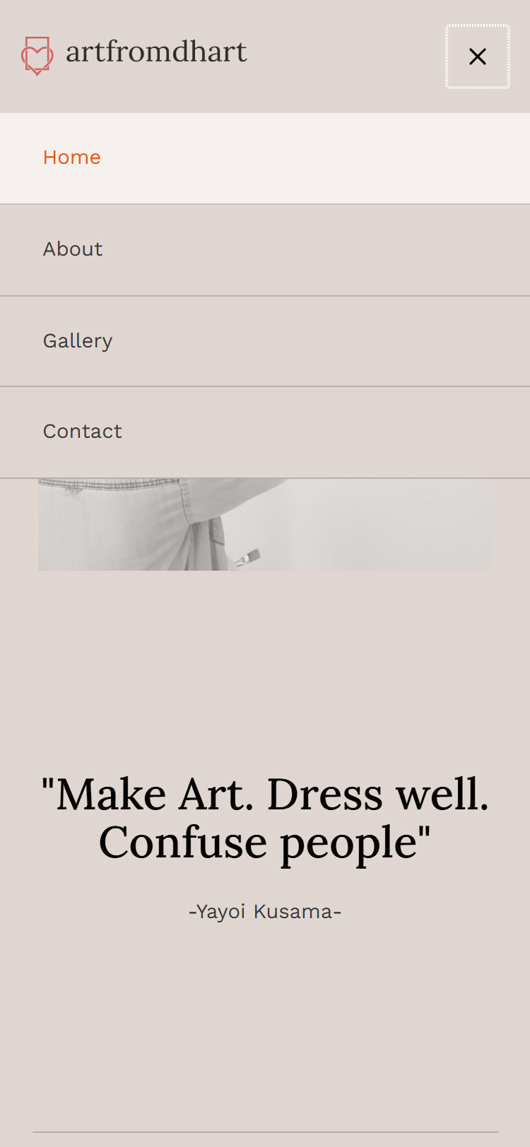
On a phone the quote and photograph still open the page, the gallery becomes a single column so each painting fills the width of the screen, and every painting still opens full screen. The menu folds into a single button, and the contact form stacks into one column.
My work
Announcements
About
Gallery
Contact
Navigation menu